
What is an infographic? We admit that there’s a lot written out there about this topic, it isn’t hard to find infographic examples out there.
However, we’d like to share our thoughts and tips on infographic creation from the perspective of a team behind an infographic maker tool and as a provider of infographic design services since 2015. Now, let’s get to it!
If you’re an educator or student, you’re probably wondering how infographics fit into the picture for your school curriculum or lesson plans.
Meanwhile, if you’re running a business or heading a marketing team, you’re curious about using infographics to share your brand story.
Are infographics expensive and time-consuming to create? Is it even worth pursuing?
What kind of infographic format is ideal for the data that you want to highlight?
In this guide, you’ll find answers to these questions (and more!) as we dive deeper into infographic creation — from its history to design best practices to downloadable infographic templates that you can use right away.
What is an infographic?
Infographic is a combination of the words “information” and “graphics”.
Merriam-Webster defines infographics as “a chart, diagram, or illustration (as in a book or magazine, or on a website) that uses graphic elements to present information in a visually striking way”.
On the other hand, Oxford Learners’ Dictionary describes infographics as information or data that is shown in a chart, diagram, etc. so that it is easy to understand.
So what do we learn from these definitions?
Authors Ekaterina Walter and Jessica Gioglio said it best in their book The Power of Visual Storytelling — infographics, in a nutshell, bring together the best of data and visuals to craft a story.
Here’s an excellent example of an infographic that combined both data and visuals to make the content more striking, shareable, and easy to understand.
The beauty of infographics is that they’re versatile.
You can share infographics on Instagram, embed them on your website, or print them out as a brochure or poster.
Do you need quantitative data to make infographics?
Not necessarily.
You can make an infographic based on qualitative information like when you want to explain a process, define an idea, or highlight differences and similarities between two or more concepts. The possibilities with infographics are endless!
You will learn more about the different ways to use infographics later in this guide.
Why use infographics
Whether it’s for your social studies class or your rebranding efforts, adding visuals to texts (like infographics) has been shown to improve learning and memory recall.
Case in point — an experiment by the Department of Computer Science at the University of Saskatchewan showed that participants prefer embellished charts over plain (minimalist) charts in terms of aesthetics. Also, there was zero difference in the participants’ accuracy in interpreting both charts’ data.
And for the most significant finding?
Here’s an excerpt from the experiment’s conclusion:
We found that people’s accuracy in describing the embellished charts was no worse than for simple charts and that their recall after a two-to-three week gap was significantly better for the embellished charts.
Watch the 3-minute video below to discover why you should use infographics for persuasive business communication, better learning, and stronger memory recall.
Sure, we might be slightly biased, but we made sure to stick with the facts, latest findings, and most reliable insights that we can find.
History of infographics
If you’ve wondered what the first infographic looked like, historians believe that cave images, rock art, and maps are the early versions of infographics.
Watch the video below to learn about the evolution of infographics.
The spray-shaped images discovered at the Chauvet-Pont d’Arc Cave in France at around 37,000 BC were thought to depict the nearby volcanoes that erupted and expelled lava into the sky.

Rock art specialists are proposing that the rock art of Serra Da Capivara in Brazil, dating as far back as 36,000 years ago, are the origins of infographics.
And then there were maps.
Discovered in the Czech Republic, the earliest-known map was created around 25000 BC.
Aside from visualizing the land around them, the ancients also mapped the skies.
One of the oldest graphics, the Dunhuang star atlas, dates back to 649 and 684 AD. This ancient Chinese atlas has more than a thousand stars depicted.

It wasn’t until the 18th century that scientists and scholars started to visualize knowledge and information.
In 1764, British polymath Joseph Priestley produced a “Chart of Biography”, illustrating the lives of roughly 2,000 historical figures on a timeline.
Two decades later, William Playfair plotted the price of wheat against labor costs in the UK. His chart revealed that wages were rising much more slowly than the cost of wheat.
Playfair, considered the father of modern-day infographics, also published The Commercial and Political Atlas and Statistical Breviary, where he introduced line graphs, bar charts, and pie charts to statistics.
The 1830s saw the birth of data-based social science.
In France, lawyer André-Michel Guerry illustrated maps showing moral statistics with Venetian geographer, Adriano Balbi. Guerry’s work was controversial because it challenged conventional wisdom at the time. French social critics believed that illiteracy led to crime, but the lawyer’s maps suggested otherwise.
By 1857, English nurse Florence Nightingale used the coxcomb chart to convince Queen Victoria to improve military hospital conditions. Her graphic showed the number and causes of deaths during each month of the Crimean War.
Two years later, French engineer Charles Joseph Minard created a map of Napoleon Bonaparte’s 1812 Russian campaign.
In 1933, Harry Beck made the first map of the London Tube. It was a milestone in infographic history since it proved that visual diagrams could be used for everyday life.
In 1972, Otl Aicher created a set of pictograms for the Munich Olympics. Aicher’s pictograms inspire today’s public signs and generic stick figures.

By 1975, Edward Tufte, considered the father of data visualization, developed a statistical graphics seminar alongside John Tukey.
As a pioneer in information design, Tufte developed the concept of data-ink ratio. For Tufte, the best graphics present their message and information as simply as possible.
In 1983, Tufte later self-published The Visual Display of Quantitative Information.
Tufte argues that any visual elements that do not communicate specific information should be omitted. He called it chart-junk.
Meanwhile, British graphic designer Nigel Holmes’ work was gaining popularity in 1979.
Holmes’ visualizations were the complete opposite of Tufte’s desire for simplicity. He supported the heavy use of graphical decoration to embellish information.
From the 1990s onwards, the terms infographic and information graphics are used interchangeably. According to the authors of The Power of Visual Storytelling, there is no threshold at which something “becomes” an infographic. Infographics can range from simple road signs to complex charts about the global economy.
Types of infographics: Choosing the right format for your message
Before you start making infographics, it’s essential to understand which infographic type will most effectively communicate your idea, information, or data.
The video below highlights the different types of infographics and when to use them.
It’s worth noting that one infographic can have the components of another infographic type. For example, a list infographic can also have elements of a statistical infographic.
Let’s take a closer look at each infographic format below.
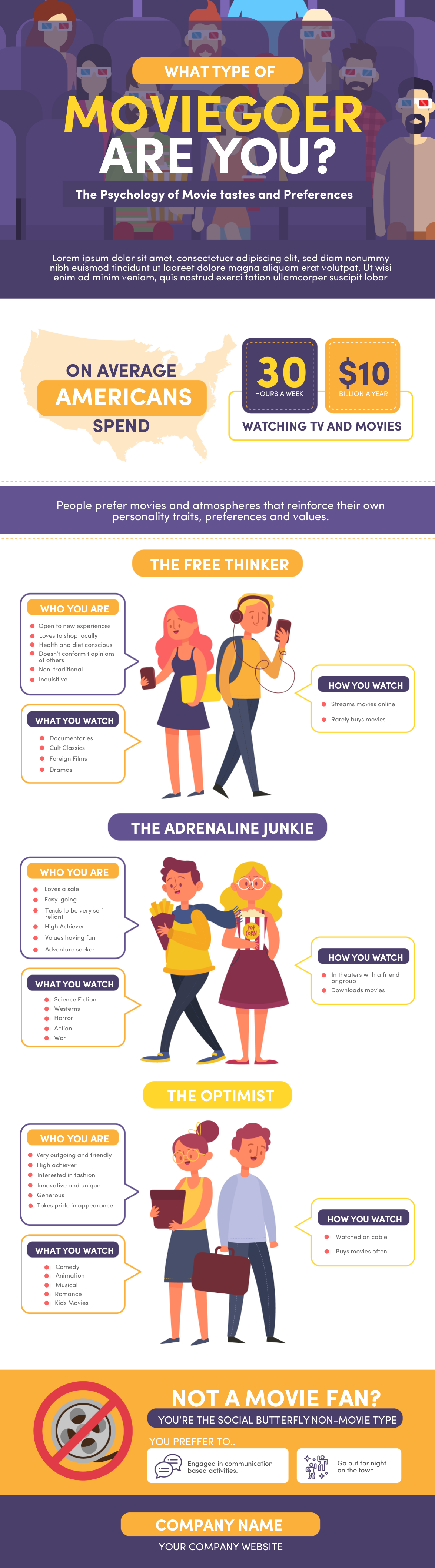
Visual infographic
An informational or visual infographic makes a piece of writing more interesting and engaging for the audience. As a result, your readers are more likely to share the infographic on social media and similar platforms.
A list of a veterinary hospital’s services is transformed into an eye-catching infographic in the example below.

Meanwhile, the infographic template below lets you know if you’re a free thinker, optimist, or an adrenaline junkie based on your film viewing habits.
List infographic
A list infographic highlights a series of steps. You can add images, numbers, or icons to illustrate each step or point in your list.
The Internet loves lists (next to cats, of course!), so this infographic format is likely to get shared as they’re usually engaging and fun to read.
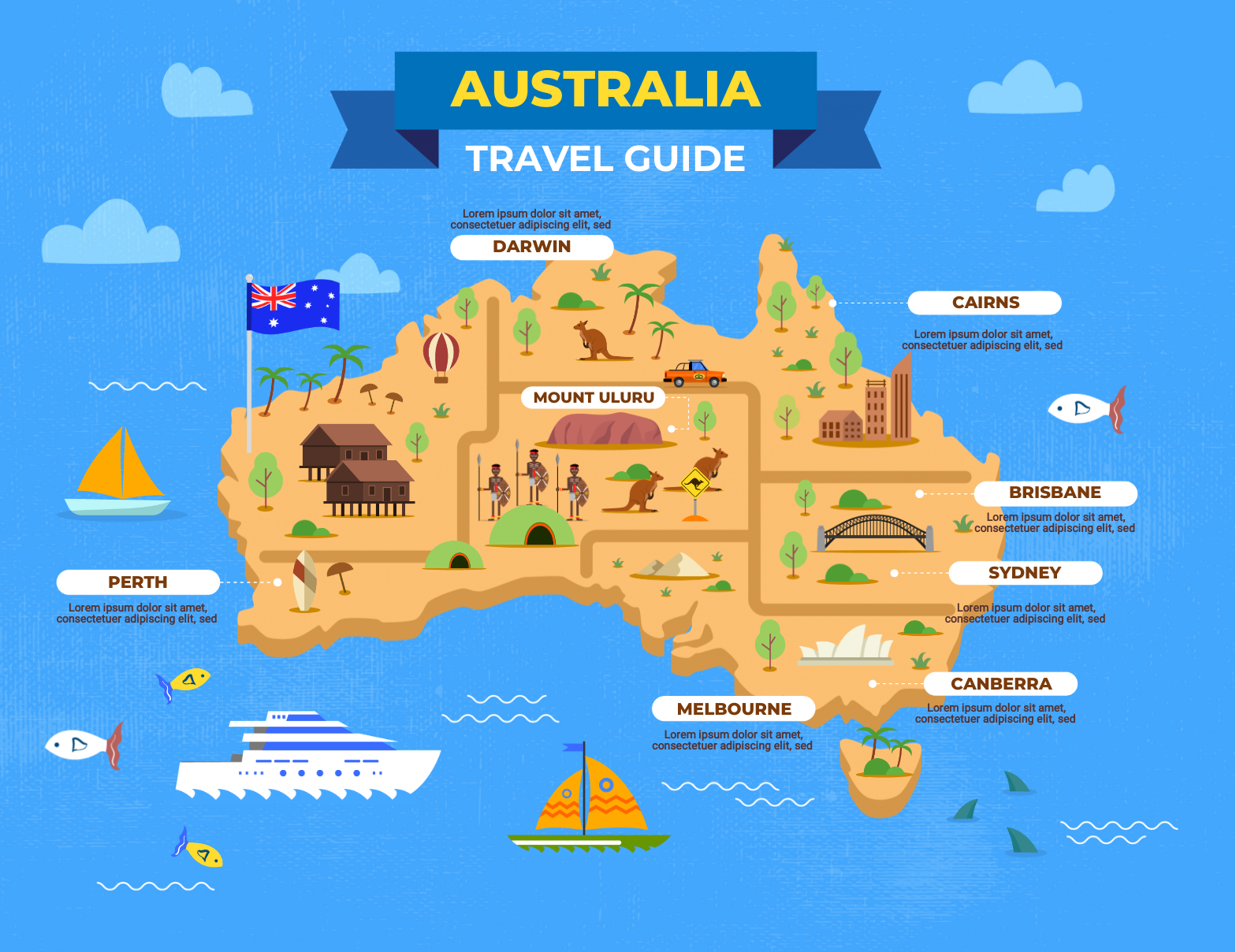
Map infographic
A map infographic presents data or information based on location.
This format is perfect for highlighting geographic trends or information like the travel Australia infographic template below.
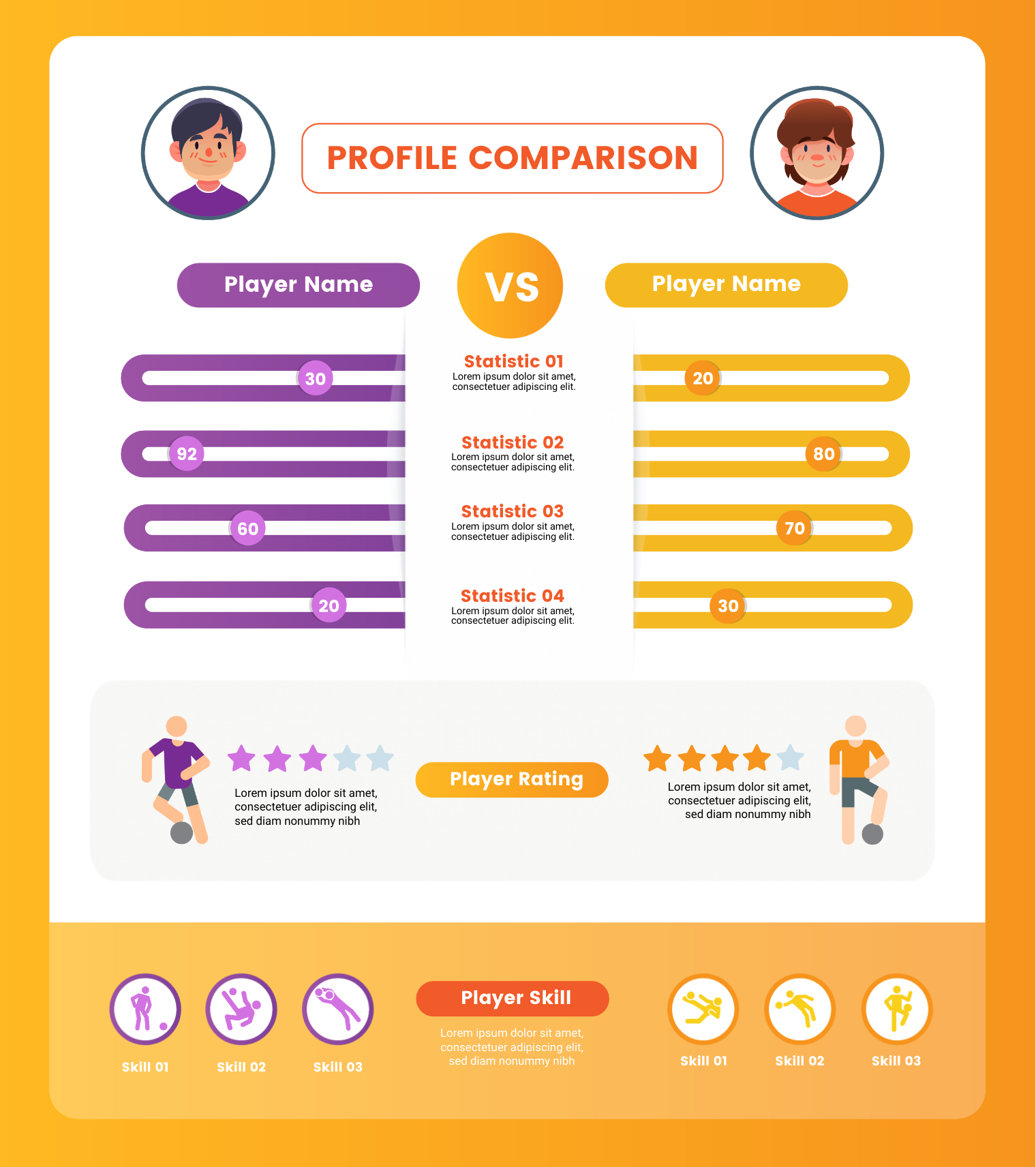
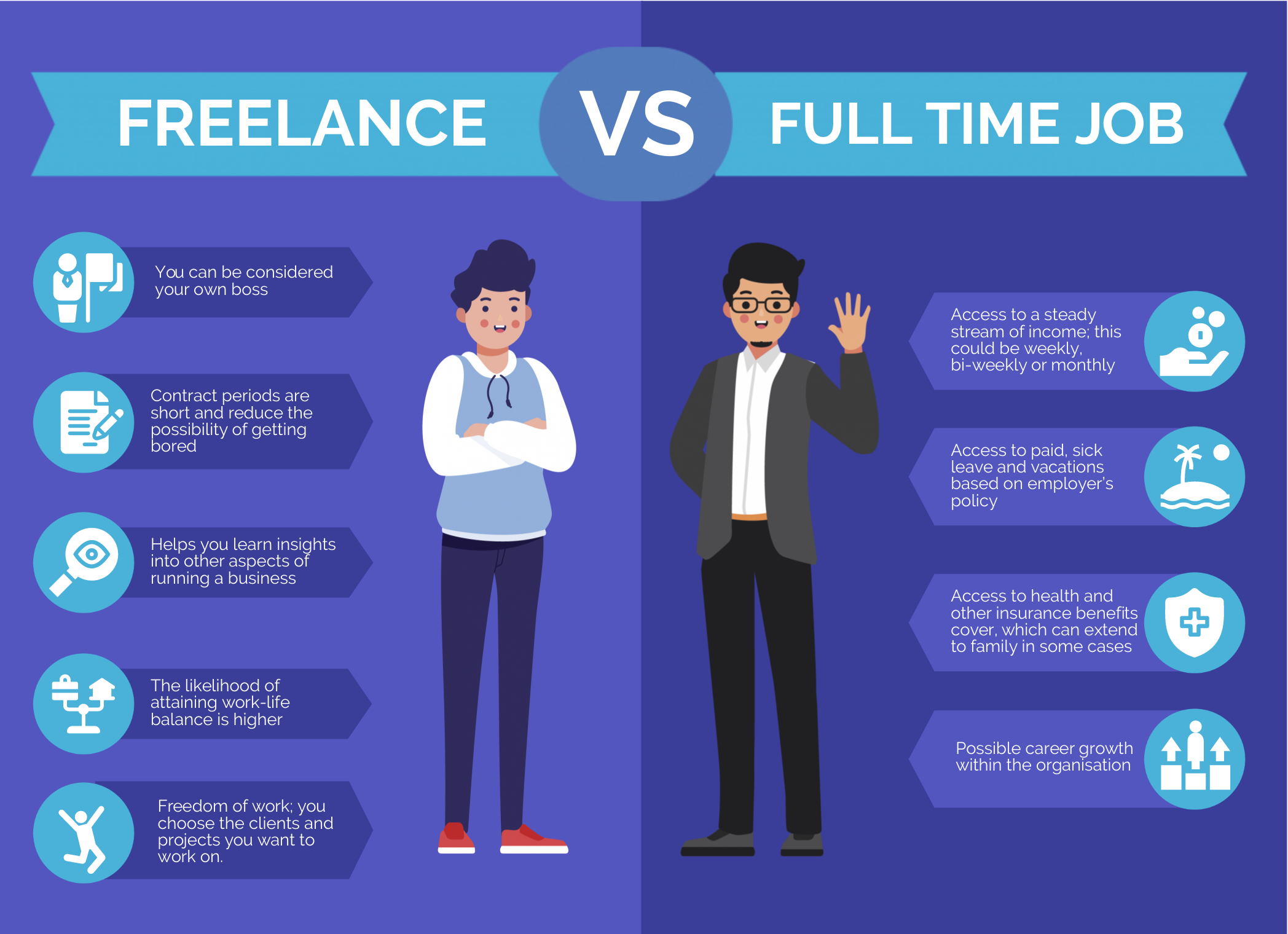
Comparison infographic
A comparison infographic compares two or more ideas or objects. Also known as versus infographic, this format highlights differences or similarities.
You can also use a comparison infographic to show how one option is superior or inferior to the other.
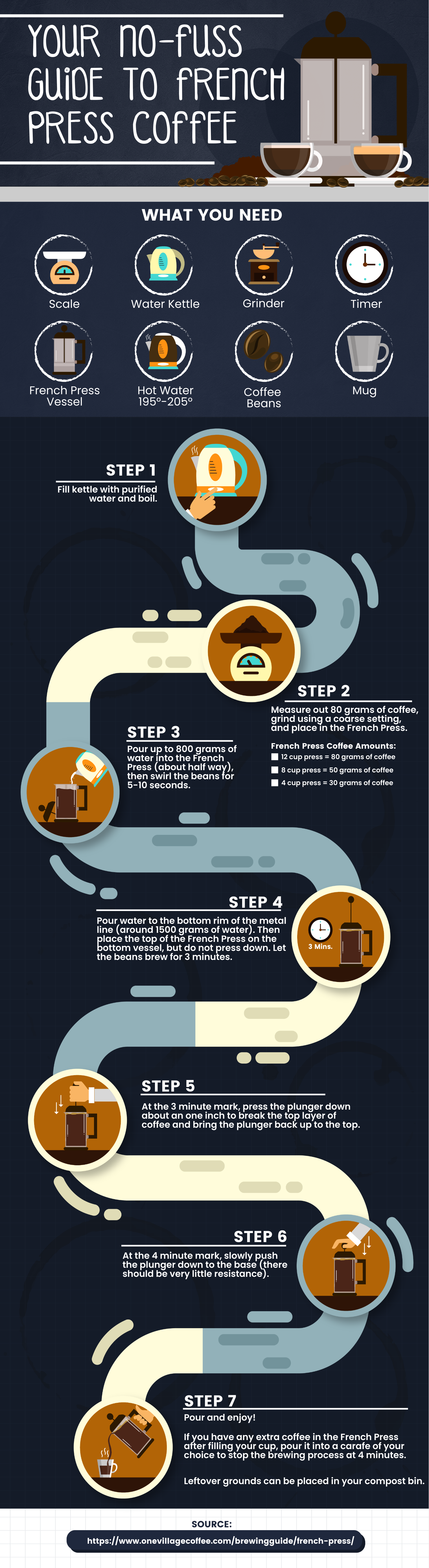
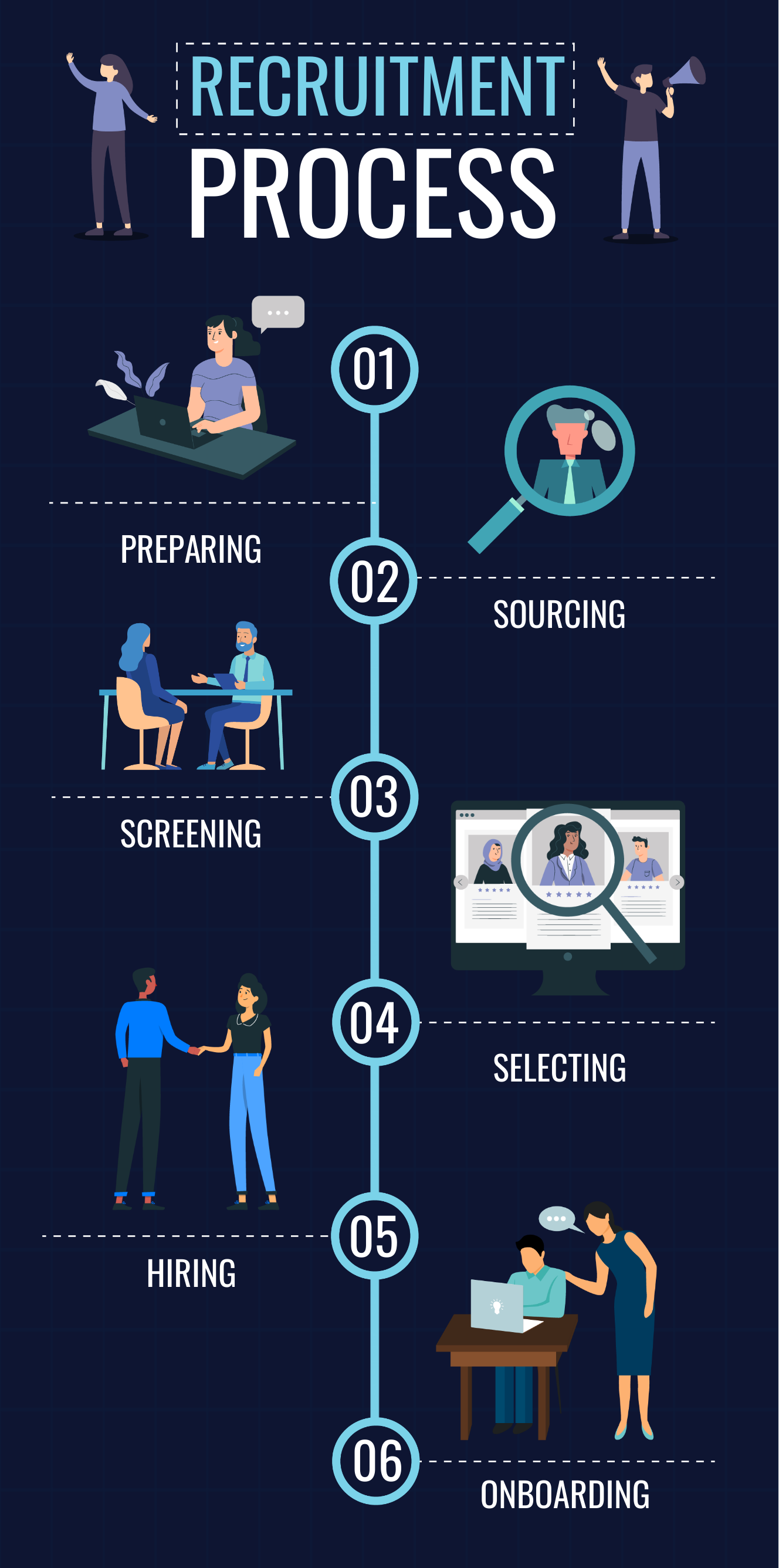
Flowchart infographics
If you want to explain an answer to a question or showcase how multiple scenarios will pan out, consider flowchart infographics.
The infographic template below describes the steps it would take to make french-pressed coffee.
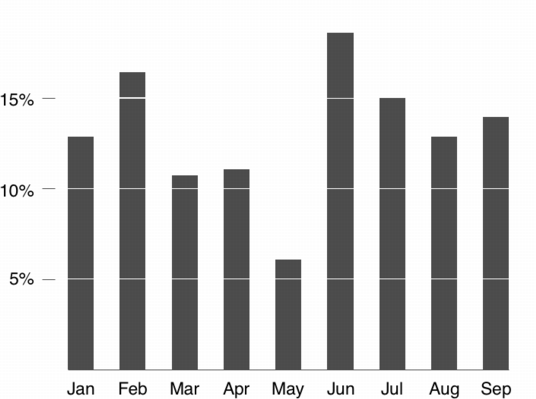
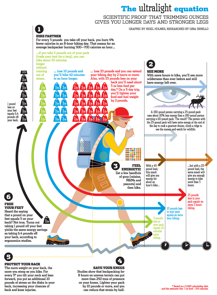
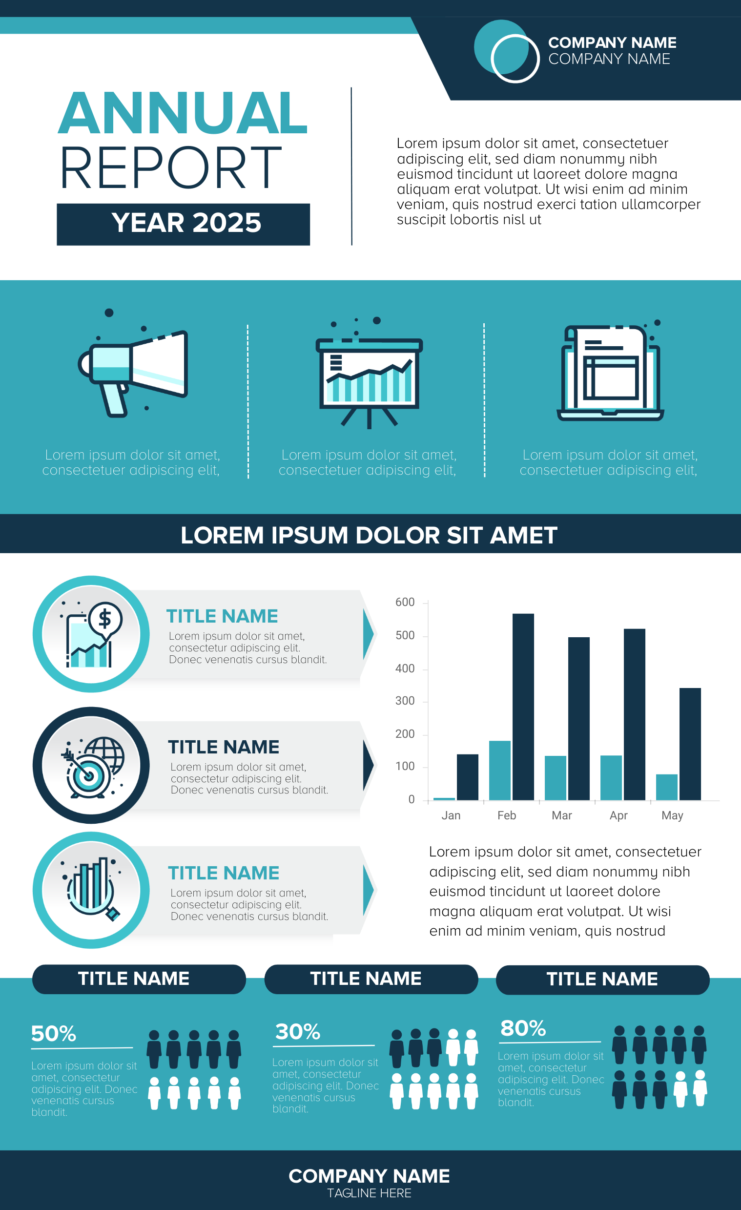
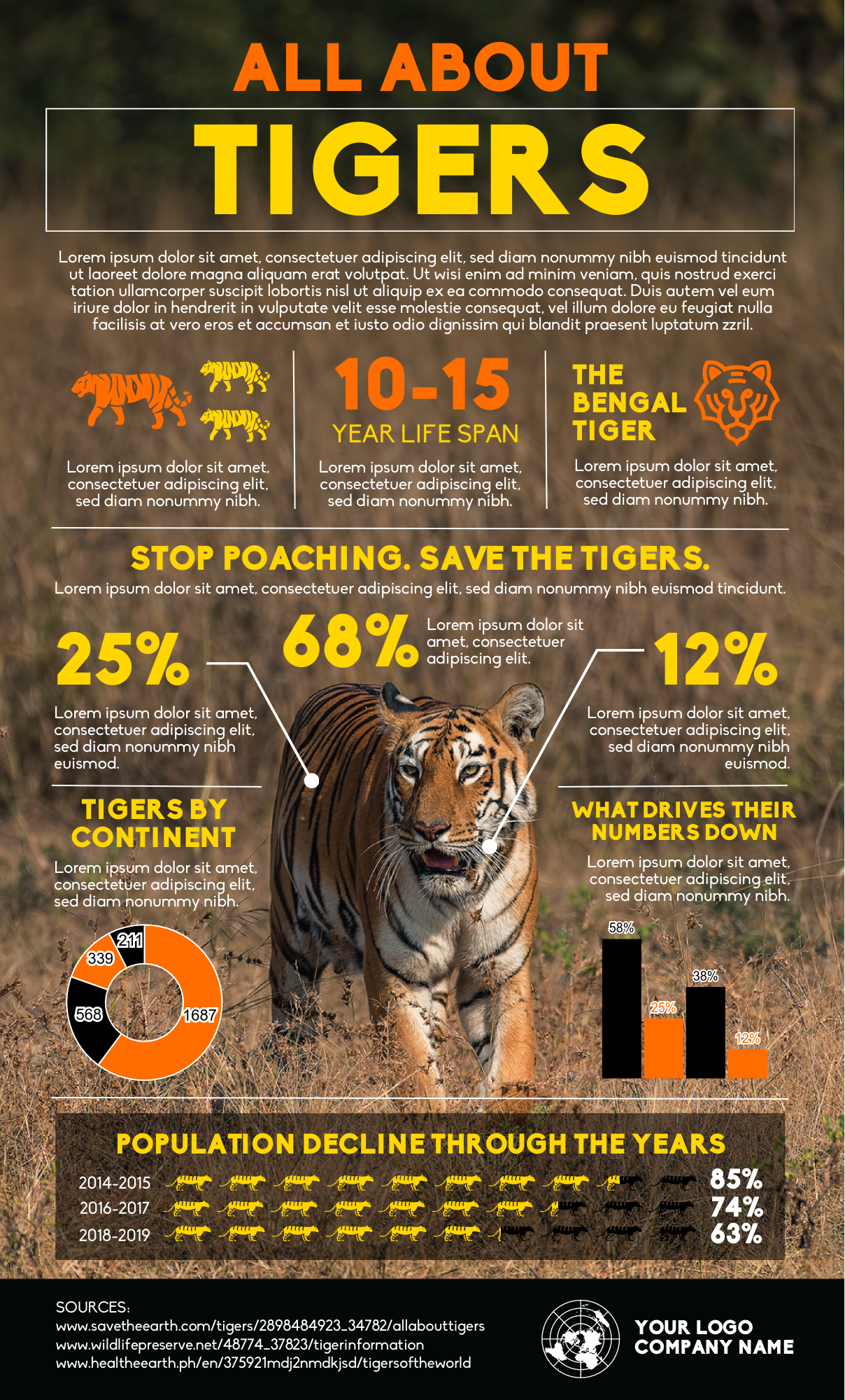
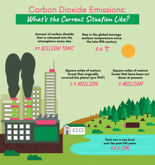
Data visualization or statistical infographics
Data visualization or statistical infographics are used to simplify complex data. Graphs, charts, and pictograms are often used for this infographic format.
Take a look at the templates below and use them to make your data and figures stand out!
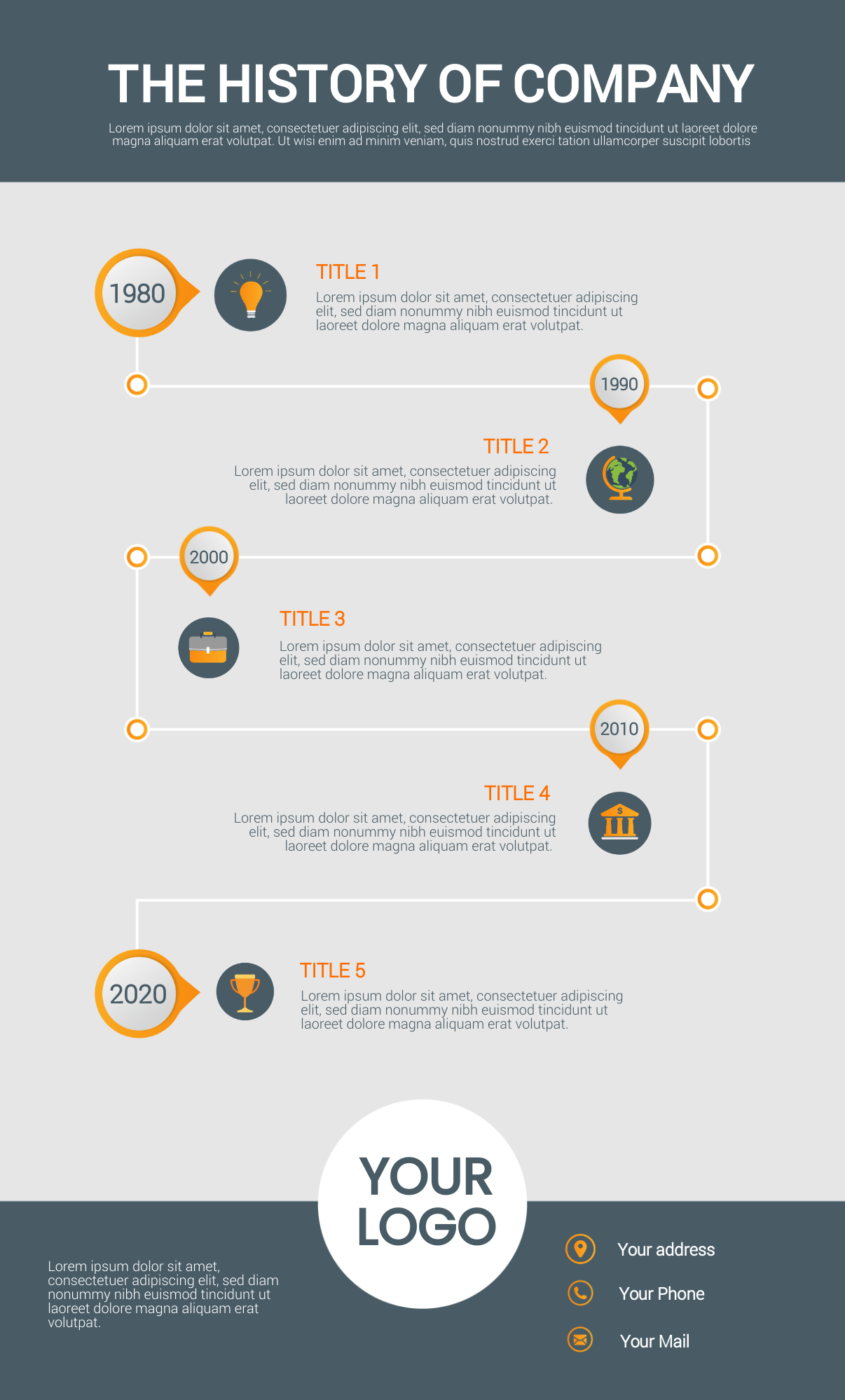
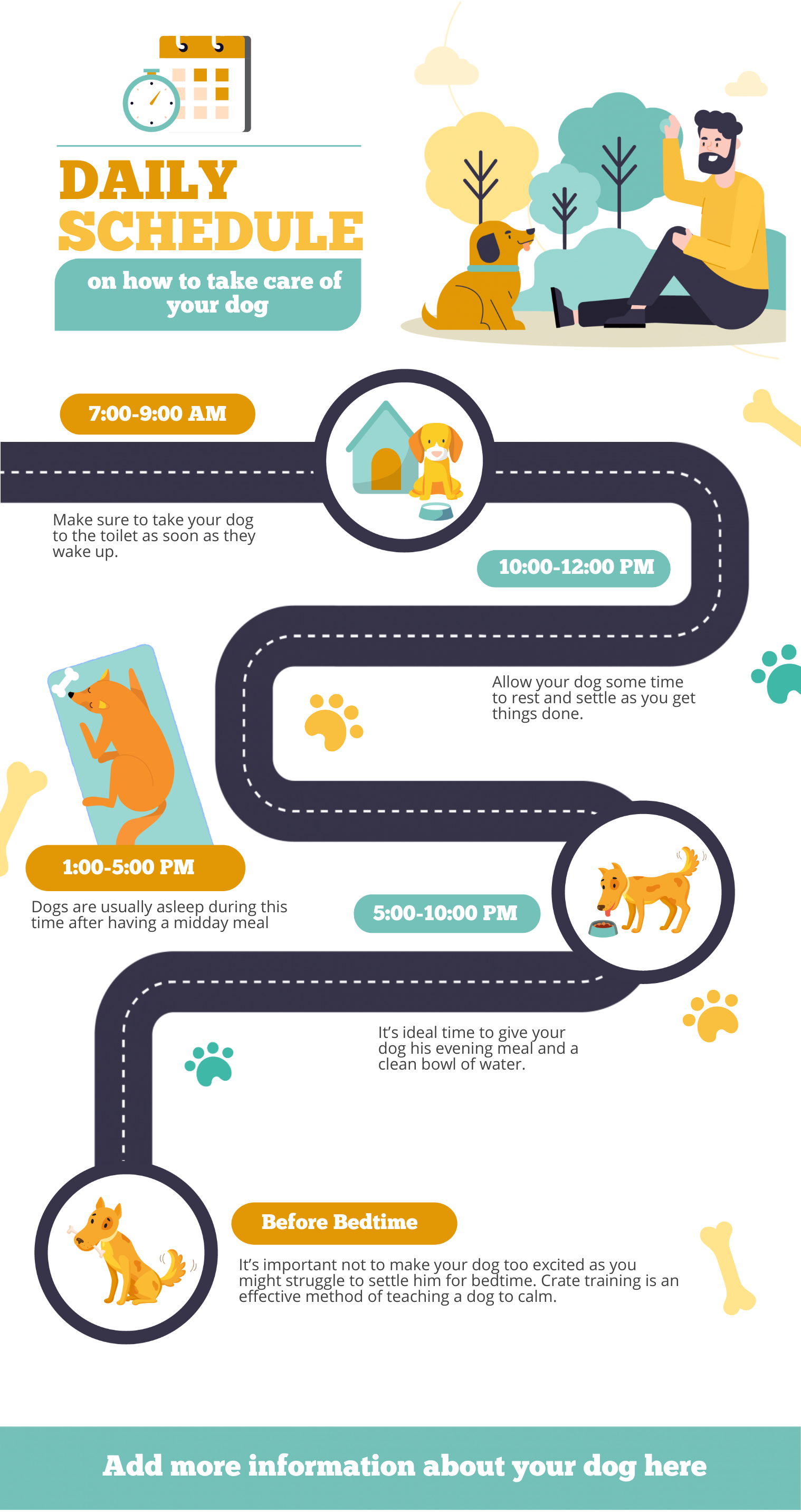
Timeline infographics
Timelines in your infographic are suitable if you want to show how one thing leads to another or highlight how something has changed over time.
You can also use this infographic format to take the reader on a journey, whether it’s your company’s history or your dog’s daily routine as illustrated in the templates below.
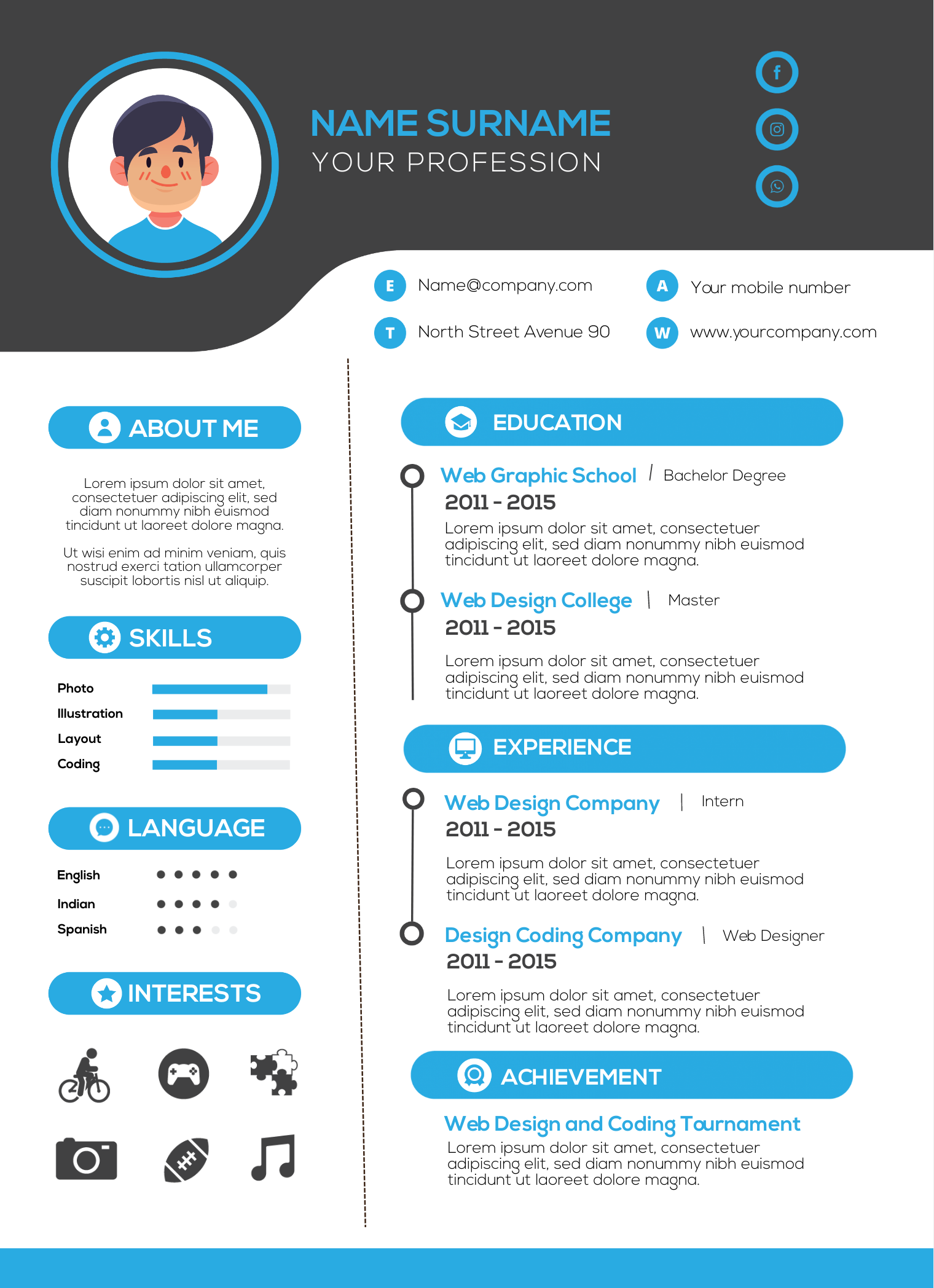
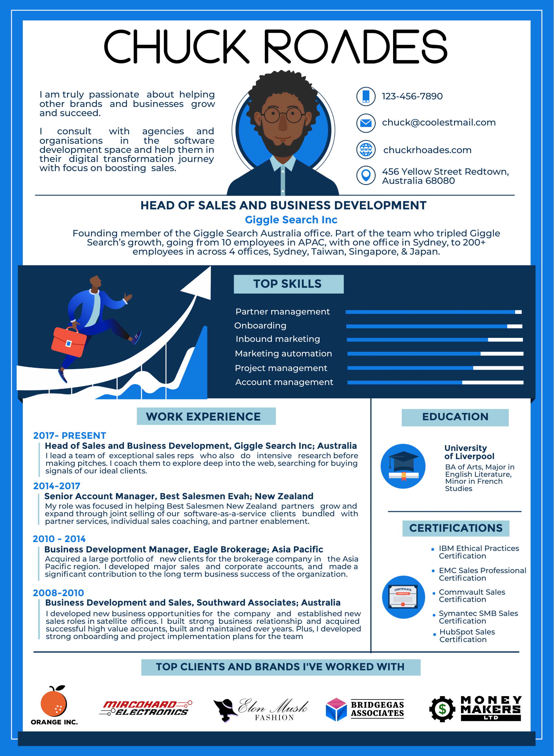
Infographic resumes
Make yourself hireable with infographic resumes.
An infographic resume transforms text-based CVs into a stunning visual story of your skill sets, educational background, and unique personality.
This infographic type is best used to help you stand out from the rest and get noticed during the recruitment process. This is particularly true in non-traditional industries or positions that are looking for creative and out of the box thinking!
Plus, using infographic resumes on your next job hunt will likely get more employers engaged and intrigued by the value that you have to offer.
Watch the short tutorial below for a quick lesson on making infographic resumes using Easelly.
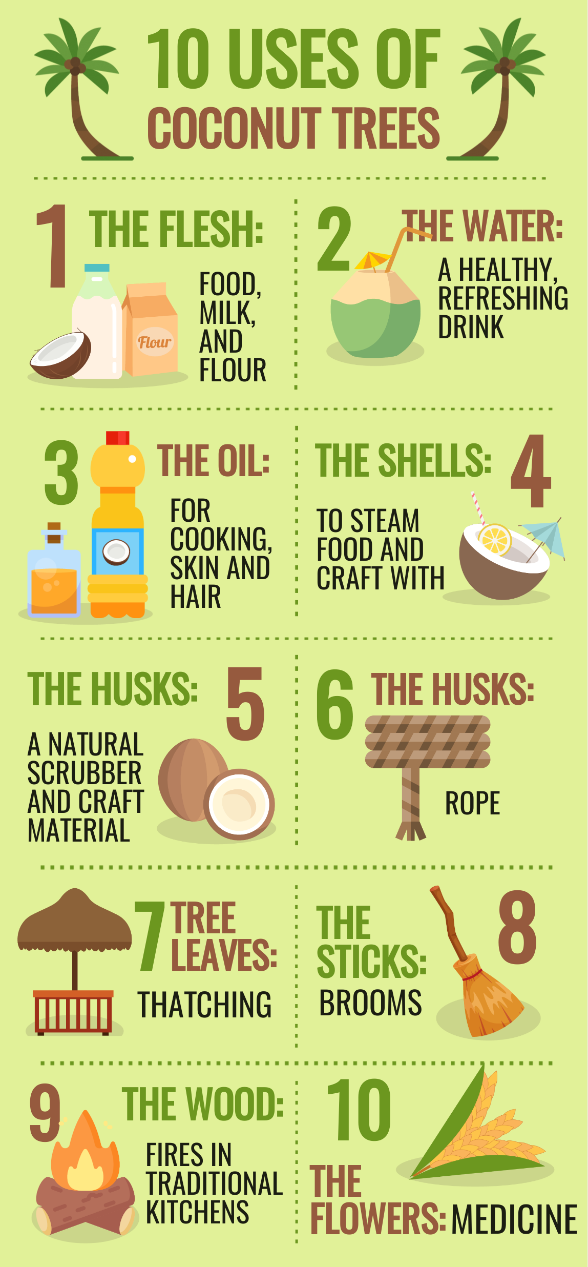
Process infographics
Would you like to share your super moist banana bread recipe with your coworkers? Or are you looking for visuals to help explain the science behind GMOs to your class?
A process infographic is the right infographic format you’re looking for. Use this infographic type to simplify a complex process by breaking down each step with stunning visuals.
Animated infographics
If you’re looking for something more engaging than a standard infographic, try animated infographics!
Animated infographics add motion to plain infographics so you can capture and hold your readers’ attention when you want it.
Motion and movement also make your infographic come to life. Another added benefit of animated infographics is they’re less expensive to produce than videos.
With Easelly, you can have one of our designers make your animated infographic, or you can add animated objects to your infographic using our Animations feature.
Now that you’re aware of the different infographic types, your next step is to understand the infographic creation process.
How to create an infographic for non-designers
Infographic creation can sometimes be a challenge, particularly if you don’t have a design background.
Fortunately, you’re about to learn how to get started with infographic creation even if you’re new to the craft.
In this section, you’ll learn about:
- The importance of an infographic brief and how to make one
- The basic infographic structure
- How to collect reliable information for your infographic
- How to pick the right color scheme for your infographics
- How to write compelling infographic content
- Why you need a call-to-action in your infographics
- White space in infographic design
- The standard infographic sizes for online and offline use
- What makes an effective infographic
- How to improve an infographic in 5 easy steps
How to write an infographic brief
An infographic brief sets the vision, clarifies objectives, and determines your infographic project’s direction. What if you don’t need an infographic after all?
Your infographic brief should include the following:
- Your objective
- Your target audience
- Your big idea
- Your infographic content
- Your visual specs
Whether you’re using infographics for lead generation or as visuals for your eLearning class, learn how to make an infographic design brief in the short video below. It’s easier than you think!
What does an infographic include
The best infographics have a structure — a catchy introduction, a meaty middle, and a satisfying end (just like a good story).
Download the infographic on the basic infographic structure below or print it out as a quick reminder before starting your infographic adventures.
How to nail your infographic research with trustworthy information
Informational honesty is a must to make relevant and useful infographics.
When presenting data, statistics, or information in your infographics, consider the following steps:
- Check for relevance
- Check the intent
- Check for opinion versus fact
- Check the source links
- Check for accuracy
- Go old school by visiting the the library to find vetted, reliable information
The infographic below explains each step in detail.
How to choose the right infographic colors
Your infographic color of choice captures your audience’s attention for the first few seconds. It can also impact your infographic’s readability.
Here are seven best practices when choosing the right color combination for your next infographic. The video below also discusses each tip in detail.
- Match the infographic’s color to the overall mood that you want to convey in the infographic.
- Get to know the basics of color theory and psychology.
- Draw inspiration from interior design’s 60-30-10 rule.
- Use your brand colors.
- Stick to 2-3 colors.
- Be mindful of color contrast.
- Take white space into account.
How to write compelling content for your infographics
Writing infographic content is like packing light.
You don’t have to take every favorite piece of clothing with you. You discover how to nail the right balance between function and aesthetics.
The same principle applies when making infographic content.
You can’t put a whole essay in your infographic, yet you have to make sure that you’re not missing essential information.
The 3-minute video below highlights how you can ensure that every word in your infographic is keeping your reader engaged rather than distracting them from your core message.
Why your infographic needs a call-to-action
When you’re done with your infographic content, your next step is to make your infographic work for you with the right call-to-action statements.
The video below summarizes the different ways to add a call-to-action in your infographics.
White space matters in infographics too
Apart from infographic colors, white space also matters in creating infographics.
White space, also known as negative space, is the space between texts, images, icons, illustrations, and other infographic elements.
Learn more about white space in the short video below.
Get your infographic size right
As you put the finishing touches of your infographic, don’t forget to get your infographic sizes correctly to ensure readability and improve reader engagement.
The standard infographic size varies depending on the platform you’re planning to use in promoting your infographic. Perhaps you’re planning to make an infographic poster and would like to print it out.
Bookmark or download the infographic below to help you pick the right infographic size.
What makes an effective infographic
Before you share and promote your infographics, ask yourself if the infographic brings value to your audience?
Nielsen Norman Group user experience specialist Lexie Kane wrote an insightful piece on designing effective infographics.
The video below summarizes her tips and suggested best practices to ensure effective data representations in your infographic.
How to improve your infographic in 5 easy steps
If you’re secretly hoping that your new infographic will bring tons of new visitors to your website or social media page, hoping isn’t enough!
You have to execute tactics and strategies to make your infographic stand out.
Watch the short video below for ways to improve your infographic quickly!
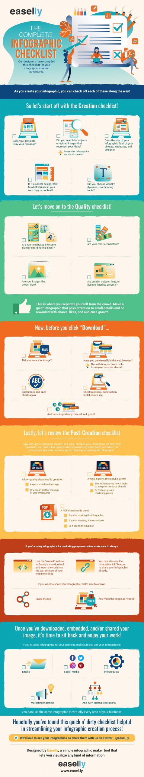
Make your infographic stand out with this complete infographic checklist
As you create your infographic, check off each of the following points along the way in the checklist below. You can also use this PDF version here.
You’re all set
Now that you know how to make infographics, you’re all set in making infographics for your classroom or business! If you’re part of a philantrophic organization, consider making one as successful nonprofits also use infographics!
At Easelly, there’s more than one way to skin a cat with infographics.
One option is to choose a template from our infographic template collection and edit it with your information. Or you can ask one of our infographic design pros to make one for you.
Are you looking for an in-depth guide with more video tutorials about infographic creation?
Head on over to our step-by-step guide in creating infographics from scratch or subscribe to our infographic design channel on YouTube.