As a business owner or entrepreneur, there’s nothing more perfect than starting your day with some quiet time and a fresh cup of coffee (milk or tea if you’re not a coffee person).
You get extra points if you can do things that you’ve been putting off for a while now: meditate, read a book, write, or hit the gym or engage in an activity resembling exercise.
So how does this perfect day ends?
If you’re running marketing campaigns in your business, it ends with a fresh batch of qualified leads in your list!
How to generate leads with infographics
At the risk of sounding cliche, the bad news is we don’t live in a perfect world where everything works in your favor, and you get the things you want every single day.
There are days when you’ll wake up late, you’ll run out of coffee, you don’t feel like running outside, and coming up with a long list of qualified prospects for your business is like finding a needle in a haystack.
In this article, we can’t help you craft your perfect day. However, we can promise to make your days a bit better by using infographics to increase your number of high-quality leads at the end of the day (or month!).
Quick note: If you don’t have the time to read the rest of the content, the video version below is only 3 minutes long!
What’s a good lead generation conversion rate?
Before we uncover stellar examples and ideas on how you can use infographics to boost your lead generation efforts, you might be wondering what’s a good lead generation conversion rate.
How would you know that your campaigns are nailing it or not?
After scouring the interwebs for reliable figures, we chanced upon Wordstream’s take on the question. Here’s what they have to say:
Across industries, the average landing page conversion rate was 2.35%, yet the top 25% are converting at 5.31% or higher. Ideally, you want to break into the top 10% — these are the landing pages with conversion rates of 11.45% or higher.
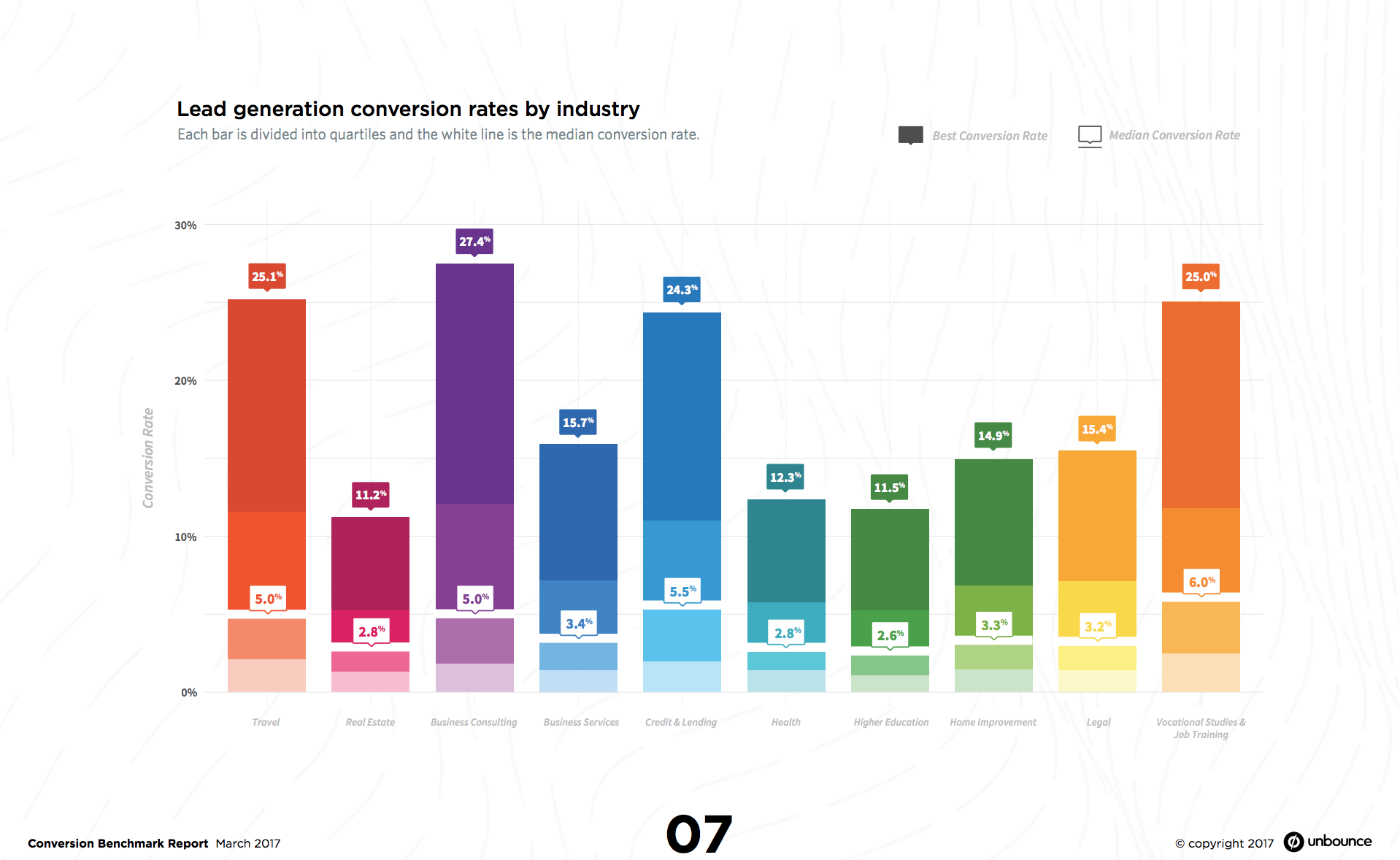
Meanwhile, Unbounce’s 2017 Conversion Benchmark Report revealed that conversion rates could vary across industries.
Based on the chart, it looks like Travel, Credit & Lending, Business Consulting, and Vocational Studies & Job Training are the top three industries that did well in lead generation. For these industries, you can realistically target landing page conversion rates over 12%. The very best pages convert over 25% of their visitors. On the other hand, industries like Real Estate, Higher Education, and Health can expect lower lead gen landing page conversion rates with 6% considered as excellent.
Overall, the median conversion rate as of 2017 across industries is between 3-5.5 percent.
4 infographic best practices to boost your lead generation efforts
So, what can you do to accomplish the same conversion rate or even go beyond the average in your industry?
1. Transform lengthy, boring reports and white papers into a visually appealing infographic.
Got a report or white paper with only a few downloads in your landing page?
Consider transforming these important reports into a visually appealing piece of information — an infographic.
When creating an infographic from scratch using one of your company’s reports, you don’t have to make room for every little detail in the report. Instead, highlight essential points and encourage the reader to learn more about the report by downloading it from your website or landing page.
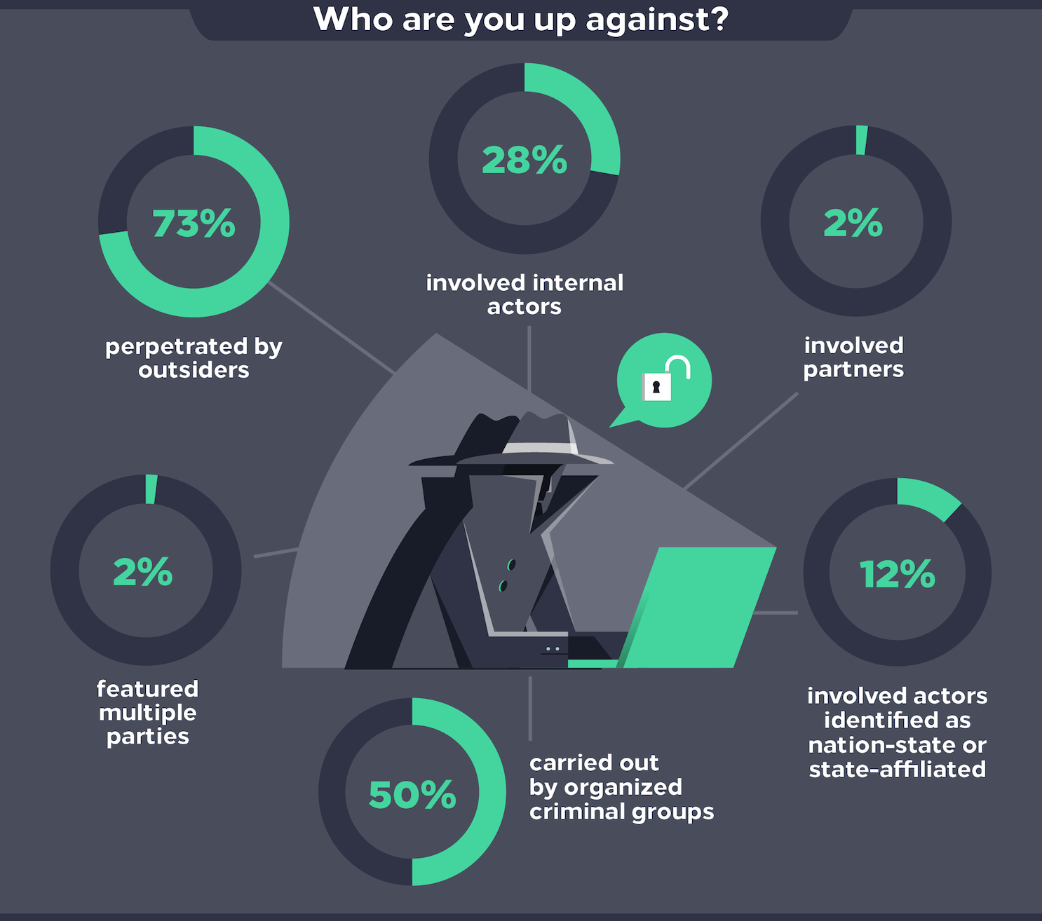
For example, the 2018 Data Breach Investigations Report by Verizon is more than 50 pages long, so we decided to highlight a few essential details in an infographic.
2. Put a little more thought into your infographic headline.
Writing generic headlines is one of the most common mistakes we’ve noticed whenever someone makes an infographic request to our design service team.
Put yourself in the shoes of your reader or target audience for a minute. What kind of headline do you think would encourage you to check out an infographic in its entirety?
In the Verizon infographic, it’s tempting to lazily write the original headline “Highlights of the DBIR Report 2018” as infographic headling.
Instead, we decided to change the original headline to “Is Your Company At Risk for Data Breach?”
Great infographic headlines pull readers into your infographic. It should make them more curious. An infographic with a poorly written headline is like a box of delicious donuts put inside a grey, lonely-looking box. No one would take notice.
3. Repurpose sections of your infographic.
An infographic is a versatile piece of content. You can share it on various platforms, and you can repurpose sections as social media ads or in slideshow presentations.
Here’s a section from the original Verizon infographic.

4. End your infographic with a clear, strong call to action. Always.
Do you ever wonder why no one visits your website even though one of your infographics got 500+ upvotes when it was posted on Reddit?
A poorly-written (or the absence) a call-to-action might be the culprit.
According to HubSpot, a call-to-action (usually abbreviated as CTA) is an image or line of text that prompts your visitors, leads, and customers to take action. It is, quite literally, a “call” to take an “action.”
In infographics, a call-to-action is typically written at the bottom. When writing your CTA, conversion rate optimization expert Peep Laja recommends adding benefits or value to your statement.
It also helps if you’re specific about the action you’re asking readers to do. “Check out my website” is less likely to encourage people to hop on to your site than “Read the full report at this website”.
In the Verizon infographic, what’s in it for readers if they read the full data breach report?
At its core, a well-written CTA in your infographic conveys value to your readers. As a result, they’re more likely to check out your website or product offerings and eventually turn into qualified leads.
Your next step: Getting started with your infographic for lead generation
Getting quality leads doesn’t have to break the bank. A well-thought-out infographic is an excellent way to push the envelope in your lead generation efforts.
Think of infographic creation as a marketing investment.
It takes time to ideate, plan, and design an infographic. However, the number of ways that you can repurpose an infographic makes it a worthy investment in the end.
Getting started with infographics for your business?
You’re losing valuable time if you’re doing it yourself.
One of our designers can create a custom infographic for you. Alternatively, try our simple infographic maker tool that your marketing team can use!


