
There’s no doubt that your content, main idea, or story is the cornerstone of your infographic. Yet your choice of infographic colors is equally important.
Unfortunately, it’s not uncommon for anyone new to infographic creation to use too many colors at once. We’ve all been guilty at some point!
How to choose the right infographic colors
Colors can bring your content to life and set the mood for any infographic you create. Your choice of hues also captures your audience’s attention for the first few seconds.
Next, the colors you use in your infographic allows you to highlight different data sets and their relationship with each other. Finally, your color combination of choice can have an impact on your infographic’s readability and overall reader experience.
Get your colors right, and your infographic will be able to build an emotional connection with your audience. Once you’ve forged this connection, brand awareness and meaningful engagement will almost always follow.
Get it wrong and no one will pay attention to your infographic — no matter the amount of time and effort you’ve put in to make sure that it’s chock full of value.
This guide will walk you through 7 quick tips when choosing the right color combination for your next infographic.
1. Match your infographic’s color to the overall mood that you want to convey in your infographic.
Think of your infographic colors as emotional cues — they help you set the tone of the look and feel of your infographic.
For example, if you’re planning to create an infographic about love and relationships, the color red and its various shades such as pastel red and crimson are great choices to evoke feelings of love and passion.
2. Understand the basics of color theory and psychology.
You don’t have to be knee-deep in research to learn how colors impact how we perceive the world and ultimately, our behavior.
Familiarize yourself with the basic concepts of color theory and read up on studies on color psychology. Color psychology is an area of psychology that examines how color influences our perception, behavior, and decision-making.
A good example is a 2014 study on the effects of color at a students’ union complex on the moods of the students.
The researchers found out that using shades of red on the front view of the complex stirred up feelings of excitement while students approach the compound. Meanwhile, shades of green made the college students feel “psychologically warm and invited.”

3. Draw inspiration from the 60-30-10 color rule of interior designers.
The 60-30-10 method is a tried-and-true rule used by interior designers when decorating. Apply this quick trick when deciding on your infographic colors.
Here’s how it works:
60% of your infographic is the primary color
30% of your infographic is the secondary color
10% is your accent color
The infographic below is a good example of a color scheme using the 60-30-10 rule. You have dark grey as the primary color, closely followed by blue as the secondary color and orange as the accent color.

4. Use your brand colors.
When deciding on the right color combination for your infographic, using your brand colors is also a great idea. Play with your existing primary and secondary colors and find unique combinations by using the color wheel.
Learn more in How to Choose Infographic Colors with Color Theory
5. Stick to 2-3 colors.
A study from the University of Toronto on color preferences revealed that most people preferred combinations of 2-3 colors.
A good rule of thumb is not to use more than four colors. When you’re tempted to use more colors, opt for shades, tones, and tints instead.
- Add white to create a tint resulting in a more subtle color. This also helps create vivid color combinations.
- Add black to create a shade resulting in a deeper, richer, and intense color.
- Add grey (or black and white) to create a tone resulting in a less intense version of the original color.
Tool tip: Use Color Hunt, a free and open platform for color inspiration.
6. Be mindful when using color contrast.
There’s more to creating contrast than using two different colors. For a start, you can contrast with hue and color temperature.
Contrast of hue – Use undiluted colors in their most intense luminosity.
Great examples of contrasting with hues:
- yellow/red/blue
- red/blue/green
- blue/yellow/violet
- yellow/green/violet/red
- violet/green/blue/orange/black
Contrast of color temperature – For a more dramatic contrast, you can contrast colors based on their temperature: cool, warm, or neutral.
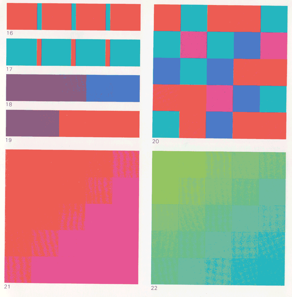
16 – The strongest cold-warm contrast: red-orange / blue-green
17 – Inversion of proportions of Fig. 16
18 – Red-violet seems warm relative to blue
19 -Red-violet seems cold relative to orange
20 – Checkered composition contrasting cold and warm colors
21 – Cold-warm modulation in red
22 – Cold-warm modulation in green
Keep in mind that using contrast can make or break your design. Too much contrast can lead to poor readability.
For this reason, it pays to follow the guidelines on creating contrast in the Web Content Accessibility Guide. Here’s a set of recent accessibility guidelines on using color contrast for the web:
- Make sure the contrast between the text and background is greater than or equal to 4.5:1 for small text and 3:1 for large text.
- Slightly temper the contrast between your text and background color. For example: don’t use pure black text on a pure white background. Stark contrast can result in blurred or moving text for people with Irlen syndrome.
- To use text over images, add a solid background behind the text or a dark overlay to the image.
7. Take white space into account in your infographic.
Besides thinking about the right colors to choose in your infographic, take the lack of color (or white space) into account.
White space, also known as negative space, is the space between the lines of texts, images, icons, illustrations, and other elements in your infographic.
Your white space doesn’t have to be white as it can also take the color of your infographic’s background. Think of white space as “empty space”.
While your colors help convey the story in your infographic, white space can also be used to highlight or clarify your message. Watch the short video below to learn how to use white space correctly in your infographics.
Ready to play around with colors and get crafty with your infographic?
You don’t have to be a professional designer to understand and implement the correct way to do color schemes in your infographic.
The most important thing to keep in mind is to seek balance between aesthetics and accessibility. The better your reader experience, the more likely they’ll understand your infographic’s message.
Need help creating your first infographic? Get started with our free infographic maker tool!