
When it comes to creating an infographic, the first thing you need is an idea. Once you’ve developed your idea more, you should then focus on how you’re going to share your idea visually.
One of the most important aspects of telling a visual story is knowing which infographic colors to choose. In this blog post, you’ll learn how to use the Color Theory when designing infographics.
Choosing infographic colors
Color theory 101
With the right colors, you can help attract people to your infographic. You can also set the stage for how people will absorb your information. Color can be your most powerful design tool in this age of “Information Overload” because it simply helps you stand out.
Colors affect us in numerous ways, both mentally and physically. For example, the color blue has been proven to have a calming effect on people, while green is associated with nature and “eco-friendly” messages. Harnessing the power of color – and what people associate with color – is a great way to make progress with your infographic.
There are three basic components of color theory that are useful when planning out your infographic:
- The color wheel
- Color harmony
- Complementary and triad colors
The color wheel
You probably remember the basic color wheel from your days in elementary or primary school… but did you know that there are categories of colors? Most professional graphic designers use a three-part color wheel:
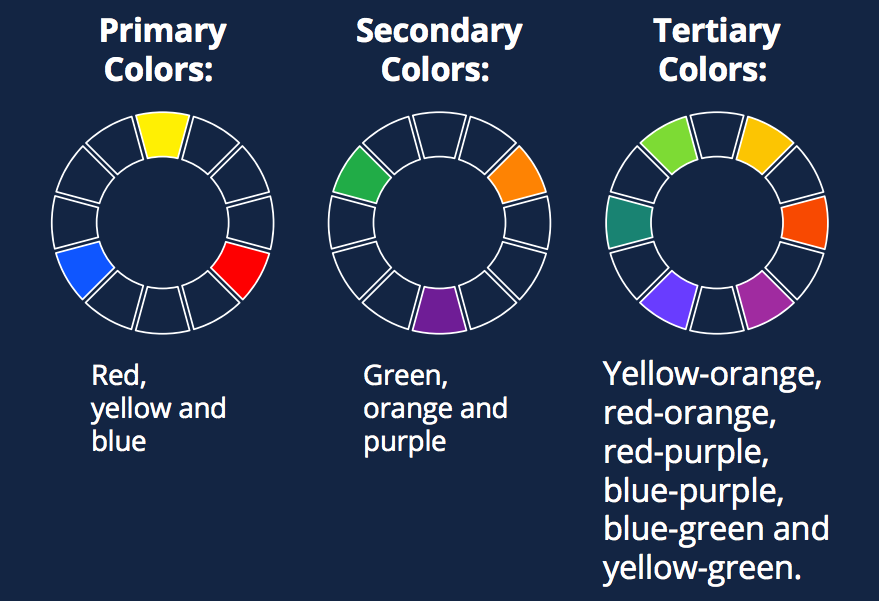
In traditional color theory, primary colors are the only three colors that cannot be made with other colors – they are sort of like the “parent colors” all other colors are made from.
Secondary colors: Green, orange and purple
These are formed by mixing primary colors (and they make up the colors of the rainbow!).
Tertiary Colors: Yellow-orange, red-orange, red-purple, blue-purple, blue-green & yellow-green.
These are the colors formed by mixing a primary and a secondary color. That’s why the hue is a two-word name, such as blue-green, red-violet, and yellow-orange.
The key to using the color wheel is to understand how each color is related to the next – and to make sure that they are actually going to look good together! That’s where color harmony comes into play.
Color harmony
Color harmony essentially means a pairing of color that is pleasing to the eye. It’s not an exact science, but science has proven that our brains react positively to a harmonious color combination. Using a color combination on your infographic that is pleasing to the eye will engage your audience – and it might help them absorb the content better!
The human brain rejects what it cannot organize, which is why you have to use color to complete your infographic message. In essence, color can give your infographic a logical structure. Color harmony also keeps people interested, which is a great way to get your infographic to “go viral.”
To ensure that your infographic colors are harmonious, we recommend sticking to two to three colors that you can use consistently. If you own a business, these colors should match your branding and logo!
If you don’t have any colors picked out already, try using complementary colors or triad colors!
Complementary colors and triad colors
Complementary colors are the ones located directly across the color wheel from one another.
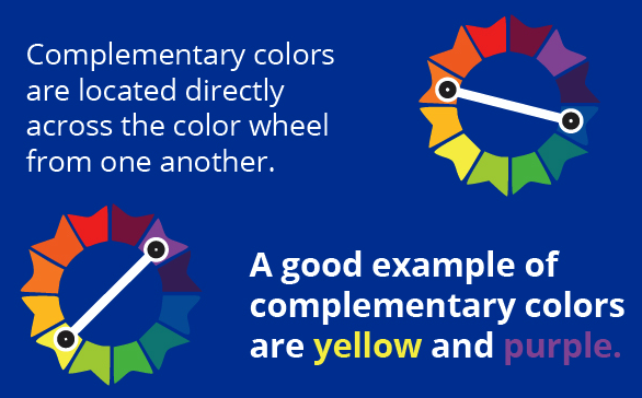
A good example of complementary colors are yellow and purple. One is light, one is darker, and they are far enough apart on the color wheel to not wash each other out. The most “traditional” example of complementary colors is red and green, which many people associate with Christmas (and that’s why we generally recommend staying away from it in your images!).
You can also use the secondary and tertiary colors wheels to find more complementary colors. This is a great way to develop a series 3 colors, called triad colors, that you can use as “branding” for your future infographics.
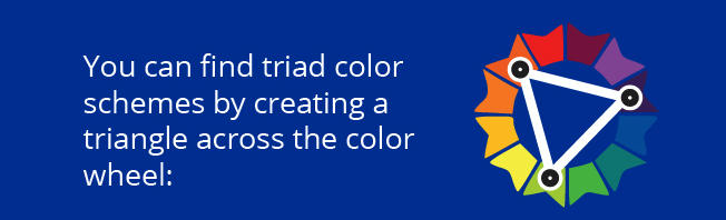
The colors you can locate with the triad scheme are complementary but not too close together, which makes for a very harmonious look!
Putting it all together
Understanding the basics of color theory when starting your infographic design process is a great way to refine your work. This way, you won’t be playing with the color palette for hours and you’ll be able to create better structure to the templates you create from scratch.
The great thing about infographic colors is that, unless you struggle to see color, your eyes and brain will let you know if you’ve got it right! The cones and rods in our eyes are naturally inclined to pleasing colors that match well, which means our brain reacts positively to them.
So if you find a color combination that you just love, we recommend sticking to it – Odds are other people will love it, too!

For more tips in choosing the right color scheme for your infographics – 7 Quick Tips in Picking the Perfect Color Combination for Your Infographics