What’s the ONE thing you need to make your audience, students, or clients love the infographics you create? It’s our best-kept secret… are you ready?
A story.
No, it’s not amazing design, it’s not perfect icons, it’s not the alt tags or image SEO. It’s the story you tell with your infographic. Bet you didn’t expect that, huh?
Why stories matter in your infographics
Infographics, which are simply images made from information, need just that – information. But can you just collect information, throw it into an image, and call it good? No! Nobody wants to read a collection of data; they want that data to be put into context!
This is where many infographic creators, especially marketers, get distracted. So often, we try to gather the information and share it without telling our audience why they should care. Instead of finding more content to create, why not start with a story you want to tell?
Start with a story
People, especially your audience, love stories because they demonstrate the value of the information – the moral to the story, if you will. When you’re creating an infographic, don’t get caught up in the size of your icons or the color template just yet. Instead, ask yourself:

From there, you can design your infographic in line with the “plot” of your story. We recommend always doodling or mapping a “rough draft” of your story before you visualize it!
The visual aspect of the infographic is designed to drive home the story of your information. You can choose a timeline template if you’re telling a story about information that changes over time, or use a comparison template if you want to show differences in information. The options are limitless with Easelly templates, but you have to know which one will cater to your story – NOT the other way around.
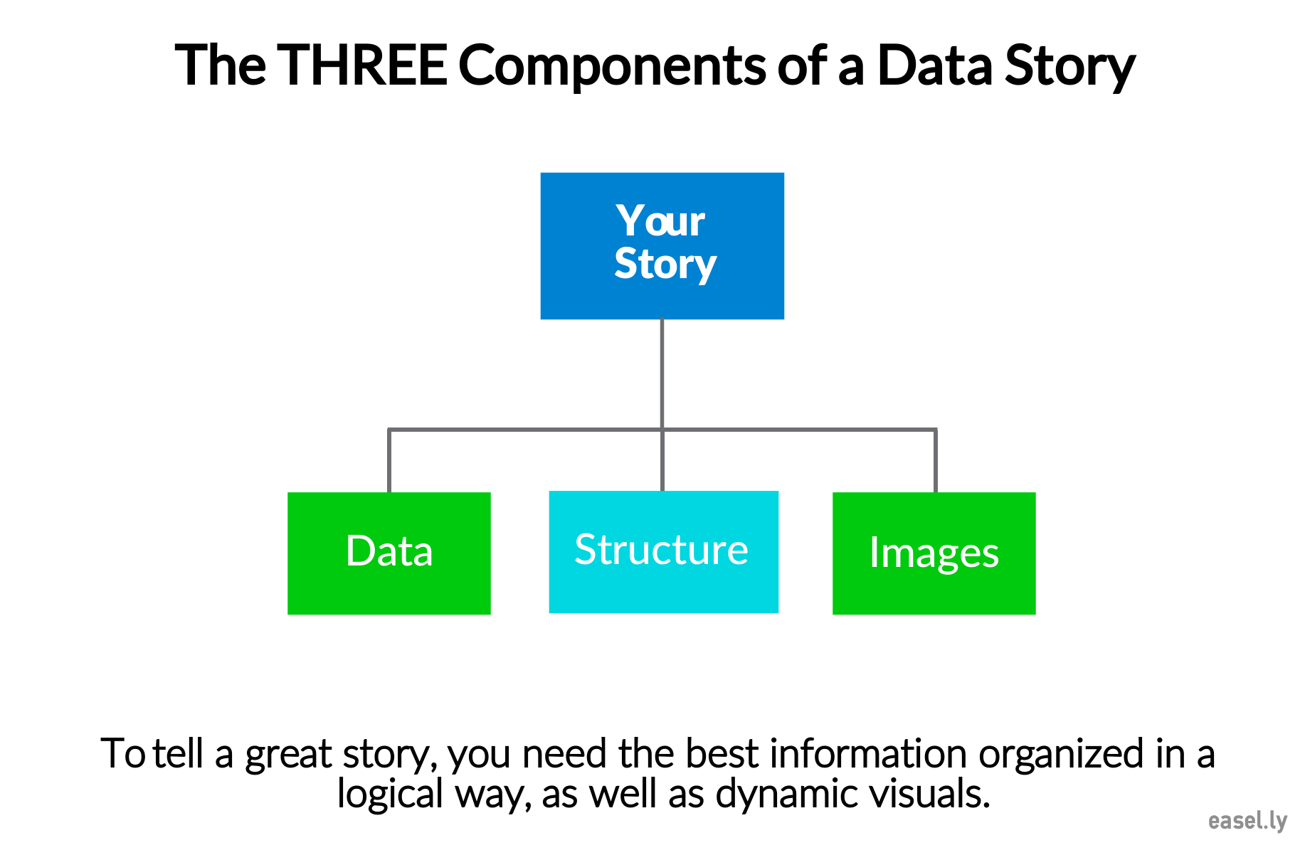
What else does your story need?
Now that you’ve started with a story, it’s time actually tell it. In order to tell your data’s story, you need three things:
- The actual data
- Clear organization
- The proper use of visual elements (images, fonts, etc.)
We don’t want to get into the nitty-gritty of data collection, but if you want some great insights, check out what Max Galka had to say about it. The idea, though, is that you collect your data and then let that data tell the story – don’t force your data to fit your story.
Clear organization comes with choosing the right template and flow. This means a timeline, comparison, chart or graph, or a divided layout that makes the structure of your information clear.
PRO TIP: You can make an infographic from scratch with Easelly and create your own layout, one that makes the most sense for your story. Watch the short tutorial below for Easelly shortcuts to help you design infographics quickly (and easily!).
Finally, there are a few cardinal design rules for creating an infographic that tells your story clearly:
- Be picky with your infographic colors.
- Don’t use too many fonts.
- Keep images and icons to a minimum. Don’t be afraid of white space in your infographics.
- Do NOT use tons of text. Be mindful of your infographic copy.
It would be just awful if the design of your infographic stole the show, wouldn’t it? Don’t distract from the story with your visuals. TELL your story with visuals.
Get ready to fall in love
The funny thing about creating content from a place of storytelling means that you’re already going to love the content you’re creating. What better way to build an audience, engage your students, or even connect with new people than by sharing a story you love to tell? The odds of them loving what you create are higher, too!
START with a story and END with design. It’s really that simple!
Happy creating!
PS: If you’ve created an infographic and you’re not sure if it’s ready to publish, check out our 3-Step Checklist to Effective Infographic Design with Examples
Editor’s Note: This post was originally published on February 14, 2017 and updated on December 19, 2019 for accuracy and comprehensiveness.