Have you ever been on a long trip only to realize that you’ve overpacked?
Ask a seasoned traveler, and you’ll get tips and helpful advice on packing light to enjoy your trip. The last thing that you’ll want to do while you’re hopping from one flight to another is lug around unnecessary luggage with you.
Writing infographic content is like packing light
When you’re packing light for a week-long trip, you learn not to take every favorite piece of clothing with you. You discover how to nail a good balance between function and aesthetics.
The same principle applies when writing infographic copy.
You have to edit ruthlessly and not copy-paste an entire 1000-word blog post to an infographic. On the other hand, you have to make sure that you’re not missing essential information.
Read on below for tips ensure that every word in your infographic copy is keeping your reader engaged, and not distracting them from your core message.
1. Decide on the type of infographic that you would like to create.
The first step to writing clear, effective infographic content is to figure out the type of infographic that you want to use for your particular goal.
You don’t want to write infographic copy when you’re still unsure how your infographic would look like. It’s like packing for your two-week trip but not knowing your destination’s weather for the next two weeks.
Planning for a specific type of infographic also helps you outline your infographic content quickly.
Would you like to use a timeline infographic? Perhaps a comparison infographic would make your content more memorable and engaging.
Watch the video below to help you decide on the right infographic format the next time you’re starting an infographic project.
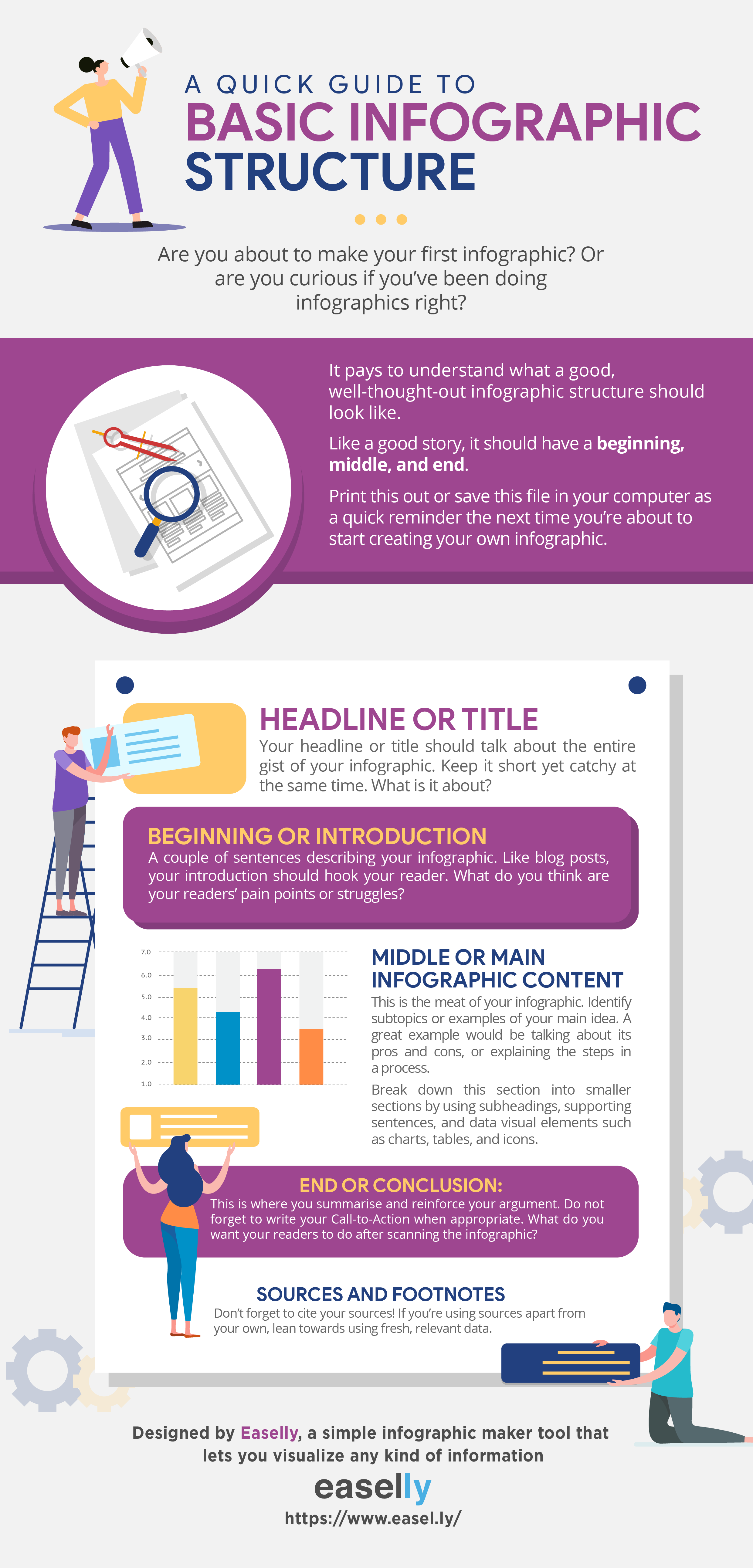
2. Understand the basic infographic structure.
Like a good story, your infographic should have a beginning (an introduction), middle (your main content), and end (a conclusion).
When you’re already aware of your infographic structure, it’s way easier to plan for your infographic content — what to write and how to say it.
3. Write your infographic headline with intention.
According to Copyblogger, 8 out of 10 readers will read your headline, but only 2 out of 10 will likely read the rest of your content.
For this reason, you need to make sure that your infographic headline will encourage your audience to read the rest of your infographic content.
How?
We turn to Enchanting Marketing’s three essential tips to crafting effective headlines (we’re modifying it a bit since our focus is on infographic content):
a. State what your infographic content has to offer
b. Mention the key benefit of your infographic content
c. Tell which problem or hassle your infographic content helps avoid
Another excellent formula to writing headlines is Copyblogger’s 4 U’s: useful, urgent, unique, and ultra-specific.
In a nutshell, your infographic headline should answer the question: “What’s in it for my target audience?”
Consider the following infographic as an example:

The infographic’s headline is perfect because it answers the question: What’s in it for your audience?
First off, it’s useful because it helps them make a smart decision when buying diamond engagement rings. Next, the infographic is ultra-specific. It provides “12 tips” and it helps the reader buy diamond engagement rings (not just a random engagement ring).
4. Craft an introduction that supports your infographic headline.
When writing an introduction for your infographic, imagine your reader asking “Why should I care?” when they’ll read your headline.
For example, let’s take a closer look at the infographic below.
“What Makes Baby Boomer Women Buy?” is the infographic headline. As a marketer (one of the infographic’s target audience), I’d ask myself, “why would I care about this topic?”
The infographic’s introduction text answers my question:
“Current trends reveal rapid growth of the Baby Boomer population as consumers due to a rise in life expectancy rates, financial independence, and digital literacy.
By and large, this generation is redefining senior life. For marketers and advertisers, this means devoting more time and attention in understanding what makes this post-war generation buy (and what doesn’t).”
After reading the intriguing introduction, I will likely read and go over the rest of the infographic.
A good rule of thumb is to keep your introduction less than 100 words or 3-4 sentences. The fewer, the better!
5. Write subheadings that provide additional value to your readers.
Think of your subheads as guideposts that will further prompt your audience to read the rest of your infographic.
Infographic subheads should be able to accomplish the following:
1. Answer a question that comes to your reader’s mind when they read your headline.
2. Arouse your readers’ curiosity.
3. Highlight what a section in your infographic is about in a short and snappy way.
The infographic about design sprints below is a stellar example. The subheadings further prompt the reader to learn more about design sprints by answering related questions to the subject.
6. Use copy or text to support your visuals (not the other way around).
When writing a blog post or an article, it’s common practice to find visuals that will complement your text.
Do the opposite when creating infographics. Your text or content should add more value or support your visuals.
The infographic on household water conservation below is a good example.

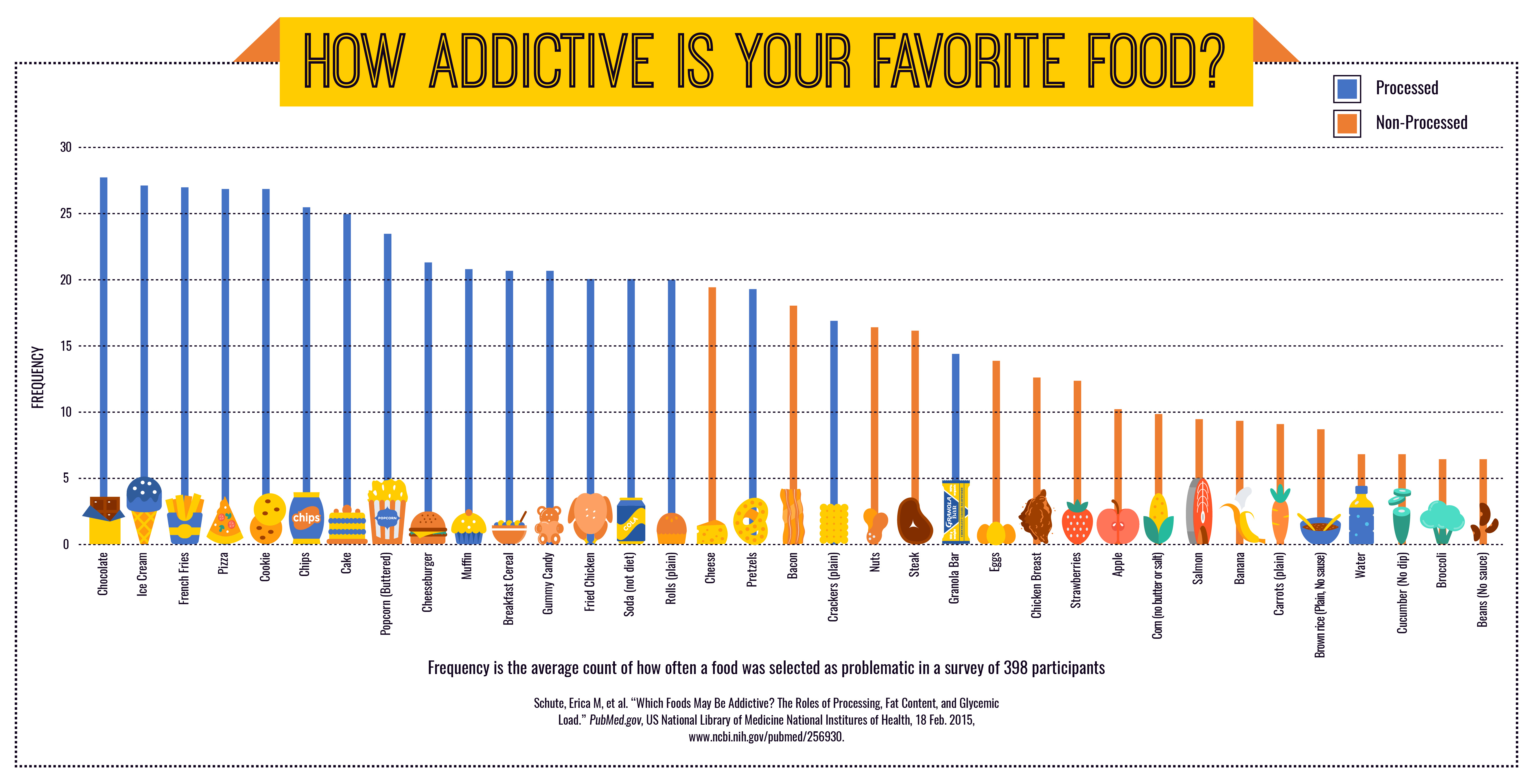
7. Label your charts, graphs, and data visualization correctly.
It’s not uncommon for an infographic to have icons, charts, graphs, and other forms of data visualization.
When using these data visualization formats in your infographic, keep your labels simple and straightforward. In some cases, you don’t need to follow grammar rules like adding a punctuation at the end when adding labels.
Use the following rules by data visualization expert Nathan Yau when adding labels to charts and graphs in your infographic:
- Check the data
- Explain encodings
- Label axes
- Include units
- Keep your geometry in check
- Include your sources
- Consider your audience
More noteworthy tips and hacks for effective infographic content:
- Double-check if you have a CTA or call-to-action statement in your infographic.
- Check for typos, spelling errors, and grammar mishaps.
- Attribute correctly. Add footnotes and sources.
- Stay on brand. Use your brand colors and don’t forget to add your logo at the end.
- Embrace white space in your infographics. It doesn’t only make your infographic look clean, but it also helps ensure that your copy is readable.
- Replace BIG, complex words with simple writing – clear, concise, and relevant.
- Finally, consider removing superfluous content. Don’t be afraid to edit, rewrite, or rephrase your infographic copy. If possible, ask a colleague or professional editor to go over your content.
Your turn to write sharp, effective infographic content
When crafting infographic copy, ask yourself – does the audience need to know this? If the answer is no, kill your darlings.
Ultimately, you don’t want your audience to say “woah, this is information overload!” when looking at your your infographic for the first time
Want to dip your toes into infographic design as a non-designer?
Try our free infographic maker tool! If you’re pressed for time, hire our team of professional infographic designers.


