
Are you about to make a pie chart but you’re unsure if it’s the right chart to effectively convey your message?
Quick fact: most of the time, a pie chart isn’t the best format!
What if there’s a better way to communicate your information and share your story?
You may not be aware of it but you’re wasting time and effort if you’re using the wrong chart or graph. Moreover, your readers may be having a hard time trying to understand what you’re trying to convey.
The art of data visualization goes beyond converting data into graphs and charts. It’s also about knowing how to present your data and information the right way.
Getting started with data visualization
Here at Easelly, we’d like to think of ourselves as data visualization nerds and superheroes!
Besides helping our users share their insights and ideas through infographics, we’re also on a mission to rid the world of data visualization gone wrong — from too many segments in pie charts to uneven bar chart sizes.

Not all data visualization superheroes wear capes through. Sometimes, they also write guides (just chilling in a corner) on how to pick the right graph or chart for your data visualization needs.
Buckle up as we walk you through the common types of charts and graphs, when to use a specific format, and design best practices to help your reader easily grasp and understand your information.
You’ll also learn how to avoid newbie mistakes and instantly improve your data visualization chops!
Why choosing the right data visualisation format is essential
When you’re presented with visual information and text-based content, your brain is more likely to synthesise and retain the former more effectively. After all, visual content is the way to your audience’s hearts.
It explains why charts, graphs, lines, icons, and pictographs are prevalent in explaining trends, summarising stats, and telling stories.
But if your information isn’t correctly visualised or designed, there’s a good chance that it can do more damage than good. The wrong data visualization format can either misrepresent your information entirely or diminish the impact of your message.
In a nutshell, good data visualization is not about throwing in charts or graphs and making them look pretty.
You know it’s good data visualization when the information you present is easy to understand and your readers are not raising their brows in confusion. In short, you’re not overwhelming your reader with too much cognitive load.
What to consider when picking the best graph or chart to tell better stories
If you’re unsure about the best type of visual that will not overwhelm your readers and convey your message effectively at the same time, your first step is to think big picture. See the forest for the trees.
Before you decide to use a bar graph instead of tables, ask yourself the following:
1. Who do you want to share it to?
Knowing your audience will help you to determine which specific data set from your huge chunk of information is the best part to visualize.
What is their level of understanding or knowledge? Which data visualization formats are they familiar with?
For example, if a majority of your readers are children, it doesn’t make sense to create complex graphs or charts. Instead, you might want to consider pictographs or simple number charts.
2. What are you trying to accomplish?
Before you work with your data, figure out your goal.
Why are you doing this? Do you want to inform your readers? Or do you want to convince them with your data?
3. What story in your data do you want to share?
What’s the main idea? What relationship between your data points are you looking to show?
This is the part where you search for important insights or interesting patterns in your data points. Do you want to illustrate a comparison? Or highlight a trend, change over time, correlation, or an outlier?
When you already know your main idea, it’ll be easier for you to choose the proper visualization format that will effectively deliver your message.
4. Where will you publish your data visualization piece?
Think about your preferred platform. If you’re an online marketer, how will you drive traffic to it?
Whether you’re considering publishing your graph in an email newsletter or uploading it on your blog, knowing your platform beforehand will help you decide which presentation formation is the most ideal.
You don’t want to go through some last-minute panic after you discover that your platform of choice doesn’t support your data visualization format.
5. Are you using too much data?
There’s no doubt that we’re in the age of Big Data. But this doesn’t give us the permission to douse ourselves with data and use them in every way possible when visualizing information.
You have to develop an eye for clarity by knowing which data point is essential (and which ones to get rid of) for a riveting, engaging data visualization piece.
6. What type of data do you want to present?
Data comes in various types. In data visualization, you’re most likely to encounter the following types: Quantitative and Qualitative data
Quantitative
These are numerical values or data that can be measured or counted. Quantitative data can be broken down to the following:
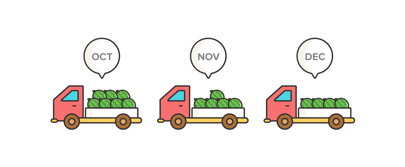
Discrete – quantitative data with finite possible values, obtained by counting.
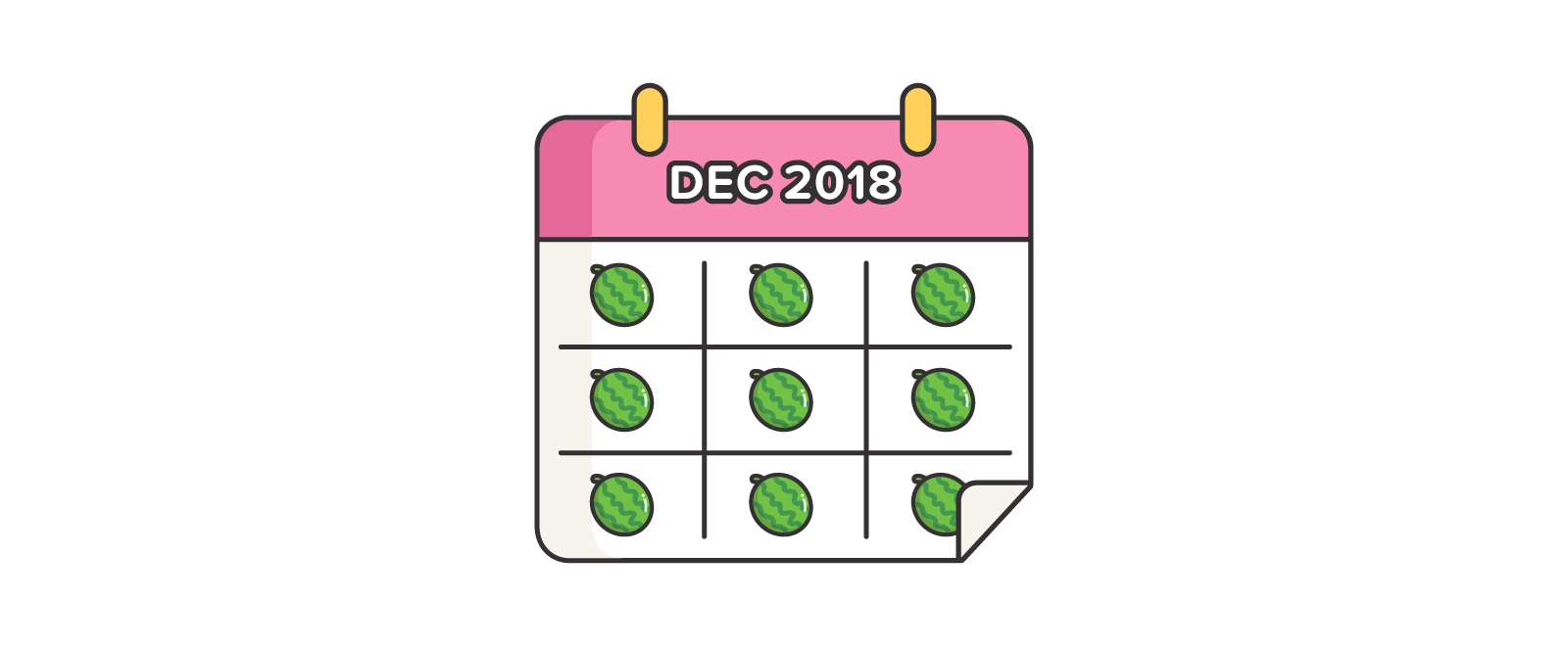 Example: watermelon harvest in December 2018 at farm A
Continuous – quantitative data which cannot be counted, and obtained by measuring.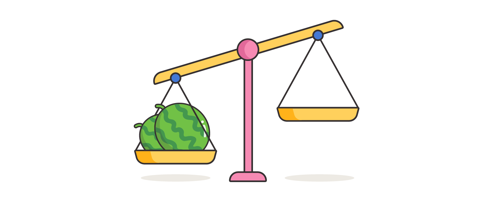
Example: total weight of the watermelons harvested on December 2018 at farm A
Qualitative or Categorical
Data that can be categorized by group or category.

Example: varieties of watermelon harvested at farm A
7. How does your data or information relate to each other?
Before you visualize your data, you have to find out certain patterns or relationships between them. The most common data relationships include the following:
Nominal – a grouping of data that has no order.

Example: Watermelon colors – yellow watermelons, white watermelons, red watermelons, purple watermelons
Ranking – an ordering of two or more subsets in relative magnitude.
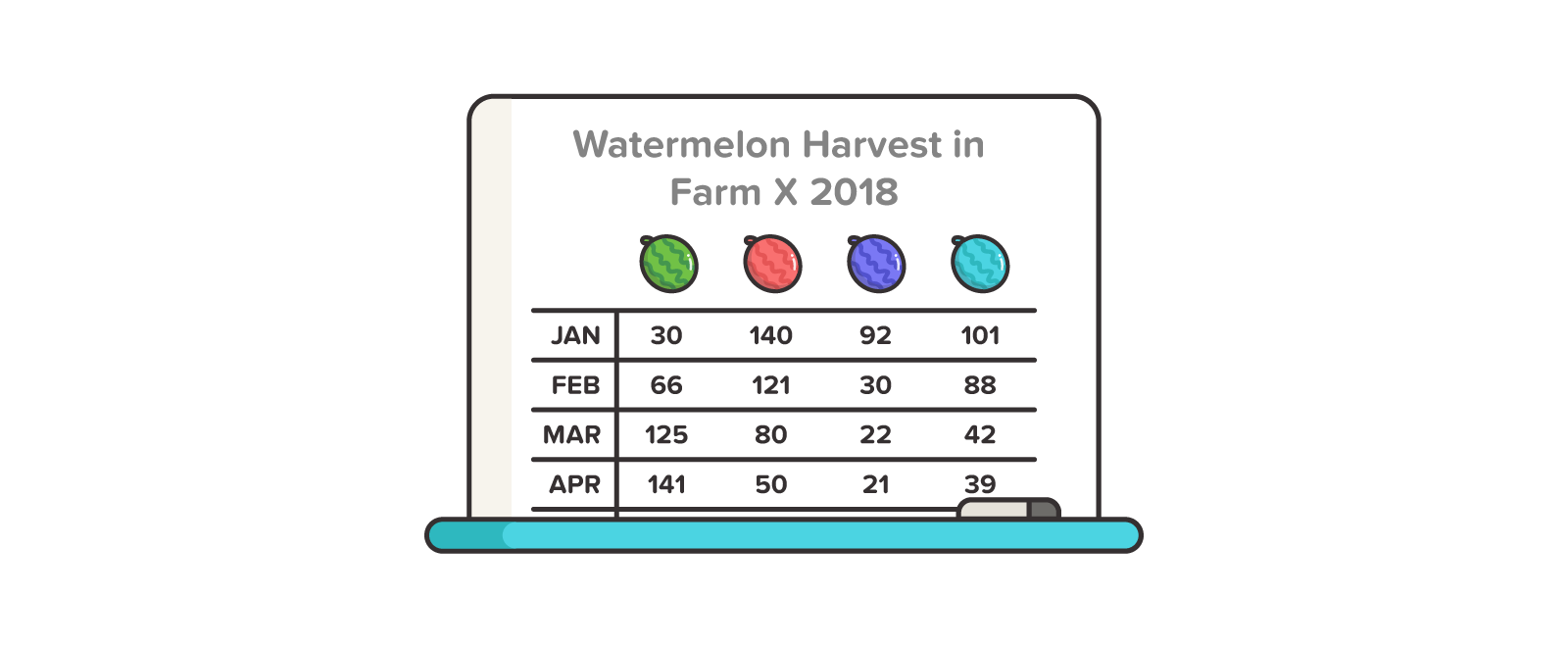 Example: A ranking of months (January to December) based on the number of watermelons harvested in Farm X.
Correlation – an indication of how two or more variables may have a positive or negative relationship or no relation at all.
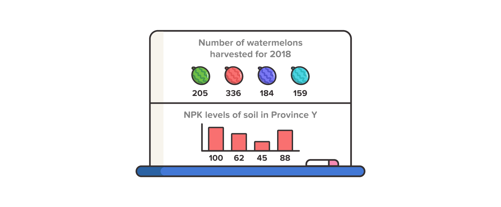
Example: The relationship between the number of watermelons harvested and NPK levels of soil in province Y.
Deviation – An illustration of how data points relate to each other, with an emphasis on how far the data points differ from the mean.
 Example: There is a relatively higher deviation in the weight of watermelons not harvested at the same age, compared to watermelons harvested at exactly 80 days after sowing.
Distribution – An illustration of how the data are spread, along with where they tend to center.
Example: The number of watermelons harvested each month in the year 2018 is within the range X values and Y values, with an average of Z monthly harvest.
Time-series – A series of data that is indexed in time, usually for forecasting data.
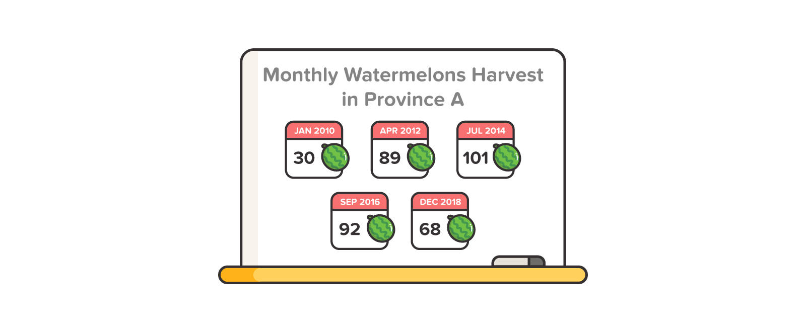
Example: Monthly watermelon harvest in province A from January 2010 to December 2018
Choosing the right chart or graph
Now that you’re aware of the different elements that can influence how to visualize your information, your next step is to find the right chart or graph to tell a better story.

In a nutshell, your data visualization goals can be narrowed down to the following:
1. Inform your audience of a specific data point or numerical value.
2. Highlight a comparison or show a composition.
3. Demonstrate change over time or location.
4. Compare different categories or highlight rankings.
5. Highlight relationships like distribution, correlation, deviation, and distribution.
In data visualization for beginners (that means we’re not planning to be statisticians!), we’re likely to go for the first four goals when making charts and graphs.
1. Simple text or numbers
Best for: Informing your audience of a specific data point or numerical value. It’s worth noting that a set of numerical data doesn’t automatically translate to creating a graph or chart.
What to avoid:
- Avoid information overload. If you plan to use multiple data points, choose other data visualization formats.
- You can highlight a specific figure total such as sales or number of website visitors. As an overview of one particular data point, it is the easiest tool to make and quickest to understand.
Best practice:
- Compare numerical value from the same period if you’re adding a trend indicator. Trend indicators should also be labeled clearly.
- For labels, a sentence or two would suffice.
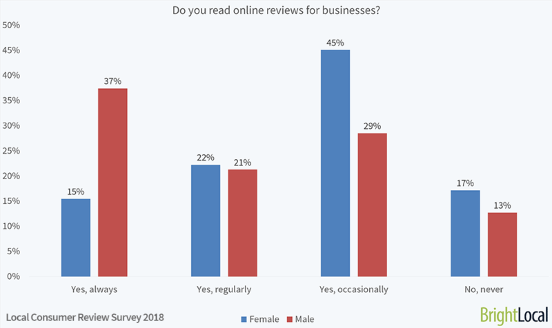
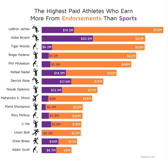
2. Bar chart

Best for: Comparing parts of a whole, highlighting different categories, or showing change over time. Common variations of the bar chart include the following:
- Vertical or column bar charts – They are best used to illustrate negative values below the x-axis, visualize chronological or time-series data, and compare sets of data of the same item (just like in the example below).
- Horizontal bar charts – They are best used to present data with labels that would be difficult to display below a vertical bar or when you want to visualize nominal variables or variables with no order.
- Stacked charts – They are best used to compare multiple part-to-whole relationships or when you want to highlight the parts of multiple totals.
What to avoid:
- Look out for data overload. If you plan to use multiple data points, choose other data visualization formats.
- You can highlight a specific figure total such as sales or number of website visitors. As an overview of one particular data point, it is the easiest tool to make and quickest to understand.
Best practice:
- Use horizontal bar charts if you have long category labels because it gives you more space for text.
- Use horizontal labels for better readability.
- Space bars appropriately and consistently (around 1/2 width).
- Use one color for bar graphs. If you have to use a different color, use it as an accent color.
- Always have a zero baseline (where the x-axis crosses the y-axis at zero) to avoid getting a false visual comparison.
- For labels and categories, try to order them alphabetically or by value for uniformity in appearance.
3. Line graph
 Best for: Displaying a single series of data, two series of data, or multiple series. The most significant advantage of line charts is you can use multiple data series and data points. Plus, almost everyone knows how to read them.
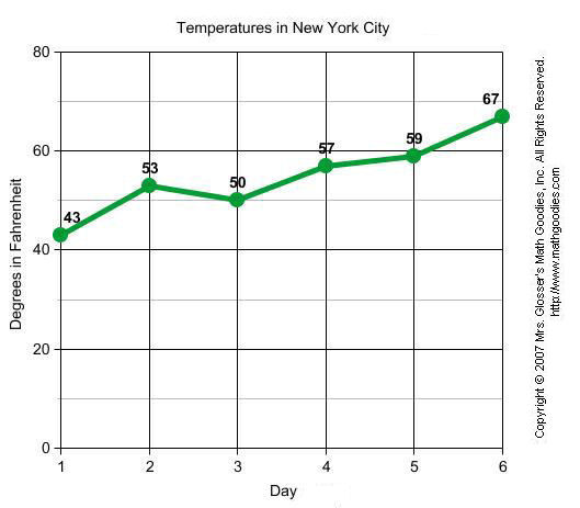
What to avoid:
- Avoid legends, also known as “key”. When possible, label your lines directly.
Best practice:
- Make sure that your points are ordered. e.g. time runs from left to right.
- Be consistent in plotting time points.
- Use solid lines instead of dotted lines.
- When possible, have a zero baseline.
- Use the right height by plotting data points where the line chart takes up at least two-thirds of your y-axis.
4. Area chart

Best for: Area charts are like line charts because they can also be used to depict time-series relationships, but they’re also different as they can portray volume.

What to avoid:
- Don’t use area charts to illustrate discrete data.
- Don’t highlight data with more than 4 data categories to avoid confusion and visual clutter.
Best practices:
- Use with less than four data series, and it’s a good idea to introduce some transparency to make sure each area is visible.
- Start your Y-axis variable above 0.
- Make your chart easy to read by putting highly variable data on the top of the chart and low variability on the bottom.
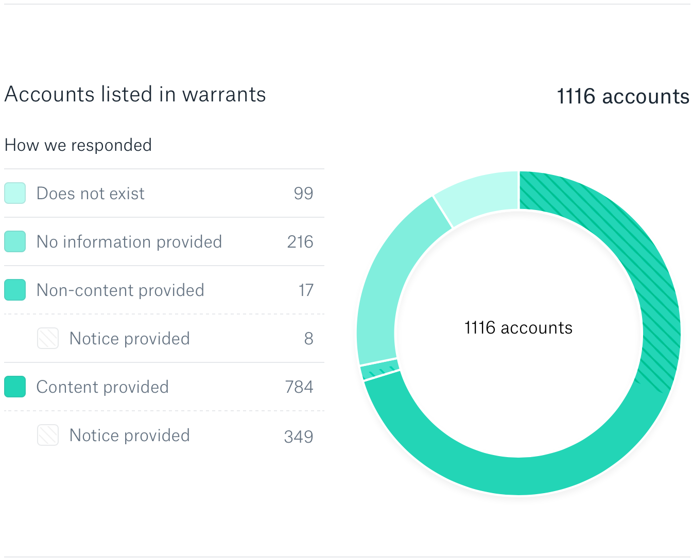
5. Pie chart and Donut chart
Best for: Illustrating simple part-to-whole relationships of discrete or continuous data.
 On the other hand, a doughnut chart is a stylistic variation of the pie chart where a total value or a design element (e.g. an icon) is placed at the center.
 What to avoid:
-
- Pie charts are not the best data visualization type to make precise comparisons. This is particularly true when there are multiple small pie segments.
Best practice:
- Pie charts and donut charts are impactful with small data sets.
- Use pie charts to display nominal variables (not ordinal variables).
- Pie charts are also ideal if you want to show differences within groups based on one variable.
- Use pie charts with a subset of categories that make up a whole when combined.
- Review if your data adds up to 100 percent.
- Order segments from highest to least.
- Start the first segment at 12 o’clock position and continue clockwise.
- Limit the chart to a maximum of 5 segments. After 5 segments, it’s difficult for many viewers to decipher proportions accurately.
Here are more resources on when to use (and when not to!) pie charts:
- When Pie Charts Are Okay: Guidelines for Using Pie and Donut Charts
- 3 Worthwhile Alternatives to the Pie Chart
6. Scatter Plots

Best for: Highlighting correlation and distribution of large amounts of data.
What to avoid:
- Do not use scatter plots when you have only a few pieces of data or if your data doesn’t show any correlation at all.
Best practice:
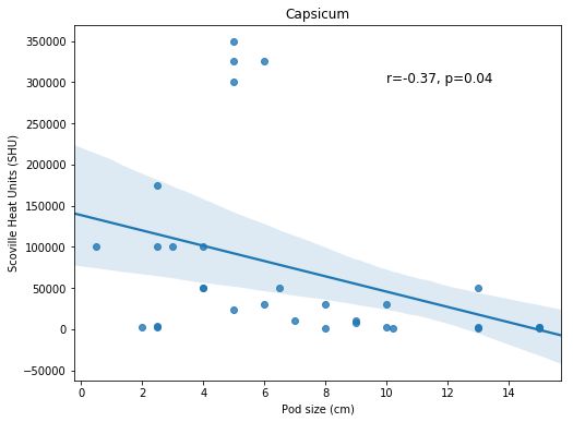
- Data sets should be in pairs with an independent variable (x-axis) and the dependent variable (y-axis).
- Use scatter graphs (not line plots) if your element order is not relevant.
7. Bubble Chart
 Best for: Comparing independent values that have distinct gaps or outliers.
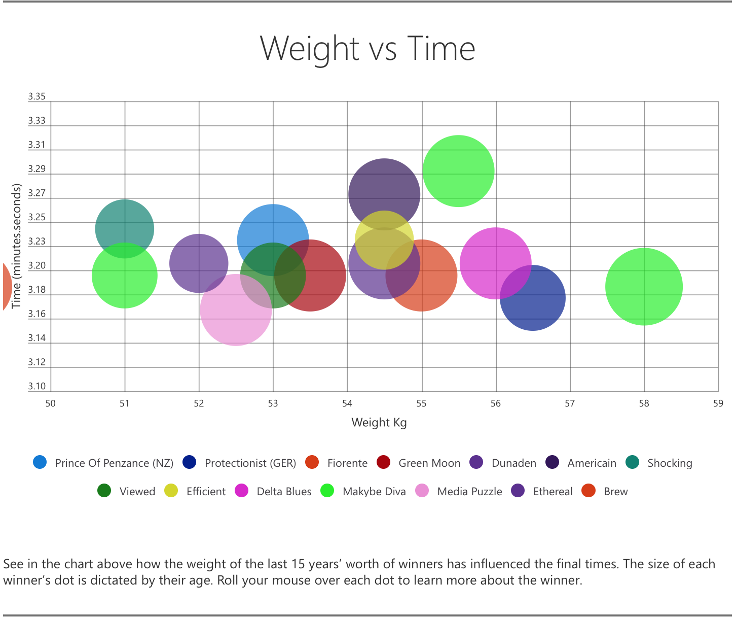
What to avoid:
- Avoid using unfamiliar shapes (it’s best to stick to circles) or icons.
Best practice:
- Label bubbles properly and make sure that they’re visible.
- Scale bubble size by area and not diameter.
Data visualization tips and best practices
Here are a few more fundamental tips to help you make accurate and more effective charts:
1. When using time in charts, it should run from left to right (horizontal axis).
2. Avoid excess lines, text, or data that does not add value.
3. Add labels, legends, and annotations when appropriate. You can use icons to avoid long labels.
4. Use color for function, not decoration. Don’t use high contrast color combinations. Finally, try to use less than six colors in a single layout.
5. Order data sets logically.
6. Cite your sources.
Your turn to visualize your data
Although there are more complex forms of charts and graphs for data visualization, the ones we’ve listed are the most commonly used and universally known.
Finally, it’s worth noting that complex charts types will eventually confused your audience rather than impress them (unless of course your audience are data visualization experts).
It’s your turn to make your own chart that will best deliver your message! You can either start with our infographic maker tool or hire a professional data visualization designer if you’re pressed for time.
Recommended Reading:
- How to Choose the Best Chart or Graph for Your Infographic
- How to Create a Chart in Easelly
- Storytelling with Data blog
Cover art by Moon Hui Lee