A well-thought-out infographic helps you stand out from the hundreds (perhaps thousands?) of infographics created every day.
Apart from the tight competition with other infographic creators, people these days also find it hard to focus. In fact, a study by the University of Chicago reveals that the mere presence of your smartphone (not in use but having it near you) undercuts one’s ability to focus.
Not to mention that we are bombarded with all sorts of content every day — from Facebook clips to discussions in Quora to YouTube videos.
So how do you overcome this hurdle and create truly unique and identifiable infographics for yourself, your organization, or your business?
Read on to learn why your infographic is not getting noticed and why readers are only “skimming” your infographic.
You’ll also discover how to fix these mistakes, capture your audience’s attention, and make them eager to learn more about you.
Why your infographic is not getting the attention it deserves
1. There’s nothing visually appealing about your infographic.
There’s a whole host of reasons why no one’s reading and sharing your infographic content. You might think that you’re doing the right thing but it turns out that this “right thing” is done the wrong way.
A particular infographic template or layout may look like the coolest template to you but keep in mind that this template may be outdated and not keeping up with design trends. For instance, did you know that each year has its own designated color? For 2020, Classic Blue is Pantone’s Color of the Year.
Think about the most recent engaging infographic you saw. Was it poorly designed, with dull colors, and lousy organization of information?
Probably not.
The odds are high that it was in vivid colour, with a logical movement of information and icons, with memorable and straightforward data.
How to Fix It
Another excellent example of a recent visual design trend that can be adapted for infographic creation is the use of dark mode color scheme. Dark mode in apps and websites started gaining traction in 2019 and is expected to gain more popularity this year.
People prefer darker color schemes because it’s easier on the eyes and feels less harsh in low-lighting environments. The science infographic template below is a good example.
Make your infographic stand out by putting more thought on your infographic colors, the icons you use, and even your fonts. Take stock of current design trends. Make it visually appealing so you stand out from other infographic creators who put minimal effort into their visuals.
2. Your infographic looks cluttered.
When readers come across your infographic, they need to know where you’re going. Literally. Too many unexplained icons, little-to-no clear movement, and too many different “areas” within an infographic will distract and confuse your audience.
How to Fix It
A good infographic is one that is laid out intelligently, in a way that flows without effort.
You want people’s eyes to fall seamlessly on the next piece of information. You want to show them exactly where they want to go.
Look at the infographic below. Not only are the icons and text laid out clearly, but there are lines and arrows to make things super clear. Don’t assume people will “get it,” make sure that they will!

3. Your infographic is too long for your audience.
While many people are fans of the endless-scroll infographics, analytics show that people prefer infographics that fit within one screen window or just slightly over.
It’s also worth noting that lengthy infographics aren’t bad. They only become undesirable when they’re made for the wrong audience.
How to fix it
Avoid pages and pages of infographics. If you have that much to say, create snippets of your infographics and share them separately.
This tip also goes for your written content. An infographic should be heavy on the graphics, not on texts. Let your icons and numbers do the talking, and only explain what you need to.
The infographic below says plenty in a few words. It’s also worth noting that this infographic is a part of a longer infographic. The creators were savvy enough to break them down into mini infographics.

Impressing people with your creative interpretation of the data, your product, or message will speak volumes.
4. Your infographic is riddled with poor formatting and errors.
Infographics can take time to make, particularly if you’re just new to it. This is still not a good excuse though for creating an infographic that has text boxes out of place, improperly sized icons, and typos or spelling errors.
You could have the most useful information on the planet in your infographic, but if it looks like a toddler whipped it up (no offense to them, they could probably do better than some adults), your audience will move on without a glance.
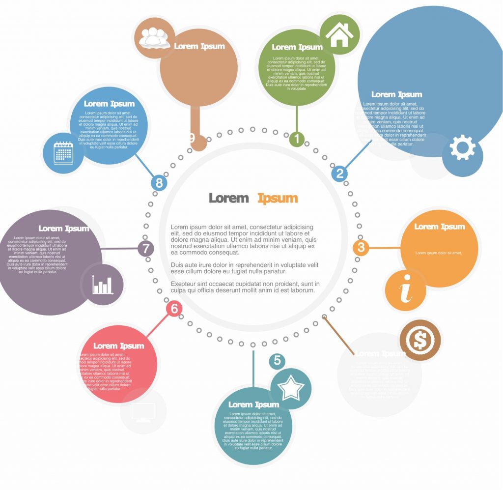
Not sure what we mean by “poor formatting”? Take a look at the image below. Noticed how the shapes and their placement are not uniform to each other?

How to Fix It
Take the time to double and maybe even triple check your infographic before sharing it. Ask friends or colleagues to proofread it for you. We all make mistakes – we just don’t have to make them permanent.
Use this guide to writing infographic content to make sure that your infographic text is keeping your reader engaged, and not distracting them from your core message.

Wrapping Up
You’re now ready to create infographics that will capture your audience’s attention and engage restless readers at the same time.
We’ve got your back if you need help with your infographics, whether you’re starting from scratch or would like to use pre-made infographic templates. You can use our simple infographic maker tool or hire one of our infographic design pros for custom infographics and animated infographics.
We’re rooting for your infographics to stand out from the others!
*Editor’s Note: This post was originally published on May 30, 2016 and updated on February 7, 2020 for accuracy and comprehensiveness.

