
Take a moment to imagine a world without signs and symbols — from universal icons such as hearts and smileys to Facebook’s thumbs-up sign.
Will there be confusion and chaos? Or do you think humans will find other ways to communicate?
According to literary theorist Kenneth Burke, humans are symbols-based species. In his Theory of Identification, Burke believes that people naturally respond to symbolism in their quest for identity. For Burke, we use “a symbolic means of inducing cooperation in beings that by nature respond to symbols” in communication.
The great thing about using signs and symbols in communication, whether it’s for school or business, is they can be both functional and artistic at the same time.
In today’s era of unlimited data and free-flowing information, we often make the mistake of leaving less time and attention in sharing information through signs and symbols. As a result, you end up with an audience trying to make sense of your cluttered, confusing set of symbols, words, and numbers.
So now what? Enter the pictogram!
The What, Why, and How of Pictograms

If there’s one form of symbol-based communication that we’ve been using since the earliest humans learned how to carve or paint on rocks, it’s the pictogram!
In prehistoric art, a “pictograph” or “pictogram” (derived from the Latin “pictus” which translates to painting, and “graph/gram” which translates to drawn or written) describes an image, sign or symbol that is created to express an idea, information, or message. In ancient times, pictograms are associated with magic and the supernatural world.
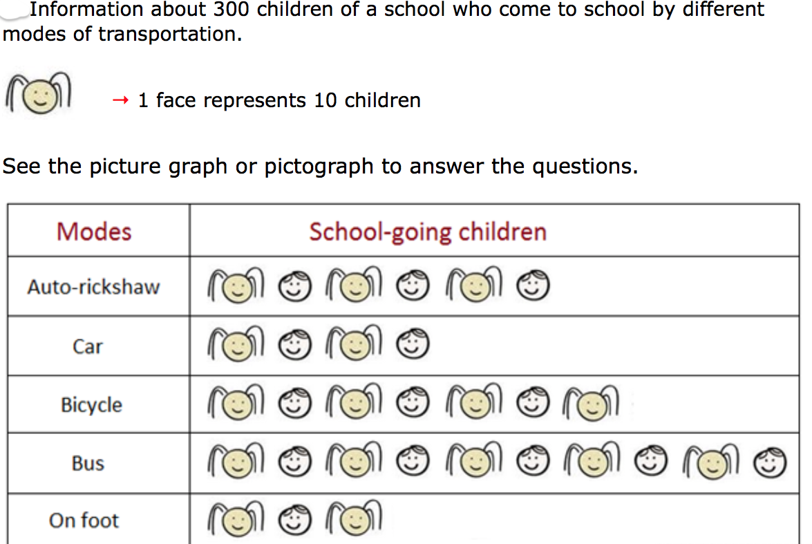
Pictograms have evolved continuously over the centuries. Today, they are also called pictographs, picture charts, or icon charts. While there are variations in how we call them today, they all have the same function: pictograms are icons that are used to represent and simplify data, concepts, and objects.
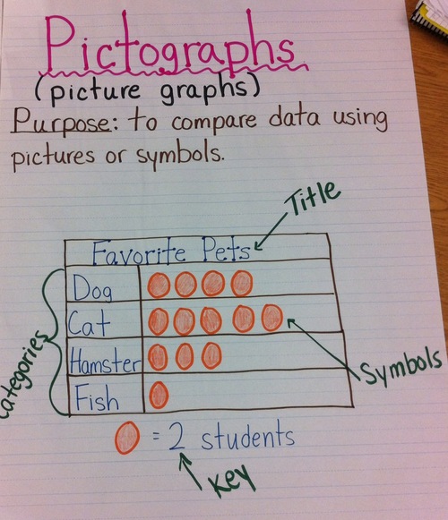
Fast forward to today, pictograms are used everywhere— apps, charts, text content, resumes, and even ads. A pictogram is a powerful data visualization tool because it enables us to communicate a difficult concept or transform words into a simple icon or image. Plus, they don’t take a lot of space!
Pictograms in your infographics
Besides simplifying complex data or information, using pictograms can also make your data more memorable and less cluttered at the same time. Think of a pictogram as another tool in your Show, Don’t Tell toolkit.
So how can you use pictograms in an infographic? Let us count the ways!
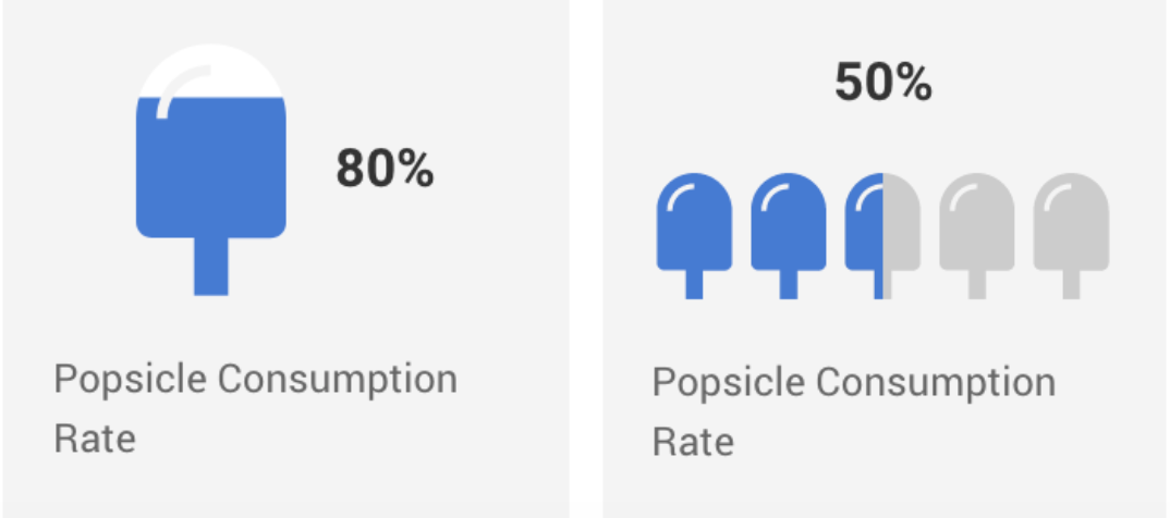
1. Use pictograms to emphasize percentages or highlight ratios.
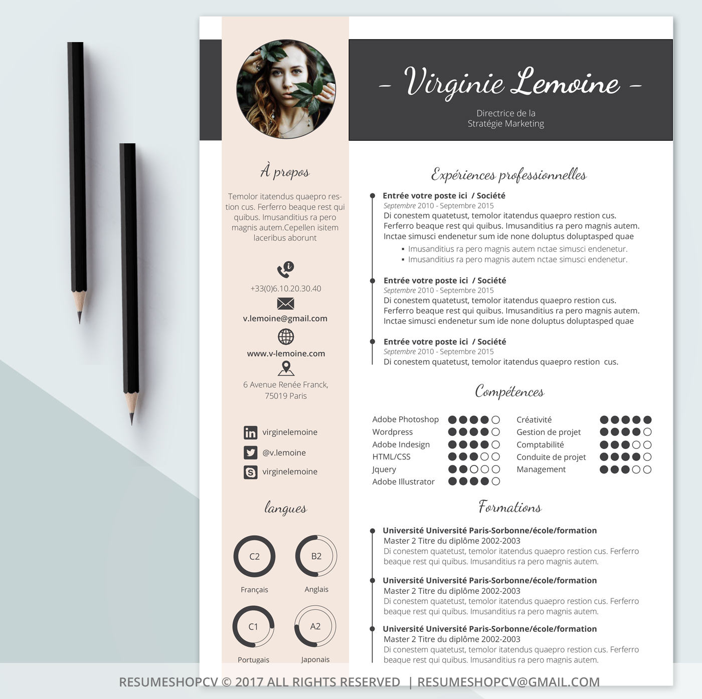
2. Use pictograms as a way to communicate your skills and work experience to recruiters and potential employers.
3. Use pictograms in charts to make your data more attention-grabbing and visually pleasing.
4. Use pictograms to illustrate the rate of progress in project status reports or organizational goals.

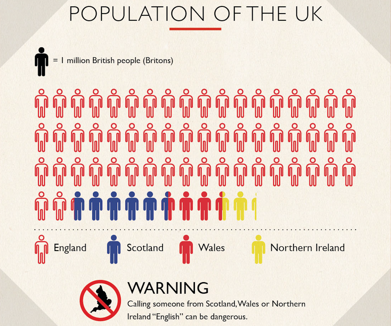
5. Use pictograms to summarize survey results and emphasize the magnitude of your data. Think of it as a visual tally.
How to make pictograms using Easelly
Here at Easelly, our mission is to inspire and enable anyone to represent an idea in a visual way.
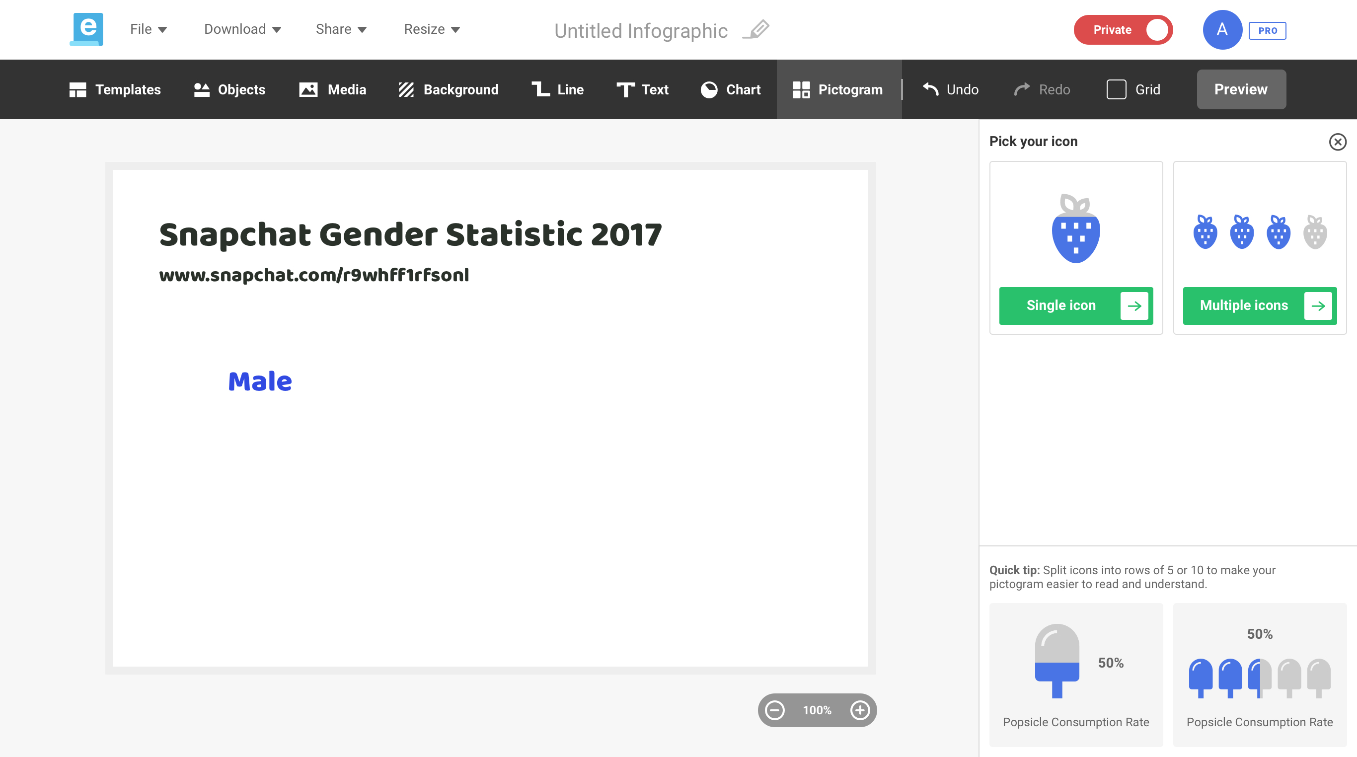
So for last month’s update, we’re finally proud to announce that the pictogram feature is here! Here’s a sneak peek on how you can use pictograms in Easelly.
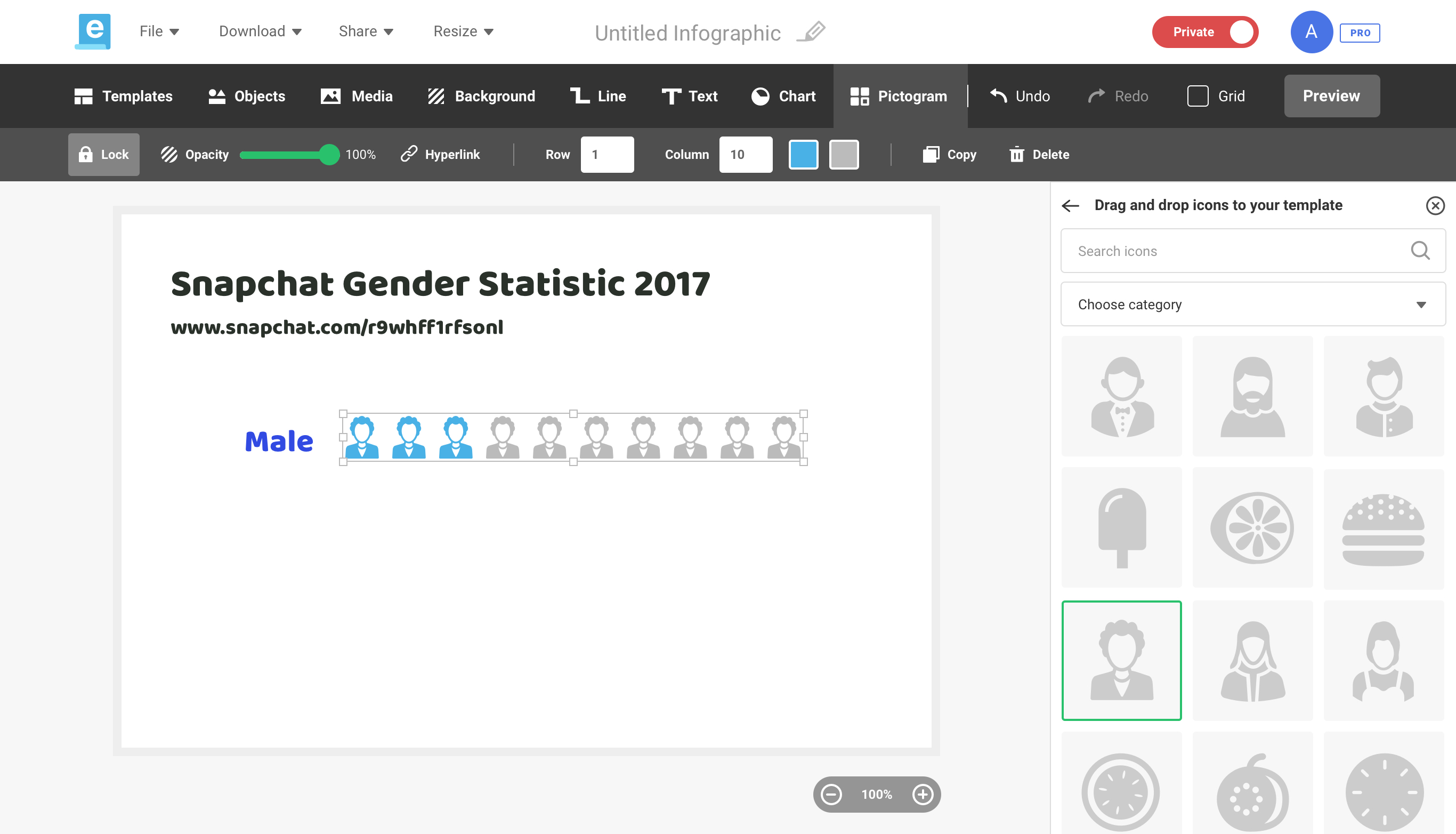
Click on the pictogram tab and choose between single and multiple icons
You can adjust the number of rows and columns too!
Next, adjust the size and percentage fill of your chosen icon. 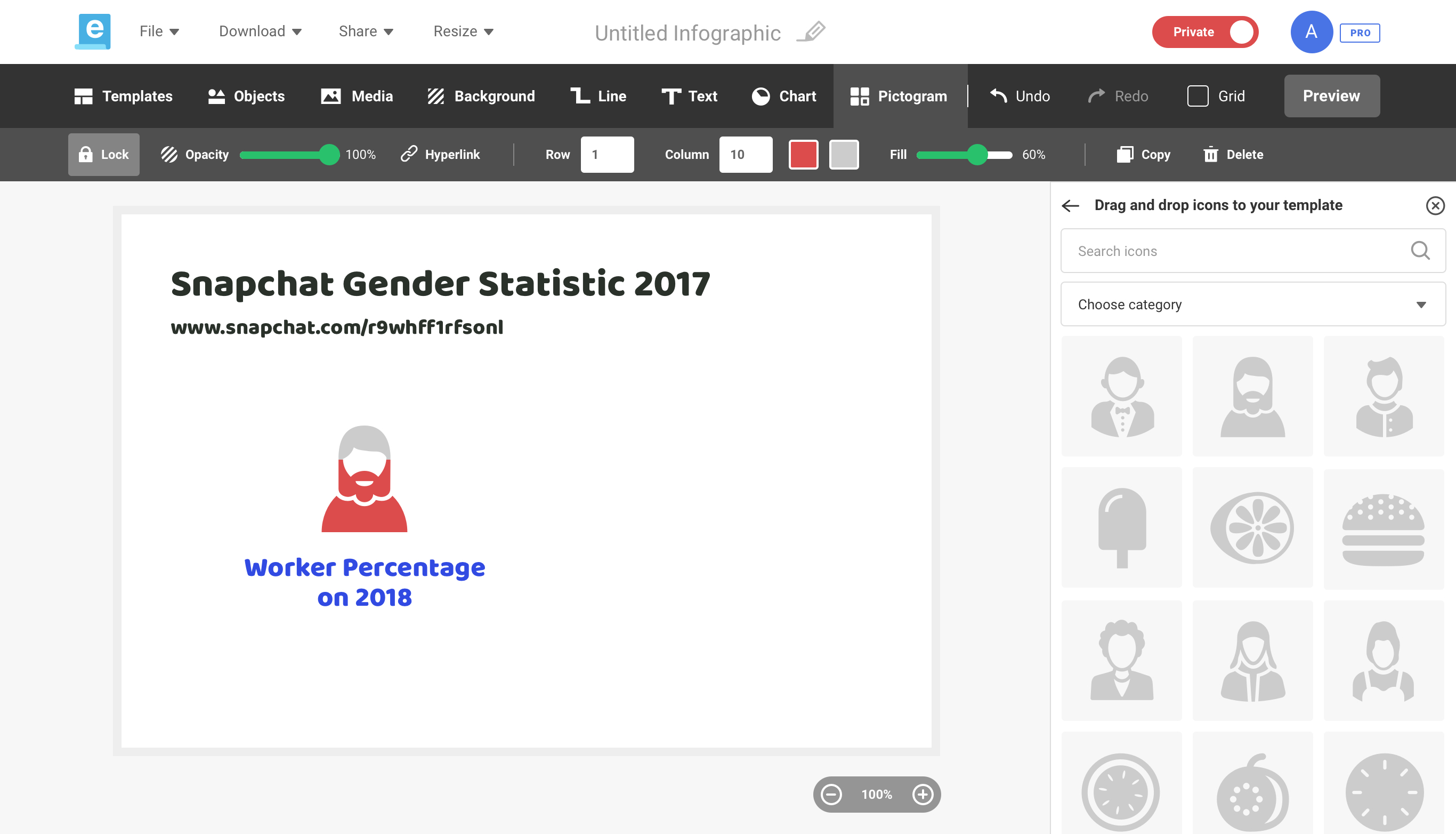
You can also change icon colors in your pictogram.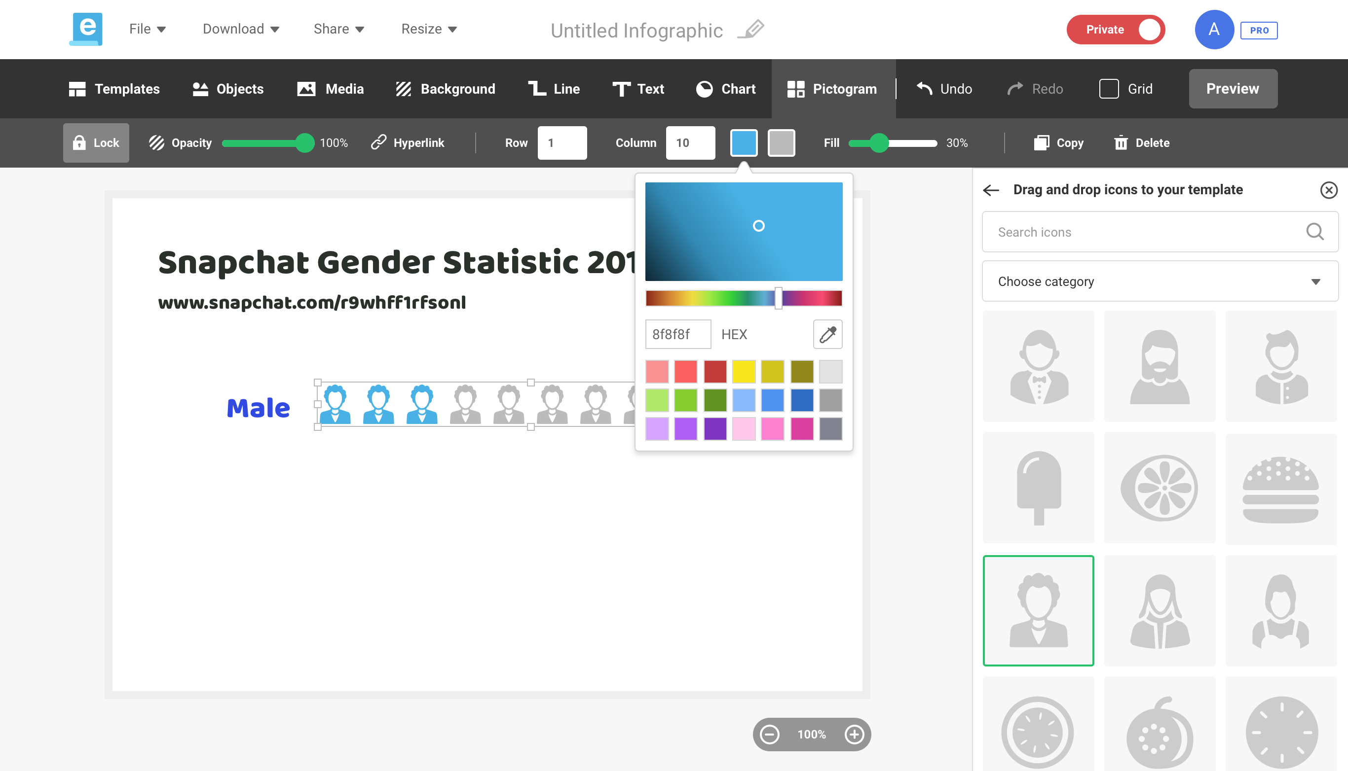
Pictogram tutorial video
You might also want to check out this short tutorial on pictograms we made using Easelly.
Keeping it Simple
We’re huge fans of keeping things simple here at Easelly. For pictograms, we’re skipping the bells and whistles, and we’re focused on making sure that you can convey your message by letting the icons and pictographs do the talking.
Using pictograms to convey information effectively
Pictograms help us retain information quickly by leaving lasting impressions. Most of all, they’re highly shareable and simple to create!
However, you can’t just add a pictogram or icon just because you think it’s cool or you feel like doing so.
Here are some pictogram best practices to consider:
1. Think about your “one simple impression”.
What’s a one simple impression?
William Playfair (the inventor of the bar, pie, and line graphs) coined the term “one simple impression to describe icons that are simple yet meaningful and easy-to-understand. For instance, if 20% of your users are teachers and you want to highlight this in your content, you can simplify it to 1/5 in your pictogram.
2. Rethink your pictogram colors.
Stick with one or two colors in your pictogram. Ideally, they should contrast with one another. Also, steer clear of red/green and yellow/blue color combinations because color-blind viewers may have a hard time reading it.
Finally, avoid icons that are multi-colored or too detailed as they tend to distract readers and obscure what’s essential.
3. Choose icons that relate to your statistic or information.
For example, you can use the house symbol to describe a number of households.
4. Use rows of 5 or 10 when presenting your pictogram.
The human brain loves patterns a splitting your icons into rows of 5 or 10 makes it more readable.
Bonus pictogram tips and tricks:
- Don’t use pictogram icons to fill up space in your infographic. In fact, there’s no reason to be afraid of white space.
- Verify the trustworthiness and accuracy of your data.
- It doesn’t have to be perfect. Embrace the idea that creating infographics and pictograms takes practice. Avoid analysis paralysis.
Ready to create your own pictogram?
You don’t have to use cumbersome design tools to create pictograms in your infographic. You can use Easelly’s simple infographic design tool to make your own pictograms. Don’t forget to follow the tips and best practices we’ve outlined in this article!