
Before you start down the path of designing infographics, it pays to understand what truly makes an effective infographic.
Striking colors? Wonderful use of typography? Attention-grabbing headlines?
Sure, a lot of people will likely say that there’s no definite set of criteria to follow because people’s perception of what’s effective can vary.
For example, Joanna from your marketing team might think that a sudden boost in website traffic is a result of a well-made infographic. Mark from the design team, on the other hand, feels that it’s all about the number of Facebook likes that the infographic gets.
Everything boils down to perception, right?
Good thing there’s the Nielsen Norman Group (NN/g), a trusted authority in all things design and usability, who can provide us with research-based information on what indeed makes an effective infographic.
What makes a useful infographic?
User experience specialist Lexie Martin of the NN/g recently wrote an insightful piece on designing effective infographics and how to translate data into a visual medium that is by turns engaging and easy to understand.
At Easelly, we’re big fans of turning insightful data and information into an engaging piece of content, so we decided to make an infographic out of it!
Effective infographic examples
An effective infographic is not just about making it look pretty. As statistician Nathan Yau writes, it’s all about letting the data speak and not putting extraneous icons all over the place to obscure what’s important.
Based on the checklist, here are some examples of effective infographics!
They’re effective because they don’t only look good and appealing to the eyes, but they also do what they’re supposed to do: engage your audience, communicate critical details, build awareness, or even generate leads if you’re using infographics for business.
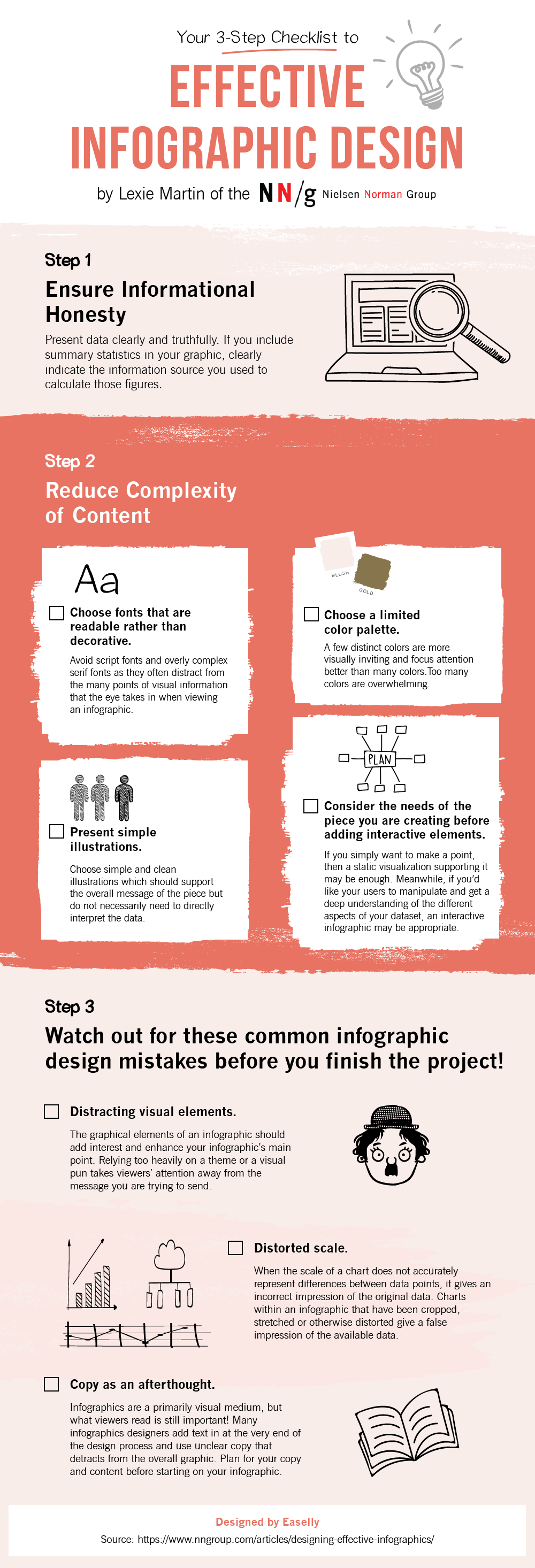
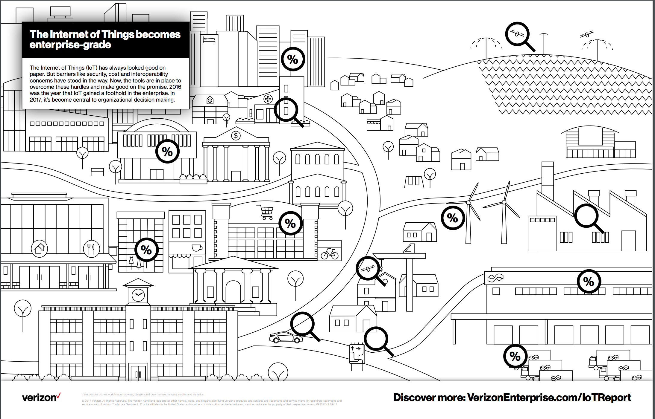
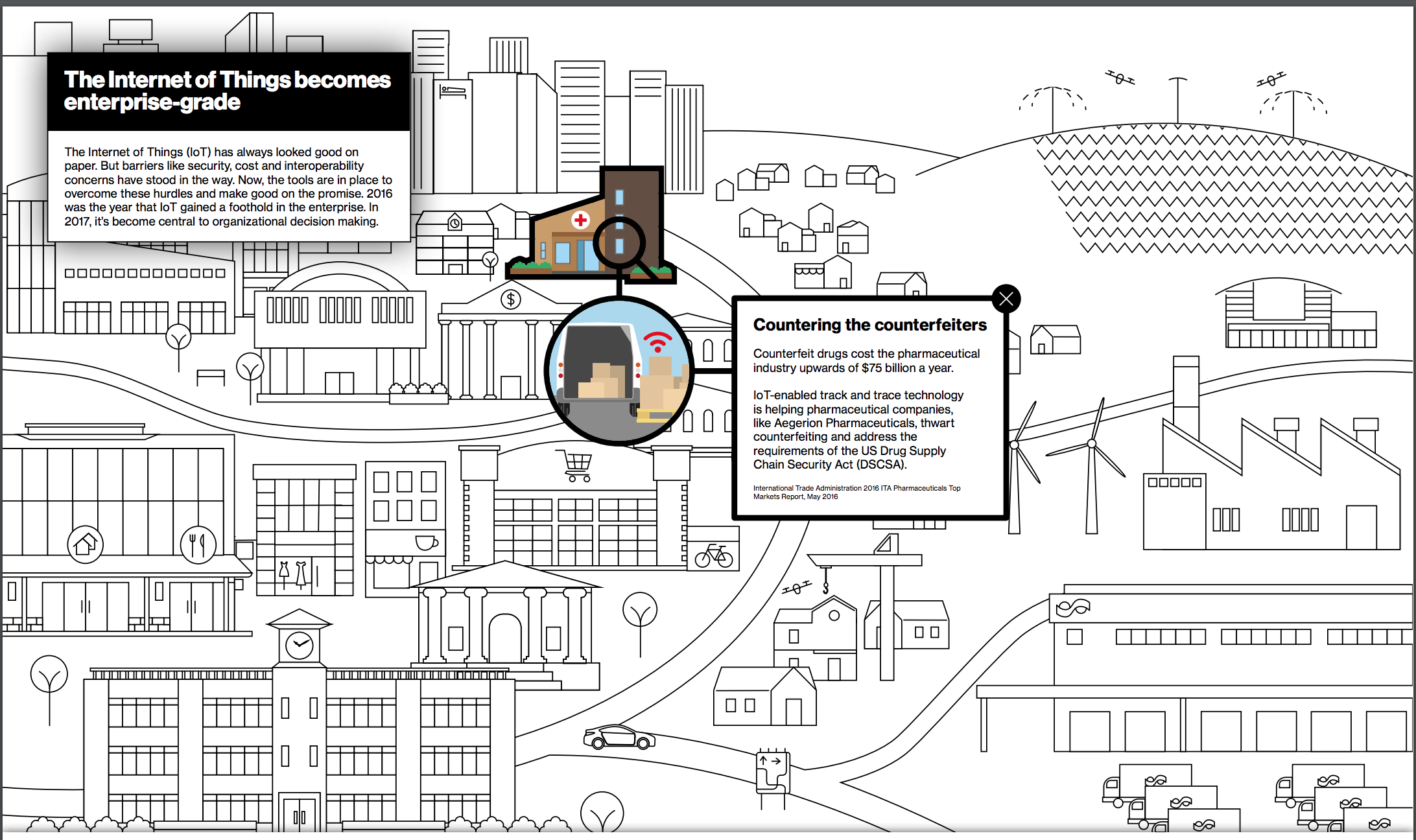
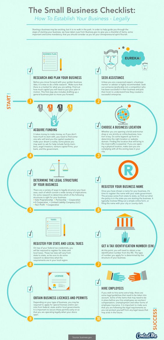
1. An effective infographic ensures informational honesty.
Apart from indicating their informational source clearly, the Verizon team gets bonus points for creativity because they created an interactive infographic. You simply click on a search icon to check out the source. You can find the full version here.
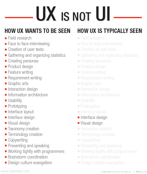
2. An effective infographic employs fonts that are readable rather than decorative.
The comparison infographic below highlights the contrast between UX and UI in a clear way by keeping texts clean and legible. The way some of the texts are blurred also drives the message (people’s uninformed perception of UX) home.
3. An effective infographic makes use of simple illustrations.
When making infographics, a lot of people make the mistake of creating fancy, elaborate drawings. As a result, people are drawn into the images instead of the data you’re trying to convey.
An effective infographic should use illustrations to support your data and overall message instead of the other way around (using texts to support your illustrations).
4. An effective infographic opts for a limited color palette.
When starting an infographic design project, it’s quite exciting to have endless possibilities of design elements before you. Your choice of colors is no exception. However, you have to be mindful of your color palette and the number of colors you’re combining.
Here’s a quick tip from Smashing Magazine on how to choose your infographic colors wisely:
If picking a color palette is hard for you, stick to the rule of three. Choose three primary colors. Of the three, one should be the background color (usually the lightest of the three), and the other two should break up the sections. If you need to add other colors, use shades of the three main colors. This will keep the palette cohesive and calming, rather than jarring.
Besides the rule of three, you can also use the color theory when deciding on infographic colors.
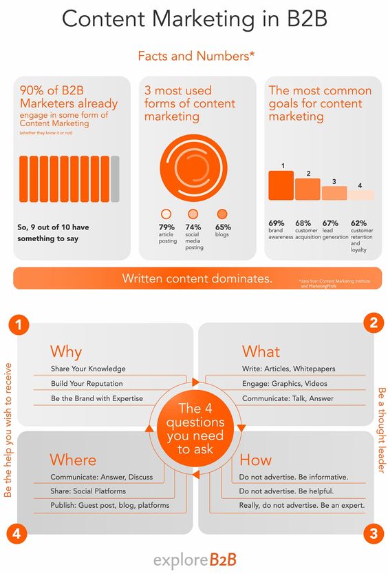
Can you spot how many colors are there in this infographic?
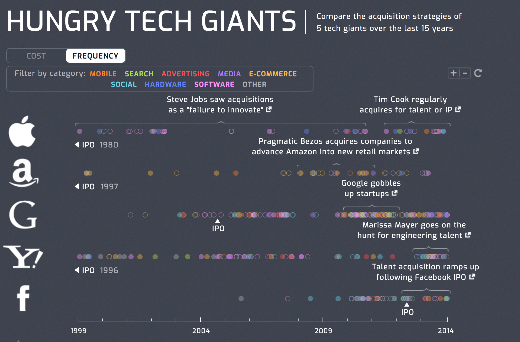
5. An effective infographic considers the needs and context of the piece before adding interactive elements.
Interactive infographics are popular for a reason. First, it makes audiences feel involved. Second, interactive infographics are also an excellent medium for understanding the context of your message.
Looking for a neat example?
Hungry Tech Giants is an interactive infographic comparing the acquisition strategies of 5 tech giants over the last 15 years.
Over to you
When you find yourself in situations where you’re still not sure how to proceed when designing infographics, take a deep breath and think about your audience. Afterward, use our 3-step checklist in creating effective infographics. Don’t forget to have fun at the same time!
Want to dip your toes into infographic design as a non-designer? Try our free infographic maker tool!