
Whether you’re the head of content for an e-commerce brand or you’re running a small seed company, you have one goal in mind – get more people to find your cozy little corner on the Internet and get more value from your content.
Generating traffic for your blog and website is doable, but it takes time, effort, and patience.
In this case study, you’ll learn how to use infographics to grow your website traffic and convert website visitors to paying customers or loyal followers.
How an infographic garnered backlinks and boosted website traffic
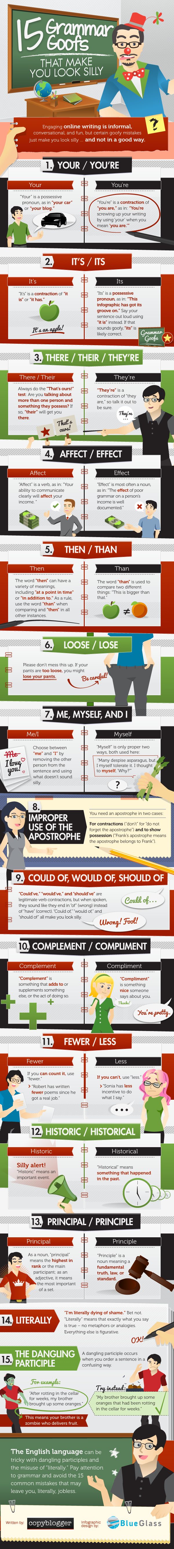
Copyblogger released an article with an infographic called “15 Grammar Goofs That Make You Look Silly” in 2012.
The article and infographic have been shared over 200,000 times since then. This useful infographic is one of the most shared in the grammar space to this day.
A title like “15 Grammar Goofs That Make You Look Silly” is incredibly striking. After all, it’s not every day that you get alliteration (grammar goofs!) and the word “silly” in a marketing infographic. It will get just about anyone’s attention. The header design also mimics the infographic’s humorous title.
About the infographic
The infographic itself is straightforward. It’s designed to look somewhat like you’re back in school. The infographic header mimics a schoolroom. It includes a clown for a teacher, a blackboard, a globe, and more. The overall design calls back to the infographic’s hilarious headline.
The infographic then lists the 15 grammar mistakes with examples. The graphic also explains the critical differences between the correct and incorrect options, so readers understand why they are grammatically incorrect.
Just like with any other useful infographic, this one is easy to follow. You don’t need a PhD in language to understand the grammar goofs and why they make you look silly.
However, one thing that makes this infographic stand out is that it’s created to call back to the article’s title. As already mentioned, it looks like a clown is teaching you, and each grammar goof looks like it is listed on a notebook.
About the article
One thing that’s incredibly important about this infographic is that Copyblogger did not write an article to explain the infographic, except for the short introduction to explain the “why” behind the infographic. Instead, Copyblogger allows the infographic to stand on its own.
Other than that, the article is just the infographic—super strategic and smart choice on behalf of Copyblogger.
Promotion
This infographic successfully boosted website traffic because Copyblogger made it a point to promote it offsite through backlinks and social media.
It’s worth noting that the infographic’s value and novelty prompted other sites and brands to use it on their website as well. As a result, Copyblogger garnered backlinks.
According to MOZ, backlinks to your website are a signal to search engines that other brands or sites find your content useful and that they can vouch for its trustworthiness. If a good number of sites link to the same webpage or website (just like the Copyblogger infographic), search engines like Google can infer that your content is worth linking to and worth the first-page ranking.
Social media was also essential to the promotion of the infographic. Copyblogger used various sections of the infographic when promoting it on social media. This is a brilliant move because it allowed other social media users to share the infographic with their followers and network.

Takeaway
So, what does this infographic tell us?
This infographic teaches us that a powerful infographic can stand alone. You don’t need a comprehensive or convoluted article to explain the infographic. If the infographic is done well, that is all you need.
Next, you should take the time to create an infographic that calls back to the article title.
An effective infographic should have a clear message and recognizable branding so that all viewers can easily connect the infographic back to the article as a whole, as well as your website.
Finally, this infographic proves the importance of a good SEO and social media plan in increasing traffic to your site dramatically.
How to make an infographic worthy of backlinks to help improve website traffic
If you want to increase traffic to your site and increase your backlinks, infographics are a great way to do it.
Whether it’s an education infographic or an infographic for content marketing campaigns, here are some essential best practices to keep in mind for creating infographics that work:
Stick to the point
The point of an infographic is not to talk about every nuanced detail of the topic.
Instead, an infographic’s goal is to give the viewer quick information in seconds. Make your infographic useful by sticking to the main point.
There’s no need to turn your infographic into a lecture or rant. Keep it crisp and concise so that viewers don’t have to do much reading.
Let visuals be the text
If your website visitors want to read, they would read the article, not the infographic.
For this reason, you need to let your visuals be the text of your infographic. Ensure that visuals are concise and well-designed to draw the viewer’s eye to it.
While a blog post should center around the text, your infographic should center around visuals. Add text as supplementary information.
Short sentences, data points, and bullet points are great texts to put in an infographic because they are short, sweet, and concise. Show, don’t tell.
Master design flow
Make sure that your infographic content has flow. An infographic should quickly lead the viewer from the first point to the conclusion.
Create a catchy introduction so that the reader’s eyes are drawn to the first point first. From there, they will be able to read and work out the next points on their own.
Use infographic templates if you want to get used to making a good infographic flow. A pre-made template will help you create infographics that are striking, neat, and easy to follow.
Make it easy to read
Finally, make sure the infographic is easy to read.
Use big fonts and a striking color scheme. Make sure that the colors on your infographic allow the words to stand out.
If users have trouble looking at or reading your infographics, it will not be shared or viewed often. Likewise, it will not increase traffic to your website.
Conclusion
Infographics are a great way to increase foot traffic to your site, both by your loyal followers and new potential viewers.
Just as in the infographic case study shown above, you need to make infographics worthy of backlinks.
In summary, create value in your infographics, spread the word through social media and email outreach, and website traffic will follow.
If you’d like to learn more about using infographics to improve your rankings, head on to this guide — Using Infographics to Improve Your Website Authority and Rankings. The guide is divided into three parts: planning for your infographic content, the infographic creation process, and promoting your infographic.