As we mentioned in Part 1 of our interview with Max Galka, data visualization has become one of the biggest trends of 2016. Not only do we have more access to more information than ever before, but we are able to collect that information (data) in all new ways. But of course, we don’t just collect data to collect it – it’s what we do with the data we gather that counts!
In this second part of our interview, you’ll get insights into how to collect data to help you create data visualizations and infographics that are top quality. Whether you’re a teacher, entrepreneur, marketer, or nonprofit organization, there is something to take away from Galka’s great insights into data. Enjoy!
Easy Access to Data
In Part 1, we discussed with Max Galka how data visualizations can be used to bring information to life. That information can be about the public need for a product like yours, a graph of recently collected information about consumers, or a visual representing your audience.
But you’re probably thinking, “Where in the world do I find this information to begin with?”
If you want to know something about your industry, about your specific location, or even about your business, most people have a hard time knowing where to begin. Google searches don’t always help and not all of us are familiar with the back-end analytics needed to track marketing campaigns or traffic numbers.
Don’t worry though; data collection doesn’t have to be as hard as it sounds. Depending on what sort of information you’re looking for (public information or more specific information about your business or audience), you should start with the “low-hanging fruit,” as Max Galka calls it.
These are 1.) public data, 2.) your website analytics, 3.) your social media, 4.) audience polls. Thanks to advancements in the “user-friendly” nature of data collection, finding information in these four areas has never been easier.
1. Public Data
For public data sets and general information about pretty much anything under the sun (other than your specific business or audience), Max Galka recommends data.gov:
Data.gov [now] hosts close to 200,000 public data sets covering just about any topic imaginable. Browsing what’s available there could keep you busy for a long time. Another one of my favorite resources is IPUMS, a repository of Census data hosted by the Minnesota Population Center. It has the same data as the official Census website, but IPUMS is 100 times easier to work with.
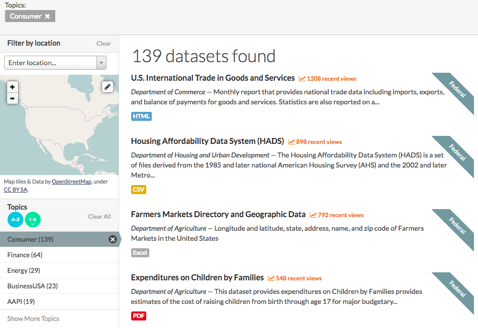
Because government databases (generally) have the most accurate and up-to-date information, these are really great places to start. T
he best part is that more and more data is being publicly released every month thanks to the DATA Act and the Freedom of Information Act.
Galka and others are actively seeking access to even more “private” data sets that the government holds. If you’d like to learn more about this, check out Galka’s project, FOIA Mapper.
2. Website Analytics
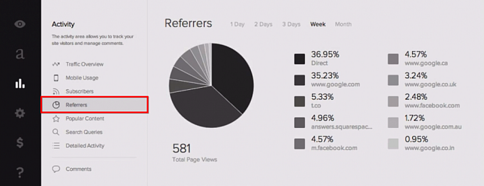
If you’re looking for data about your own business or audience but have no idea what “analytics” are, let’s start with your website “dashboard.”
Whichever platform you use for your website, whether WordPress, SquareSpace, etc., there are basic “site stats” in the admin panel of your website. These site stats will tell you how many people have visited your site, what pages they looked at, and where the traffic came from.
You can also invest in programs like Google Analytics if you’d like more detailed and targeted information, but that’s not considered “Beginner Level.”
Also keep in mind that if you sell something on your site or you have people subscribe to your blog or email list, you’ll get more specific information about them. Demographics such as age, gender, location, and interests will all pop up in your analytics the more engaged your visitors are.
Pro tip: Want to gather more data? Encourage people to convert — buy, subscribe, sign up, whatever! More engagement = more data!
While it may seem cut-and-dry (and boring), all data you gather from your website can be used to:
- Create better content
- Launch new products
- Create infographics about your service or product
- Create data visualizations for investors, executives, or for your end-of-year review
It’s very basic data, but that data can be used in many ways in a number of great visuals, and can help you better understand who is visiting your site.
3. Social Media Reports
Next, and maybe most importantly, we come to social media as a source of data. If you run your own social media, you know that some posts get more engagement (likes, shares, retweets) than others. But did you know that Facebook, Twitter, and even Pinterest now track the sort of engagement your posts receive? Galka believes that social media is one of the best (and easiest) places to receive information about your audience:
Both Twitter and Facebook have really beefed up their analytics reporting lately. And by looking at who’s engaging with what, you can learn a lot about your target audience: who they are, what they are interested in, what resonates with them. That kind of information can help inform decisions across all areas of the business, not just social media.
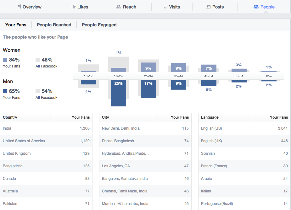
Generally, we take our successes on social media as a hint to post more of whatever our followers enjoyed. But as Galka explains, that data can be collected for other uses.
Your social media reports may help you decide which products are working well, which geographical locations are most likely to respond / need your services, or which area of your business could use the most TLC. You can collect this data for your own personal / business use, of course, or you could use it to create infographics about your product or services.
4. Audience Polls
If the previous 3 sources of data don’t get you the information you want, it’s time to go right to the source: the data sets themselves!
Your audience is a walking, talking, breathing data set just waiting to be collected. To take advantage of this, all you need to do is *gasp!* ask them.
Whether you send out an email asking your customers, “Which product is your favorite and why?” or if you have an open-ended, “Leave a review or response on our Facebook page” sign-off, your audience will give you information.
You can also use Twitter and Facebook to directly poll your audience anonymously, which is great if you don’t need to know who is responding.
There are also programs like SurveyMonkey and others which allow you send out surveys en masse to your audience.
The great thing about all of these options is they’re super easy to plug into a visual and all the information is going to be particularly catered to your business and / or audience.
Pro tip: Audience polls aren’t just for businesses! Teachers, nonprofits, and other organizations can use polls to collect data about virtually anything.
Collecting Data Doesn’t Have to be Intimidating
Many businesses who are looking to collect data on their customers or their industry have to mine the data for themselves.
Bloggers have to research keywords and understand trends. Even teachers and nonprofits have to do this; not every set of data you want will be in a government database somewhere. While your data mining process doesn’t have to be as complex as you think, you do have to know where to look.
Also keep in mind that, just because you collected the data, it doesn’t mean that it’s telling a story – yet!
Galka recommends that data miners:
“… vet whatever conclusions you are drawing from that data. ‘Correlation does not imply causation’ … [is] still good advice for data visualizations. Just because there is a relationship between two variables, it does not mean one causes the other. It’s generally best to let the data speak for itself and avoid trying to extrapolate what it means.”
Whether you use data to educate students, grow your audience, improve a product, explore your industry, or create beautiful visuals, remember: Data can speak for itself; it’s just your job to collect it.
As a quick recap, Max discussed the differences between Data Visualizations and Infographics. And while they are more similar than they are different, they both require you to collect data and information!
Depending on your goal and information you are trying to share, he suggested 5 places to start when looking to collect data:
- Public Data
- Website Analytics
- Social Media Reports
- Polls, Surveys, and Sales Data
- Libraries
He also provided some tips on getting started with Data Analysis:
- Check if source is reliable (and attribute it properly!)
- Vet the conclusions you’re drawing from the data
- Correlation does not imply causation
- Let the data speak for itself
While there are many tools out there that will allow you to create Data Visualizations and Infographics, he gave us a preview to Blueshift which is an easy way to design and publish dynamic maps in minutes!
Visit Blueshift to sign-up for early access! We also appreciated Max’s opinion on Easel.ly as an easy-to-use tool to create aesthetically pleasing infographics. We agree!
Additional Resources:
- Webinar Slides (View Only)
- Information, Visuals, and Collecting Data: An Interview With Max Galka (Part 1)
- How to Collect Your Own Data: An Interview With Max Galka (Part 2)
- Step-by-Step Guide to Making Infographics from Scratch (guide)
- Infographics for Your Classroom (eBook)
- YouTube – Infographic Design Tips and Tutorials
Max Galka Resources:
- http://metrocosm.com/
- https://blueshift.io/
- https://foiamapper.com/
- Data Visualization Resources & Learning Tools
Easelly would like to extend a big THANK YOU to Max for taking the time to talk with us and I hope you found it informative!