
Are you about to make your first infographic design?
Or are you curious if you’ve been doing infographics right?
Whether you’re about to dip your toes into infographic creation or you’ve been doing it for years, taking structure into account is an equally essential step as writing a thoughtful infographic design brief.
So what does a good infographic structure look like?
Infographic structure essentials
Our design team made this infographic below that you can print out as a quick reminder before getting started with your infographic and data visualization projects. Alternatively, bookmark this link in your browser!
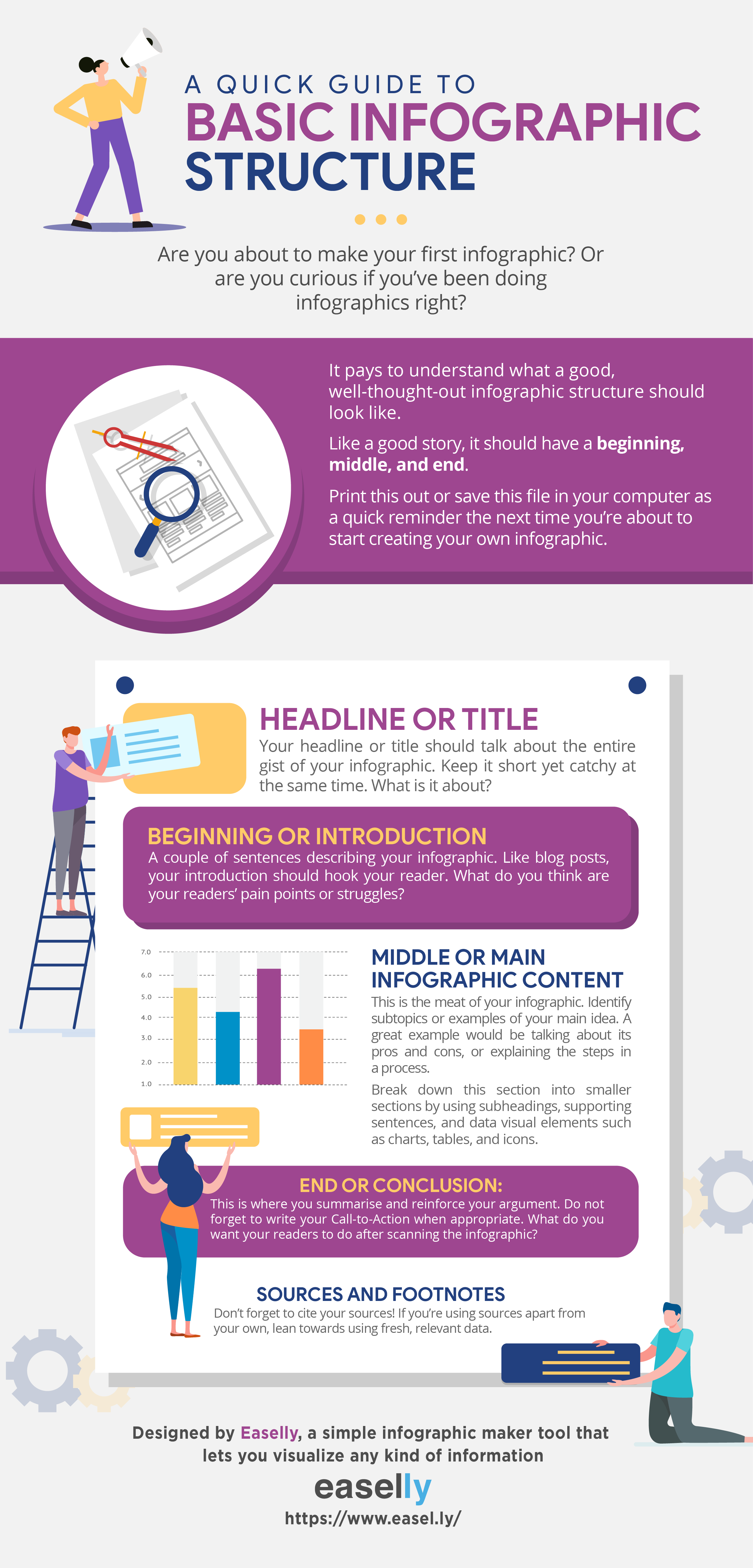
The headline
Your headline or title should talk about the entire gist of your infographic. Keep it short yet catchy at the same time.
You create engaging content like infographics because you want to start a conversation with your prospects. For this reason, think of infographic headlines as your conversation starters.
The introduction
These are a couple of sentences describing your infographic. Like blog posts, your introduction should hook your reader. What do you think are your readers’ pain points or struggles?
As much as possible, limit your introduction into a couple of sentences or less than 100 words.
The main content
This is the meat of your infographic. Identify subtopics or examples of your main idea. A great example would be talking about a topic’s pros and cons, or explaining the steps in a process.
Break down this section into smaller sections by using subheadings, supporting sentences, and data visualization elements such as charts, tables, and icons. These elements also make your data interesting and easy-to-understand. After all, infographics are meant to simplify concepts.
Insider tip: Not sure which infographic format to use? Here are here are 10 infographic formats with examples that you can refer to when you’re feeling uninspired.
The conclusion
This is where you summarise and reinforce your argument. What do you want your readers to do after scanning the infographic? What are the main takeaways that you want the reader to learn from the infographic?
Do not forget to write your Call-to-Action or CTA when appropriate. It’s an image or line of text that prompts your visitors, leads, and customers to take action. Do you want them to visit your website? Or sign up for your email list? In infographics, the call-to-action is typically written at the bottom.
Insider tip: be super specific about your CTA and always think about adding value.
Do you really need to follow an infographic structure?
So you’re a creative rebel? We get it.
For a start, the best infographic comes from understanding the basics such as infographic structure. A structure makes it easier for readers to follow the story or message you’re trying to communicate. Once you’ve understood the why behind the rules, feel free to break ’em!
Get started in infographic design today. Alternatively, someone from our super-productive infographic design service team can do it for you.
*Editor’s Note: Updated on October 4, 2018 for accuracy and comprehensiveness. It was originally published on June 16, 2015.