
When it’s time to make an infographic, you’ve probably turned to the Internet.
There’s no shortage of resources on infographic creation out there, and it can be overwhelming at first glance.
You’re also curious if you have to download software on your computer so you can make your visual graphic from scratch.
How long will it take you to make an infographic by yourself? Should you even DIY (do it yourself), or are you better off hiring a designer pro to make one for you?
Here’s the good news — you’re about to read a detailed (but not dull, we promise!) guide to making your infographic using our infographic maker tool.
What to expect from this guide to making infographics
This guide is for people who don’t have a design background and will focus on making infographics to simplify information for a general audience.
We will not tackle complex data visualizations that are best left to data visualization experts such as Flowing Data and Cole Knaflic.
Now, let’s get started!
What’s an infographic by the way?
The video below briefly talks about infographics and why they’re the ideal medium if you want to simplify information for your audience.
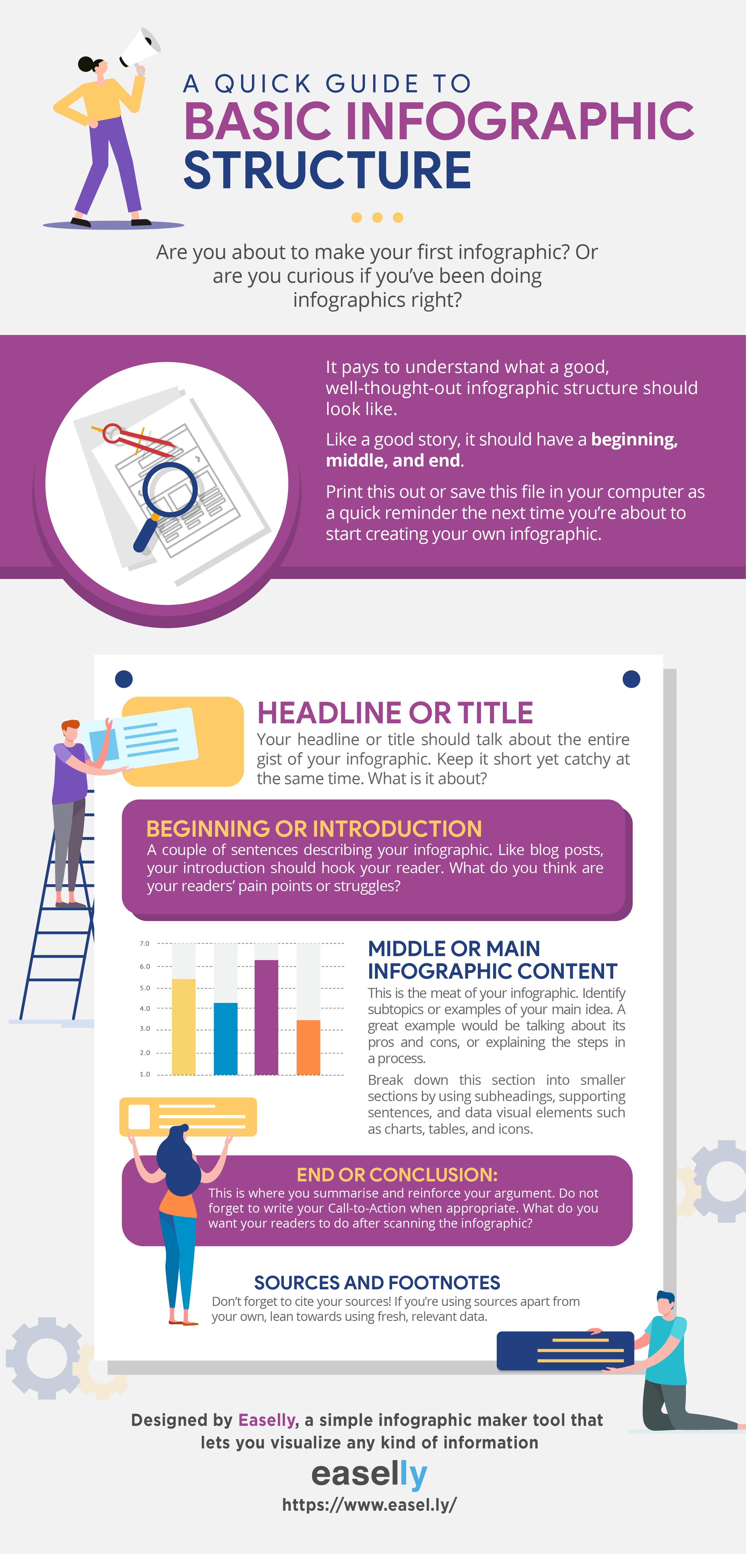
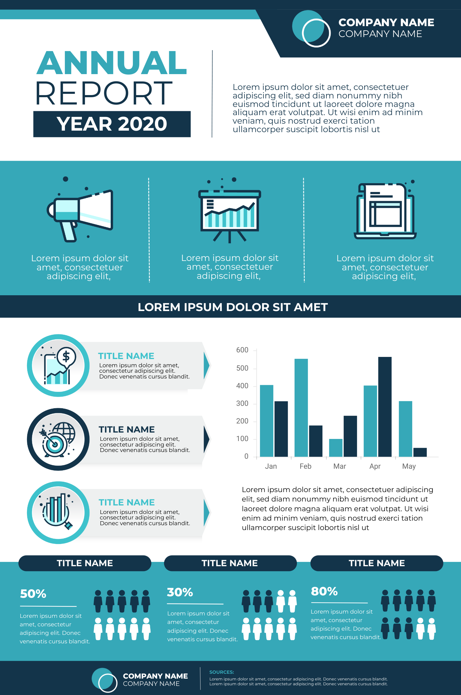
The basic infographic structure has the following components:
- Headline or title
- Beginning or introduction
- Middle or main content
- Conclusion or your call-to-action
- Sources
Finally, it’s worth noting that infographics are one of the most socially shared forms of content. They’re also versatile — marketers use infographics to improve website authority while teachers use them for almost any subject.
With that said, let’s get to the fun part – making your infographic using our free infographic maker tool.
Step 1: Get to know your target audience.
The first step is to understand your intended audience.
At this point, ask yourself the following questions:
1) Who is your audience?
Let’s say that you’re creating an infographic on how to manage diabetes through lifestyle changes.
Keep in mind that your potential readers are more than just “a 50 year old with diabetes”.
There are other variables to consider, such as familiarity with your infographic content and the amount of time they need to spend in reviewing your infographic to comprehend your message fully.
2) How will they see it?
Infographics can be used on a wide variety of platforms.
Are you going to make infographics for your Instagram profile, a news website, or your blog? Are you considering a leaflet or a poster in your school cafeteria?
3) What is the key message you want them to take away’?
After figuring out your audience persona and your preferred medium, identify the key messages you want to communicate in your infographic.
What do you want your audience to understand, think, feel, and do after viewing your infographic?
4) What are the key barriers to communicating your key message?
The most common barriers to communicating your message via infographic are lack of visual appeal, irrelevance of information presented, and the absence of information that will “surprise” or elicit a reaction from your audience.
For example, just because the infographic is based on a reliable source, it doesn’t mean that the viewer will always believe it.
It’s human nature for people to apply their own set of knowledge when considering facts. Some will combine their personal experiences with the data and will likely question the information you present.
People may also ask about your source or how your information was collected. A quick note saying ‘how we know’ in your infographic (like in the example below) may be useful to add.

Step 2: Collect, gather, and evaluate your infographic content.
When organizing your data and information, don’t just pull out “data for the sake of data.”
Find data points that will add value to your infographic.
Another important aspect of gathering reliable information for your infographic is to make sure that you get your information or data from trustworthy resources.
Here’s a quick list that you can use:
- Evaluate your information’s relevance.
- Assess the intent of your source.
- Check for fact vs. opinion.
- Double check the source links.
- Evaluate accuracy.
- Find vetted, reliable information offline like the library or interviewing experts.
Finally, think of writing infographic content as a lot like packing light. You have to nail the right balance between function and aesthetics when packing for a trip.
Likewise, you can’t put a whole essay on your infographic, but you have to make sure that you’re not missing essential information.
Use the video tutorial on writing infographic content below to help you choose the right words and phrases the next time you’re designing an infographic.
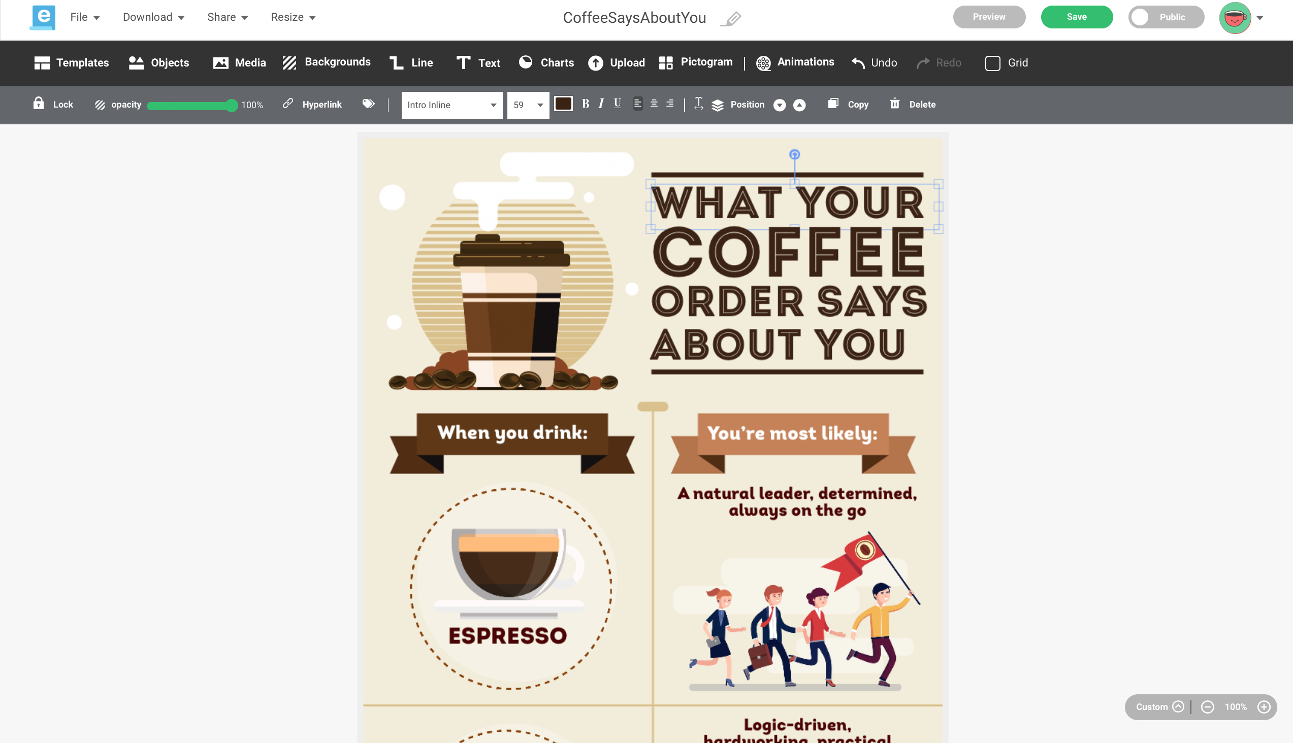
Step 3: Pick an infographic template.
You don’t have to download software on your computer so you can make an infographic.
Infographic maker tools like Easelly are web-based (this means that you can do it right in your computer browser!).
Once you’re logged in, you will find thousands of professionally-designed infographic templates.
Customize these templates with charts, images, icons, illustrations, and animated objects. Adjust font sizes or change your colors.
Here’s a short video tutorial on how you can customize infographic templates using Easelly.
Now, you’re probably wondering if infographic templates will undermine your creativity.
Here’s our take on it — templates do not stifle creativity and can even give it a boost.
Creating a new infographic from a template means making something new despite limitations in time, resources, and the infographic elements itself. It’s what creativity is all about, right?
Before you get started on your infographic creation using a template, it pays to take a closer look at the different types of infographics.
Visual infographic
Use this format to make a piece of writing or boring report more visual.
Map infographic
Use this format if you plan to share and present data trends based on location.
List infographic
This is suitable if you want to support a claim or explain a process through a series of steps.
Comparison infographic
Pick this infographic format if you want to highlight or compare two ideas, concepts, and objects.
Statistical infographic
Choose this format if you want to make facts and statistics more engaging and shareable.
Flowchart infographic
Use this infographic type to offer specialized answers to a question or highlight how multiple scenarios can reach the same conclusion.
Timeline infographic
Pick this infographic format to share information chronologically. This could mean showing how something has changed over time or explaining how one thing leads to another.
Infographic resume
Make yourself hireable with an infographic resume. Choose this infographic format if you’re looking for ways to stand out from other job seekers.
This format is ideal for job seekers in the creative industry or non-traditional fields such as startups.
Process infographic
Use this infographic format if you want to break down a complex process into digestible nuggets of information. Think of this format as a distant cousin of the flowchart infographic.
Animated infographics
Choose this infographic format if you want to engage your audience through motion and movement. This is also ideal if you want to showcase a specific section in your infographic.
You don’t have to try everything!
The goal here is to understand when to use a specific format, and identify the right design based on your current infographic needs and requirements.
Step 4: Choose your infographic colors carefully.
Your infographic’s color scheme is more than just about making your infographic visually appealing.
Besides capturing your audience’s attention and making it stand out, the colors that you pick for your infographic also help highlight different data sets and their relationship with each other.
Finally, your infographic colors can also impact your infographic’s readability.
Take note of the following best practices when working on your infographic colors:
- Be mindful of color associations that may be culturally specific.
- Avoid overwhelming the viewer with many colors as it can distract your audience. Restrict your color palette to 3 primary colors and 2 secondary colors that are used sparingly.
- Use white space.
- Use colors that will match the overall mood that you want your infographic to convey.
- Consider the 60-30-10 rule in interior design.
Watch the short tutorial on picking the right infographic colors below.
Step 5: Pay attention to your headings.
Next to your color scheme, the infographic heading is also an essential element in your infographic.
Your main title and subheadings should be large in scale and high in contrast. Consider adding a decorative element to your heading so that it stands out from the rest of your infographic background.

Step 6: Align your infographic elements.
Taking care of alignment is a crucial step when designing infographics.
It enables you to make the different infographic sections to form a harmonious whole.
How do you do this?
Imagine having a grid — a series of invisible lines that help your infographic elements line up. Text and visual elements should line up with each other along the grid.
Another tip is to create a set of boxes (as shown below) that line up. You can use these boxes to act as placeholders for your content.

It’s worth noting that a zigzag layout in infographics has been shown in an eye-tracking study to help promote viewer comprehension and with less cognitive load.
Step 7: Highlight the most important parts of your infographic.
Ensure that there’s one section in your infographic that highlights your key message.
The most important parts of the infographic should still draw your audience’s attention, even with their eyes half-closed.
Write down key statistics using larger fonts or highlight them using a different color.
Eye-tracking studies reveal that people tend to focus more on the larger text summaries in an infographic rather than the small columns of text.

Step 8: Use imagery and charts carefully.
When using images, icons, animated objects, and illustrations in infographics, the golden rule is to ensure that these visuals enhance (rather than distract from) the data you’re presenting.
Too much embellishment will negatively impact reader comprehension.
Keep your charts and graphs simple. Stacked bar charts are likely to confuse. You can use them with a highly literate audience but should be avoided when speaking to a broader audience.
Several studies on visual design reveal that people prefer simpler sets of data in their infographics and didn’t enjoy ‘having to think.’
And then there’s the pie chart. They are generally suitable for highlighting percentages, but they cannot accurately portray exact numbers.
If your data is almost always the same percentages, a pie chart may not be the best option, as there isn’t enough of a striking difference to highlight the slices in your pie.
Pro tip: Label your pie chart segments carefully as it can be a challenge for your readers to figure out the exact value by only looking at an angle.
Recommended reading – Data Visualization Guide: Choosing the Right Chart to Visualize Your Data
Wrapping up
Now that you know that infographic creation doesn’t have to be rocket science, your next step is to make your own!
Before you share your infographic, watch the video below to discover 5 easy steps that you can do to improve your infographic.
Just one more thing before you get started — always think about providing value to your audience when creating an infographic.
Ready to make your own infographic with Easelly’s infographic maker?
Take a peek at our infographic template collection or improve your design chops with infographic video tutorials.