
B2B marketers don’t have it easy.
From legal to cloud engineering to manufacturing, creating B2B content can feel unsexy and less creative for a marketer.
Products and services can be too complex and filled with jargon, making them difficult to market.
The challenge doesn’t just end there.
According to a B2B marketers survey in 2020, some of the biggest obstacles in B2B marketing include uncooperative coworkers from other departments, stockholder interference, and lack of resources (time and money!) to put their content marketing plans to action.
Whether you’re the marketing director or chief content officer of a B2B brand, don’t be discouraged.
This guide will walk you through infographic ideas, best practices, and templates to create engaging (not dry and too technical!) visual content for your next B2B campaigns.
Why use infographics in B2B marketing
Before diving into the best practices for business-to-business infographics, it’s helpful to understand B2B and B2C marketing differences.
When you’re promoting a product or services to businesses, you’re appealing to their logic instead of the usual “appeal to emotions” in B2C.
Understandably, a B2B marketer would have to present facts, figures, and trends to the B2B consumer.
For these reasons, infographics tend to shine in B2B marketing.
Think of infographics as your allies to help you “Show, Don’t Tell” in getting your audience’s undivided attention.
From the increase in ROI that your software generates to the trends of your industry, there’s a lot of data that B2B marketers need to share with their customers, and infographics continue to be a great way to tell a story and visualize data.
Next, B2B purchases often involve a great deal of research, where the buyer spends more time looking up solutions and comparing options.
While some big-ticket B2C purchases have the same decision-making processes, the B2B consumer journey is often longer and may require more resources during the lead nurturing stage.
Like what resources?
An infographic is a great example!
Infographics are ideal pieces of content to help nurture leads through the B2B buyer’s journey because they can help get your point across quickly.
When you combine imagery and text, it’s easier to get your audience’s attention. In addition, charts with strong visual images are more likely to be remembered than their plain counterparts.
How to make good B2B infographics
As Ryan Skinner of Velocity Partners writes, there are good infographics and bad infographics in B2B.
Luckily, our infographic creation experience for B2B companies through our infographic design services has given us practical insights into designing high-performing infographics for the best b2b marketing campaigns.
We’ve narrowed down some of the best practices below, including infographic design templates that you can use.
You’ll soon be making and promoting infographics that will help you land new clients and retain your current ones!
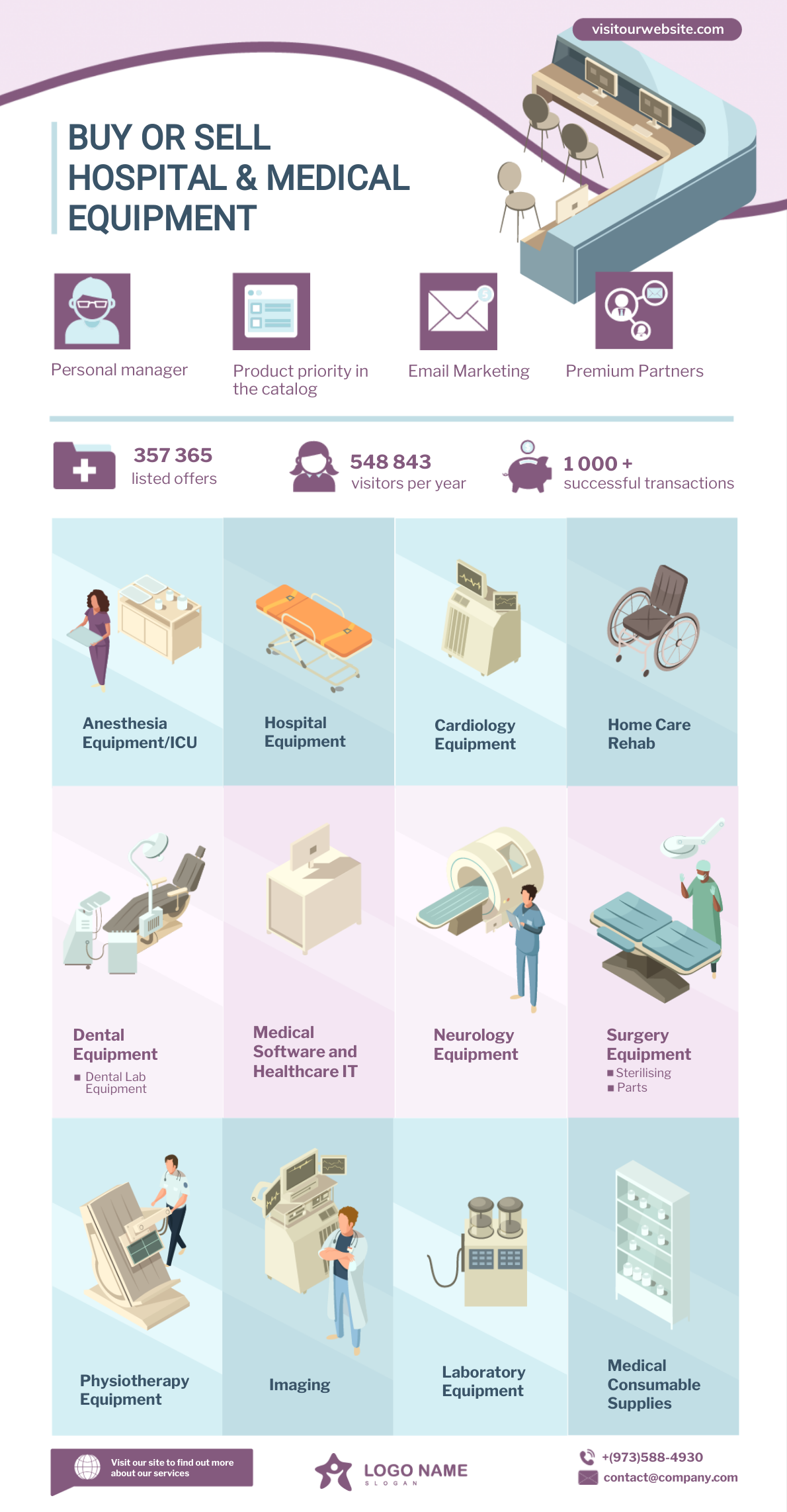
Go for vertical design to optimize the display of your story
A long, vertical infographic makes it easier for you to create a flow for your audience.
Meanwhile, an infographic that’s closer to a square than a rectangle may require readers to scroll sideways, then down, then sideways again.
A square infographic could also break the flow of the story you’re trying to tell.
For your next B2B infographic, make sure you use a horizontal design like most infographics.
Vertical infographics display much better on both desktop and mobile devices and are easier to make responsive. They also display much better on popular social media platforms like LinkedIn and Pinterest.
Take a look at the two infographics below – one is vertical while the other is horizontal.
Vertical infographic
Horizontal infographic
Which would you prefer?
With a vertical infographic, it’s easy to scroll (and keep scrolling).
On the other hand, the user has to enlarge the horizontal infographic and then zoom in to read the content. Depending on the device they’re on, they may even have to scroll left and right, which is not an ideal user experience.
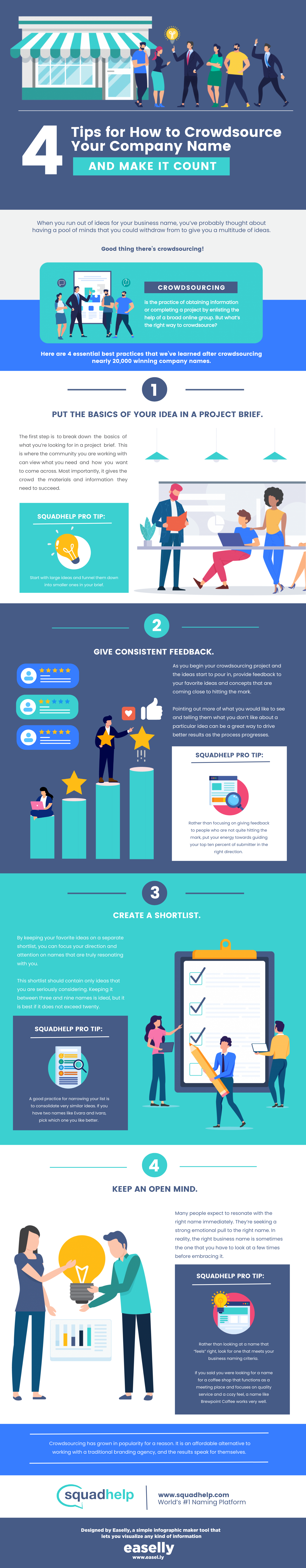
Stick to your brand colors
It’s exciting to play with different infographic color schemes and create colorful and eye-catching infographics that people will want to share on social media, but it is best to stick to your brand colors.
Using your brand-approved colors will ensure that audiences can tie your infographic back to your brand.
When creating multiple graphics for your B2B campaigns, it’s best to keep things consistent with maybe just a couple alternating accent colors to mix things up from image to image.
Squadhelp, a disruptive naming agency, made the infographic below using their brand colors.
Highlight data that’s easy to digest
It’s tempting to showcase all of the findings from a business case study in your B2B infographic.
However, it’s almost always not a good idea because your audience will only likely scan your infographic at first glance.
A better approach would be to choose some of the biggest takeaways to include in your infographic, and make sure that you don’t need to explain too much.
Make sure that your data sets go together well, too.
Your B2B infographic should aim to tell one story, not ten.
Choose multiple data sets that back up the title of your infographic, and ask yourself if each piece of information is telling the same story.
The infographic below is a good example of prioritizing the most important parts in your infographic.
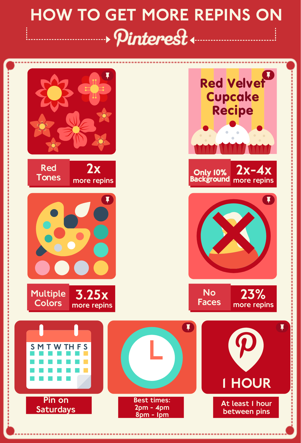
It clearly depicts tips and best practices on how to get more repins on Pinterest based on data.
The audience can quickly retrieve the information they are looking for without having to hunt for the answer.
Encourage your audience to share your infographics
The first step to encouraging people to share your infographics is to share it yourself.
LinkedIn is a popular place for B2B infographics, but Facebook and Pinterest are two other great options.
Depending on your company and your audiences, determine the best places to share your data and utilize social media management tools to gain exposure at the most optimal times of the week.
Another great way to encourage sharing is to create bite-sized graphics by cropping out sections or resizing your infographic.
Cropping will make it easier for your readers to share one piece of information and link back to the entire infographic.
No matter how you share your data (in pieces or as a whole), make sure that your brand name is always on the graphics you create (like the Verizon infographic below) to boost brand awareness and create positive associations with your brand.
Keep your charts and graphs simple
We live in the age of information overload, which means your audiences will continue to have access to all of the data they need with just the click of a button or the touch of a screen.
For this reason, it’s increasingly important to provide data in an easily digestible format like the infographic below.
In other words, keep your charts simple and be careful about over-embellishing them.
Make your B2B infographics with Easelly
Capture attention with business infographics, and drive traffic, leads, and conversions by following the aforementioned infographic best practices on B2B content marketing.
If designing from infographic templates seems impossible and you have other important things to do for your business, our infographic design service team will be delighted to help you and your team!
Editor’s Note: This post was originally published on April 13, 2018 and updated on October 14, 2020.
This was originally a guest post by Kelsey Reaves of Trust Radius and updated for accurancy and comprehensiveness in 2020 by the Easelly content team.
TrustRadius is a trusted site for B2B software reviews.