
As companies cultivate their brand identity, they must also define their personality, story, values, mission, and tone.
However, companies often overlook their visual brand identity that encompasses all of these core elements.
What is a visual brand identity and why it matters
A brand’s visual identity is the visible component of branding like your brand colors, fonts, and logo.
It is a reflection of your company and often the first aspect of your brand that will be noticed. It also critically impacts whether or not a customer will eventually purchase your product or service.
A consistent and distinct visual identity can help you stand out in a highly competitive marketplace. Especially now, when consumers’ spending behaviors have shifted dramatically, companies must be extra attentive to where and how they fit into the market.
Another challenge these days for brands is you must also stay attuned to changing news cycles and cultural sensitivities.
This means thoroughly researching, testing, and developing a visual brand strategy that truly speaks to your core customer.
Here are five compelling visual branding examples from companies and why they hit the mark at resonating with their audience.
1. Glossier
The beauty brand Glossier entered the market with rave reviews for its “no makeup” makeup products and skincare line.
Their minimalist ethos transcends from Glossier’s formulas to their packaging and branding.
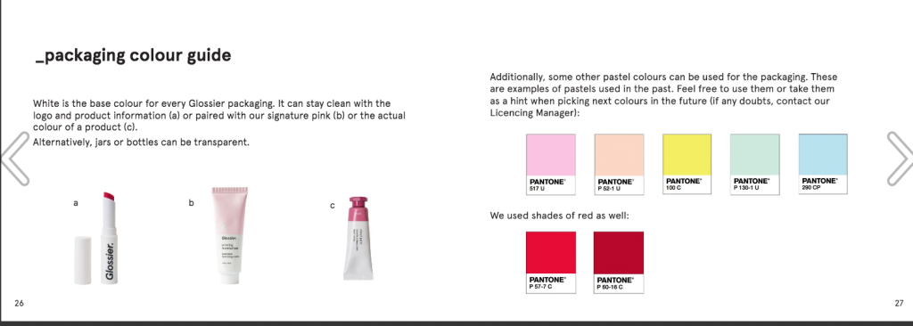
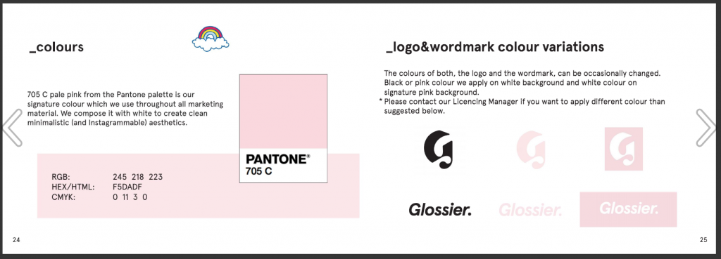
With its simple fonts and two-toned color palette, the visuals are inspired by the on-the-go New Yorker who is effortlessly cool at the same time.
Not only has the brand solidified its visual identity, but it also created a community of loyal Glossier enthusiasts who stock up on brand hoodies and mugs in addition to their products.
2. Oatly
The dairy alternative trend is growing in popularity, and Oatly is becoming a prominent brand leading the charge. The oat-based beverage’s bold font and illustrations with striking thick lines represent the company’s daring ambitions.
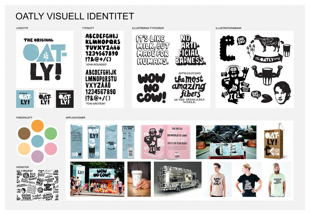
One notable difference is that Oatly decided not to make the packaging clear, as many beverage companies do. By breaking this convention, they hoped that customers would resonate with their brand’s mission to shift mindsets and innovate the non-dairy industry.
3. Casper
As the bed-in-a-box trend continues to hold strong, Casper has stood out from the competition with memorable and relatable branding.
The company’s light-hearted tone and messaging are echoed throughout its marketing materials. The overlapping shapes and tight palette of complementary colors are both calming and playful.
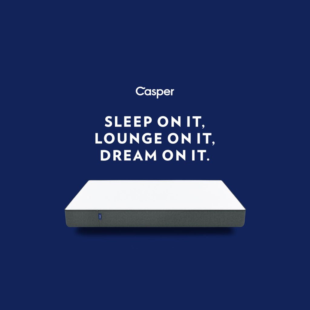
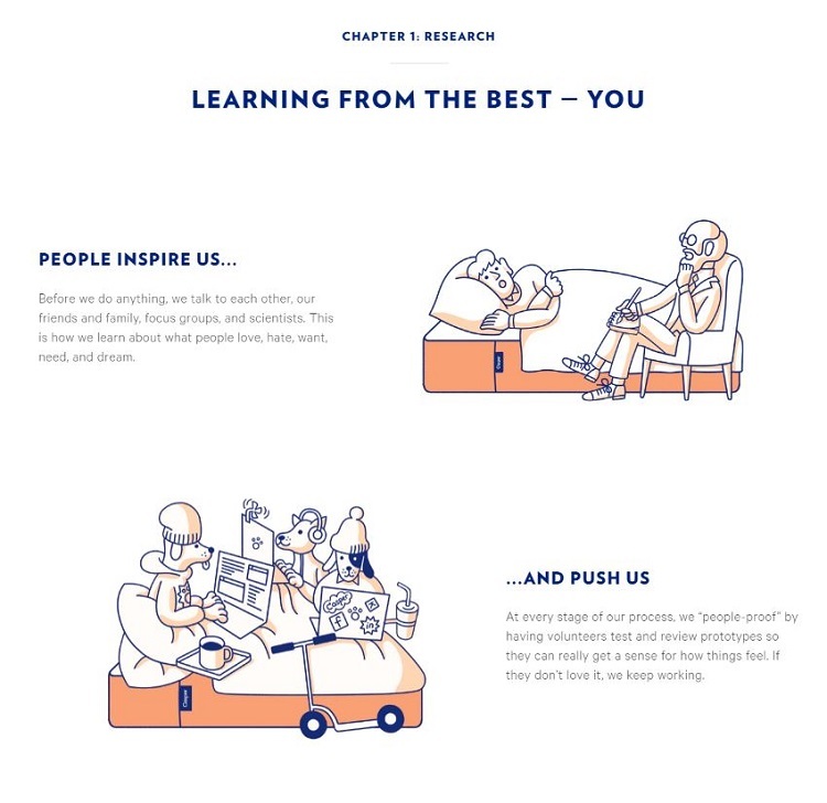
Caper’s visual identity is guided by the idea that purchasing a mattress doesn’t have to be a dull experience. Instead, the brand’s rosy imagery suggests that the formerly mundane task has been updated to an easy and enjoyable to-do.
4. Peloton
Since the beginning of quarantine, Peloton has skyrocketed in new members because it offers a safe alternative to the gym.
The on-demand fitness studio has a recognizable logo resembling both a “P” and a spin bike.
Although the brand continues to expand its offering from strength-training to yoga classes, the visuals still pay homage to its beginnings.
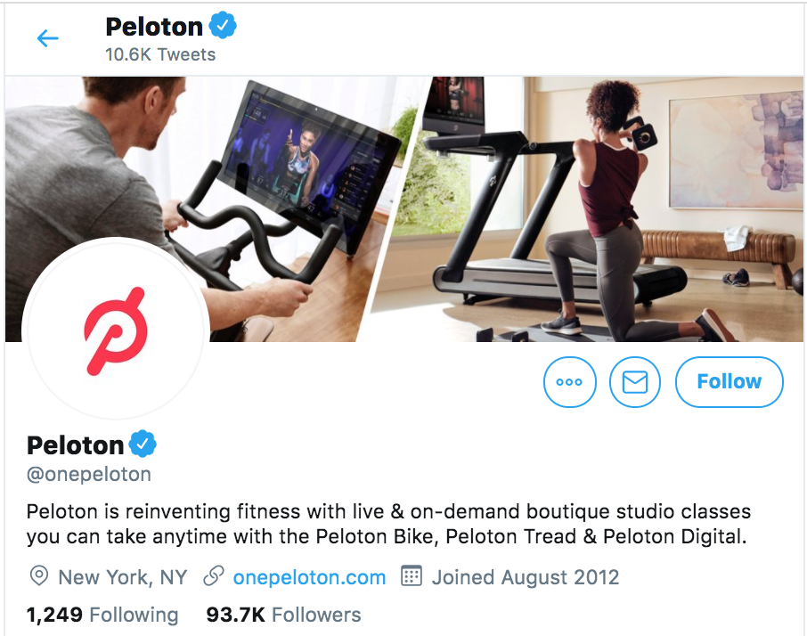
In addition to their instructors’ images, Peloton embraces user-generated photos across social platforms to demonstrate their mission of using technology to connect the world through fitness.
5. Bumble
Bumble is the first dating app where females are empowered to make “the first move.” But what also makes this brand stand out from others is its total commitment to its visual branding.
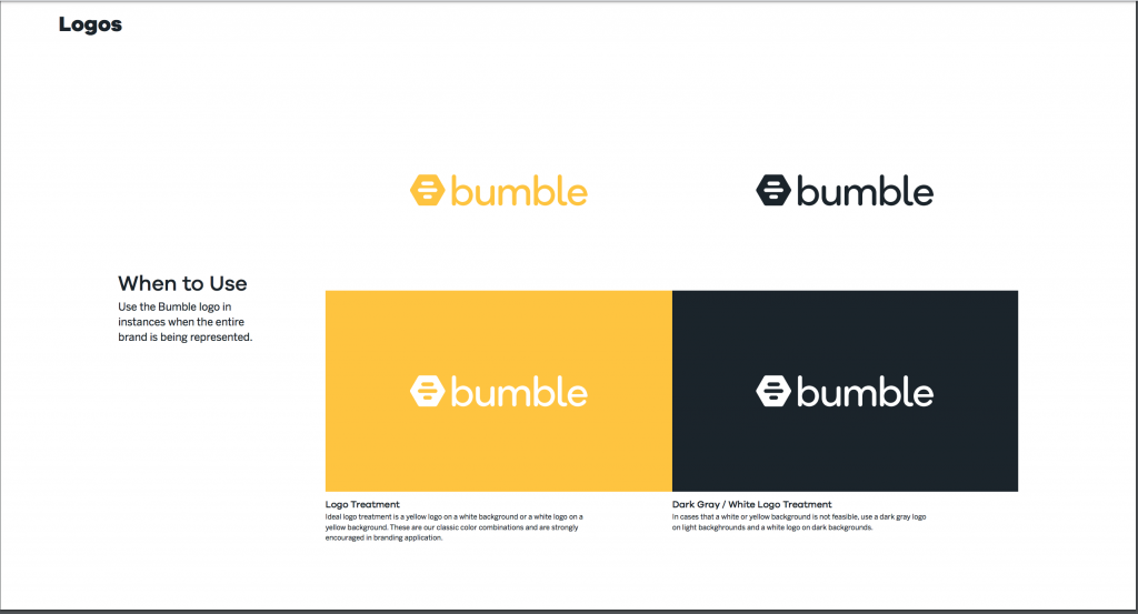
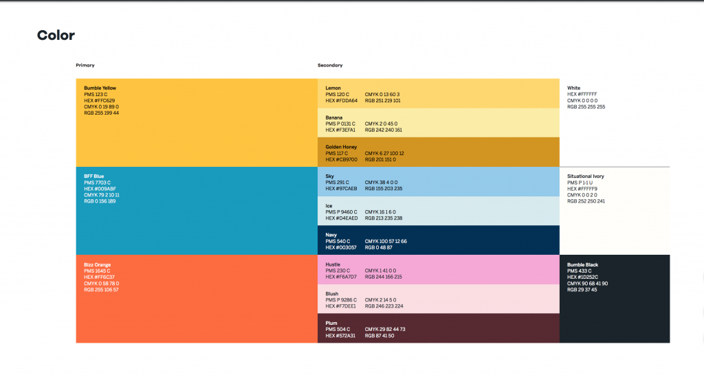
A sea of yellow with white and black font dominates its marketing materials and even its app design. There is more to this color scheme then adhering to that of a beehive. The brand’s primary color of choice also evokes emotions that includes optimism, imagination, and communication — all great qualities in both a dating app and a date.
The Takeaway
If you’ll notice, what all of the brands we’ve mentioned have in common is the consistent implementation of a strong visual identity that highlights each company’s values and goals.
From logo design to the strategic use of color psychology, these leading brands can easily be recognized in their respective markets.
With the right amount of planning for your visual branding strategy and sticking to it consistently, your brand will stand out and even cultivate a thriving community.
Still unsure on how to get started with your visual brand identity?
This guide is for you — how to build a unique visual brand identity through crowdsourcing.
Editor’s note: This guest post comes from Grant Polachek of Squadhelp.
About the Author
Grant Polachek is the Head of Branding at Inc 500 company Squadhelp.com, the worlds #1 naming platform, with 25,000+ customers from early-stage startups across the globe to the largest corporations including Nestle, Philips, Hilton, Pepsi, and AutoNation. Get inspired by exploring these winning business name ideas.