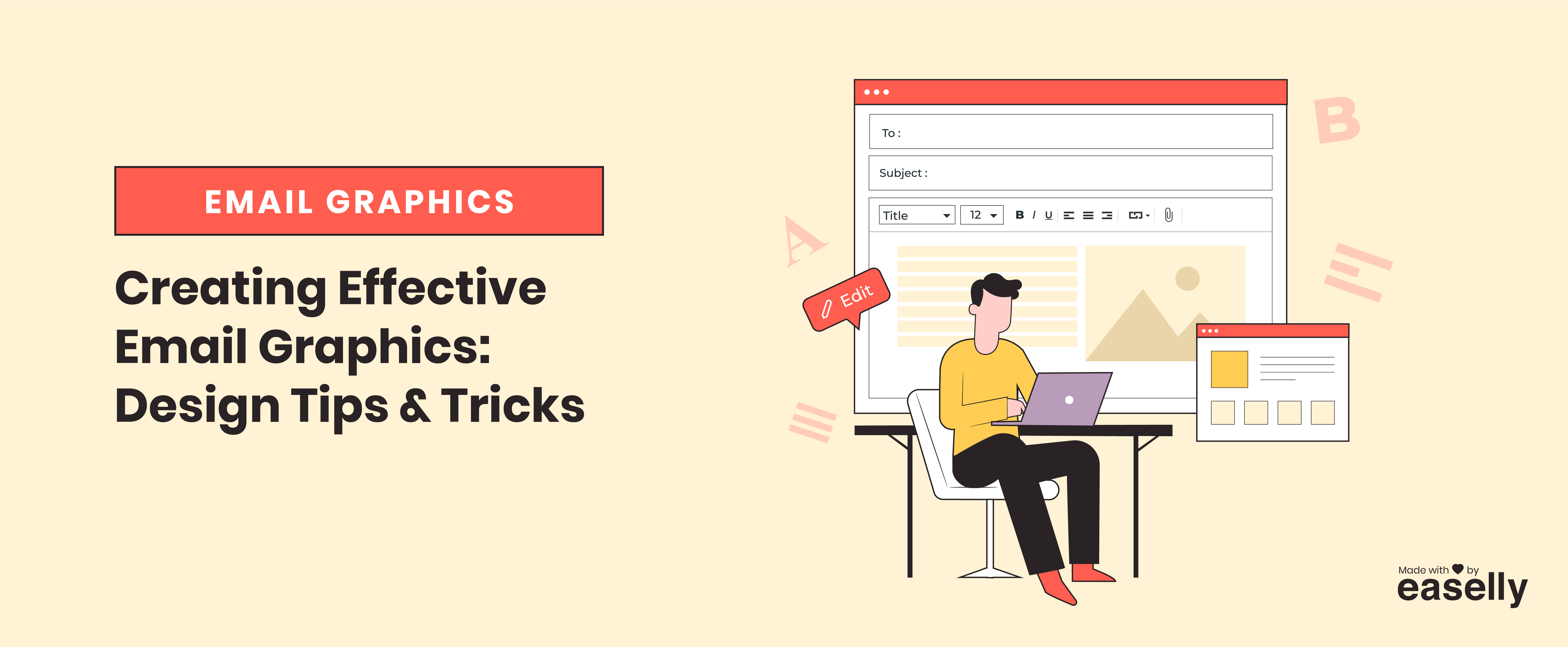
Have you ever wondered how people create those amazing-looking graphics for their emails? Or maybe you’re just starting to design your own and could use some tips?
This blog post is for you! In it, we’ll walk through a few basic design principles that will help make your graphics look sharp and professional. Plus, we’ll share some helpful tools to get started. Let’s get to it.
The Design Elements You Can Use In An Email
When you’re creating a graphic for an email, you can use a few design elements to make it look its best. Here are a few of the most important ones:
Videos
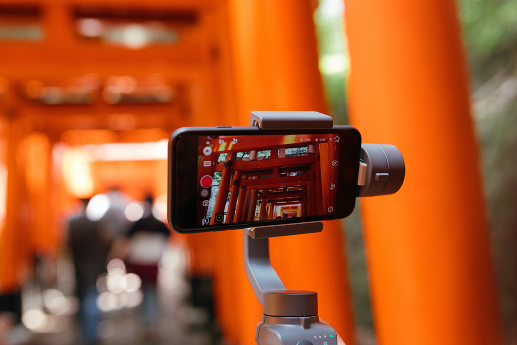
Videos are a great way to add interest and engagement to your email. In fact, readers are 6% more likely to open your email if it has the word “video” in the subject line. Additionally, videos can help increase site traffic, which can impact SEO.
Nevertheless, keep in mind that too many videos in an email can be overwhelming and cause people to unsubscribe. So, it’s important to use videos thoughtfully and sparingly. They should be short (less than 2 minutes), relevant, and offer value to the reader.
You can use video to:
- Showcase a new product or service,
- Demonstrate how to use your product,
- Deliver a message from the CEO or founder, and
- Share customer testimonials
If you’re going to use video in your email, make sure the file size is small enough that it won’t take too long to load. You should also include a thumbnail image of the video with a play button so that readers know what to expect.
Tips and Tricks:
1. Keep videos short and sweet.
2. Use engaging thumbnail images.
3. Make sure file sizes are small.
Static Images

These types of images are another great way to add interest to your email. You can use them to highlight a new product, illustrate a point, or simply break up a text.
When choosing images, it’s important that you use high-quality, professional photos. Blurry or poorly-lit pictures will make your email look unprofessional and also turn potential customers off.
You must also use images that are relevant to your email’s content. Don’t just add pictures for the sake of adding them — make sure they serve a purpose.
Tips and Tricks:
1. Use high-quality, professional images.
2. Make sure to export images as a JPEG or PNG file.
3. Choose images that help tell a story.
Animated Images or GIFs

Moving images add some fun and personality to your email. They’re a great way to show off a new product, highlight a sale, or add some visual interest.
Litmus reported that 57% of email marketers sometimes used GIF thumbnails back in 2018. Since then, this trend hasn’t changed much, so we’ll likely continue to see more GIFs in email marketing campaigns.
You can use GIFs to:
- Showcase a new product,
- Highlight a sale or special offer,
- Add some personality to your email, and
- Make your email more visually interesting
When using GIFs, it’s important to keep them short and sweet. No one wants to wait for a long, drawn-out animation to load. Additionally, make sure the file size is small so that your email doesn’t take forever to load.
Tips and Tricks:
1. Use a free online GIF maker like Giphy or Imgflip to create your own GIFs.
2. Search for free, high-quality GIFs online (e.g., Unsplash)
3. Make sure the file size is small, and the animation isn’t too long.
Dynamic content
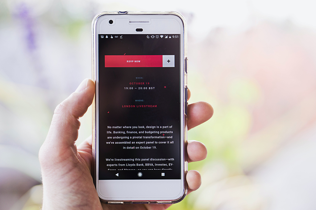
This is a type of content that changes based on factors like the user’s location, device, or interests. You can use this to personalize your email and make it more relevant to the reader.
For example, if you know that someone is opening your email on their phone, you can include a mobile-friendly CTA. Or, if you know that someone is interested in a certain product, you could incorporate content about that product in your email.
You can use dynamic content to:
- Personalize your email,
- Make your email more relevant to the reader, and
- Increase click-through rates
When using dynamic content, though, it’s important to ensure that the information you’re including is accurate. You don’t want to show someone content that isn’t relevant to your readers, as this could frustrate and cause them to unsubscribe.
Tips and Tricks:
1. Use an email service that offers dynamic content (e.g., Mailchimp, Constant Contact)
2. Test your email with different types of content to see what works best.
3. Monitor your click-through rates to see if dynamic content has a positive impact.
Infographics

Because they’re easy to digest and visually appealing, infographics are a great way to add some interest to your email. You can use them to explain a complex concept, show off some data, or simply add some visual appeal.
When creating an infographic, make sure to use high-quality images and graphics. Remember, your goal is to add interest to your email, not make it look like a child’s school project.
Additionally, include a call-to-action (CTA) on your infographic. You want people to be able to click through and learn more about the topic you’re discussing.
Tips and Tricks:
1. Avoid using too much text — focus on visuals instead.
2. Always include a CTA.
3. Ensure that your infographic is mobile-friendly.
The Design Elements That Help You Design Email Graphics
Now that you know what types of email graphics you can use, it’s time to start thinking about the design elements that will help you create them. These include things like fonts, colors, and layouts.
Fonts
Everyone loves fonts that are easy to read. Think the likes of Arial, Verdana, or Trebuchet. They may not be the most exciting fonts out there, but they’re functional and get the job done.
When choosing a font for your email graphics, make sure it’s easy to read, large enough to be seen on a mobile device, and consistent with the overall tone of your email. You don’t want to use a playful font if you’re trying to convey a serious message.
For example, if you’re using an image of a product, you might want to use a sans serif font like Arial or Helvetica. These fonts are clean and modern, which can help convey the message that your product is high-quality and up-to-date.
If you’re using an infographic, on the other hand, you might want to use a more playful font. This will help add some interest and personality to your email. A good example of a playful font is Comic Sans.
Whatever font you choose, make sure it’s easy to read and in keeping with the overall tone of your email.
Colors
The colors you use in your email graphics are important, as they can help set the tone and convey the message you’re trying to get across.
If you want to convey a message of excitement or energy, you might use brighter colors like red or orange. If you’re trying to share a message of calm or relaxation, on the other hand, you might use softer colors like blue or green.
You should also consider the color of your product when choosing colors for your email graphics. For example, if you’re selling a product that’s red, you might want to use complementary colors like blue or green in your email. This will help make your product stand out and be more visible to potential customers.
Colors have psychology behind them. Do some research on color theory before finalizing your email’s color scheme, as this will help ensure that you’re using the right colors to convey your message.
Layouts
The layouts are just as important as the colors and fonts you use in your email graphics. A good one will help ensure that your email is easy to read and that people can find the information they’re looking for quickly and easily.
Remember that less is often more. You don’t want to include too much information in your email or make it too cluttered. This will only make it more difficult for people to understand and cause them to unsubscribe from your list.
So, what’s the best way to layout your email graphics? There’s no one-size-fits-all answer to this question, as the best way to structure your email will depend on the type of email you’re sending and the message you’re trying to convey.
In general, though, you should keep your email as simple and uncluttered as possible. Stick to one or two fonts and a limited color scheme, and use plenty of white space to break up your text.
It would also help to consider using a grid system to layout your email. This will help ensure that your email is well-organized and easy to understand.
Final Thoughts
Email graphics are a great way to add visual interest to your emails and make them more engaging. Keep these design tips in mind when creating email graphics, and you’ll be on your way to creating email graphics that are both effective and engaging.
For more email graphics design and templates, reach out to us at Easelly. Our platform offers thousands of high-quality email templates and graphics that you can use to create beautiful and effective emails. Request a demo today to see how our platform can help you create stunning and effective email graphics that convert!