
One Trick to Maintain (and Win!) Email Subscribers
Is your email marketing campaign feeling a little stagnant? Do you have a high unsubscribe rate, or are you just lacking subscribers in the first place? Every campaign goes through its ups and downs naturally, but in order to start retaining your email subscribers and converting more than ever before, there’s one vital tool you may be leaving out: email infographics.
Infographics are incredibly versatile in the world of marketing. Th
Why Use Infographics in Your Emails?
What are your email open rates? How many people click-through your emails to landing pages and links you have embedded in your emails? How many sales come as a result of your email campaign efforts? All of this data will show you why you need infographics, so make sure you’re gathering the info you need!
The cold hard facts:
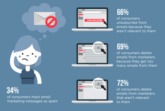
The average open rate for an email can range from 15 to 25%, depending on the size of a business’s following and the niche market they are situated in. To make things worse, 34% of subscribers will mark your emails as spam if you don’t hit the target in your campaigns. And, as you’ve probably heard us mention from time-to-time, the average human attention span is now only 8 seconds – that’s less than a goldfish!
If you’ve only got 15-25% of your subscribers even opening your emails and another third potentially marking them as spam… What are you going to do to keep subscribers from opening, scrolling through, and then deleting your emails before they can even register what you’ve got to say? Catch their eye!
Email Infographics Get the Message Across Faster and More Effectively
Your emails are meant to pass along vital information about your message, brand, service, or product to your audience. They’re also designed to get more interaction, more conversions, and even more sales for your business. But instead of typing long-form emails (which don’t get read), why not insert some of that information into an infographic?
When you use infographics instead of pages and paragraphs of text in your email campaign, you’re:
- Engaging your readers’ eyes – Eye tracking studies indicate that subscribers skip the intro and most of the smaller text in your emails, scanning for only what is most relevant to them.
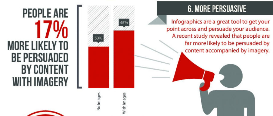
- Encouraging action – Subscribers are more persuaded by clear, relevant visuals and Calls to Action in lieu of straight text.
- Breaking it down – People want to get the jist of your message without having to process through your story, your data, or your bad jokes (sorry).
To top that off all, infographics are the fastest way to get people to remember what you’ve shared in your email.
Infographics are:
- Recognized within 13 milliseconds
- Processed 60,000 times faster than text
- Easily remembered – up to 65% recall 3 days later!
So really, it’s no wonder that your long form, non-visual emails aren’t exactly hitting it out of the park with your subscribers. But where you do you go from here?
Things to Keep in Mind When Using Email Infographics
Content marketers are known for creating massive amounts of content and then inundating their audience with it. Don’t make their mistakes! While it can be great to have a plethora of infographics to use in your email marketing, you also need to focus on three things:
- The quality and design efforts you put into your infographics
- Finding relevant content for your infographics
- Using just the right amount of images in your emails
Finally, it’s time to start using infographics in your email campaign!
Step-By-Step Guide to making your first Email Infographics
So you’re convinced. You’re ready to get going with your first ever email infographic, but where do you start? A quick look online is more than likely going to overload you with information. Everybody has an opinion on the best way to go about make up an infographic but it is incredibly simple, especially when using
We’ve prepared a guide in a previous blog giving you a step-by-step guide to creating high quality, impactful infographics. Heres a more condensed version, specifically targeted towards creating email infographics.
1. Consider your target audience
Many people would think that you need to lan to your content first and foremost. That’s a common mistake in the world of marketing.
The most important thing when creating any marketing content is considering who it’s for. Whilst we may think that our content is incredible and people are lucky to have the chance to read whatever we put out, I guarantee this isn’t the case. You aren’t making your content for you. It’s vital to consider who your target demographics are, what content they expect from you and what message you want them to take from the email. It doesn’t matter how aesthetically pleasing the email is, if the message isn’t right then there’s just no point.
The key to getting your desired engagement for email relies heavily on getting this first step right so commit to researching and planning this properly.
2. Collect, Gather and Evaluate Content
Now we get down to the real nitty gritty of it all. It’s time to hit the books and gather up all the content you need for your desired topic. The biggest hurdle in this step is learning to avoid pulling out data just for the sake of it. It might make you feel smart but honestly it doesn’t always translate well in your infographic.
Think of what you want your infographic to say, then gather up content and research from reputable sources. Once you’re happy with the research sit down and evaluate each piece of information. Learn to be cutthroat here. Making a quality infographic is a lot like packing for a holiday. You need to find the balance between packing light and being functional. You need to mix in aesthetics and functionality without overloading your reader with pointless facts.
The video below should help explain all of this;
One last piece of help we’ll give you here is a handy checklist our own team uses when evaluating information:
- Evaluate your information’s relevance.
- Assess the intent of your source.
- Check for fact vs. opinion.
- Double check the source links.
- Evaluate accuracy.
- Find vetted, reliable information offline like the library or interviewing experts.
3. Pick out the best template to get the job done.
So you have your audience locked on and you know everything there is to know about your topic. The next step is to take your curated content and work out how you want it to look. Are you going to be using charts, diagrams or animations? How much text is too much text? How many images should I use?
If all those questions gave you a bit of a shudder, don’t worry. Easelly has you covered. We have loads of great templates at the ready and you should be able to find one to fit your needs “easelly” enough (haha!)
You can browse our free templates here but if that’s not enough then you should consider upgrading to Easelly Pro. There you can find thousands more templates and icons to give yourself a good head start. Don’t worry though you can absolutely get the job done on our free template maker.
4. Let’s talk color scheme
Another important factor to consider is the color scheme you want to use throughout your infographic. We’ve made blogs and videos about this in the past but the best advice we can give is to follow this list of considerations.
- Be mindful of color associations that may be culturally specific.
- Avoid overwhelming the viewer with many colors as it can distract your audience. Restrict your color palette to 3 primary colors and 2 secondary colors that are used sparingly.
- Use white space.
- Use colors that will match the overall mood that you want your infographic to convey.
- Consider the 60-30-10 rule in interior design.
5. Customise, Organise and Proof Read
Now that everything is taking shape it’s time to get it all together and organise into a coherent infographic. Align all of the elements in your template. Ensure you’ve added enough of your own branding and a firm call to action. After all what’s the point of putting together this fantastic email if your target audience don’t know what to do with it!
Once you’re happy with your layout and information it’s time to go back through everything with a fine tooth comb. Send it to a friend or colleague and take a good look. You aren’t just looking for spelling errors. You need to be ruthless. If any information isn’t relevant or any elements don’t look good then cut them.
If you’re graphically challenged and you just can’t get this to work for you then there is another more painless way. For the low price of $59 we’ll do it all for you!
Email Infographics for your Campaign
Are you seeing a decrease in subscribers or having trouble finding subscribers? Unfortunately our audiences have pretty complex tastes. If you’re overdoing it, or you’re letting subpar quality content slip through the cracks, they’re going to start noticing. The most important tip to remember for using infographics in emails? Make sure they’re necessary.
Now, if you’re at a loss for how to incorporate infographics into your email marketing campaigns, consider:
- Turning a long-form email into an infographic
We all have those high performance pieces of content that we’ve spent days of research and work on. It could be blog, YouTube video or even an ebook. Take the whole thing or a section of it and repurpose it into a targeted email infographic!
- Highlighting points in your email with your own data
- Creating a signup infographic
Parting Wisdom
Generally speaking, you can play around with what works best with your subscribers. Odds are, they’ll start interacting with you as soon as you start utilizing this awesome tool. But don’t overdo it with the images, and keep them in the wheelhouse of your brand (use logos, color schemes, fonts, etc. that are synonymous with your brand).
If you’re worried that infographics are “too difficult” or might not translate well in email, remember that people seek out infographics all the time – 800% more than they did in 2012! Infographics are also way easier than long form writing or creating a video, and more useable to boot. Infographics don’t require embed codes to “play” and they’re great for mobile email, as opposed to video, which can be hard to embed into the body of your email and may not load.
Ready to grow your email list and your business? Get started making great infographics from scratch, or use our templates to get you going!
Then let us know how it’s working for you!
Still unsure where to start? Why not let us handle it for you? For just $59 you could have a professionally designed infographic in your hands within 48 hours!