8 Design Principles to Improve Your Conversion Rate
Like any profession, designers rely on a set of rules to create visually attractive content. You have design principles for architecture, interior design, paintings, websites, etc. Some of these principles cross every type of medium, while other rules are specific to certain mediums.
This article will review eight web design principles. We’ll cover things like color theory and contrast psychology, information hierarchy, visual clues, and more. Hopefully, you can apply some of these lessons to your work to Let’s dive into this guide.
- Color Theory & Contrast Psychology
Color theory is one of the most important design principles. It covers the visual effect of colors. You can use color theory to find colors that match, colors that contrast with each other, and more.
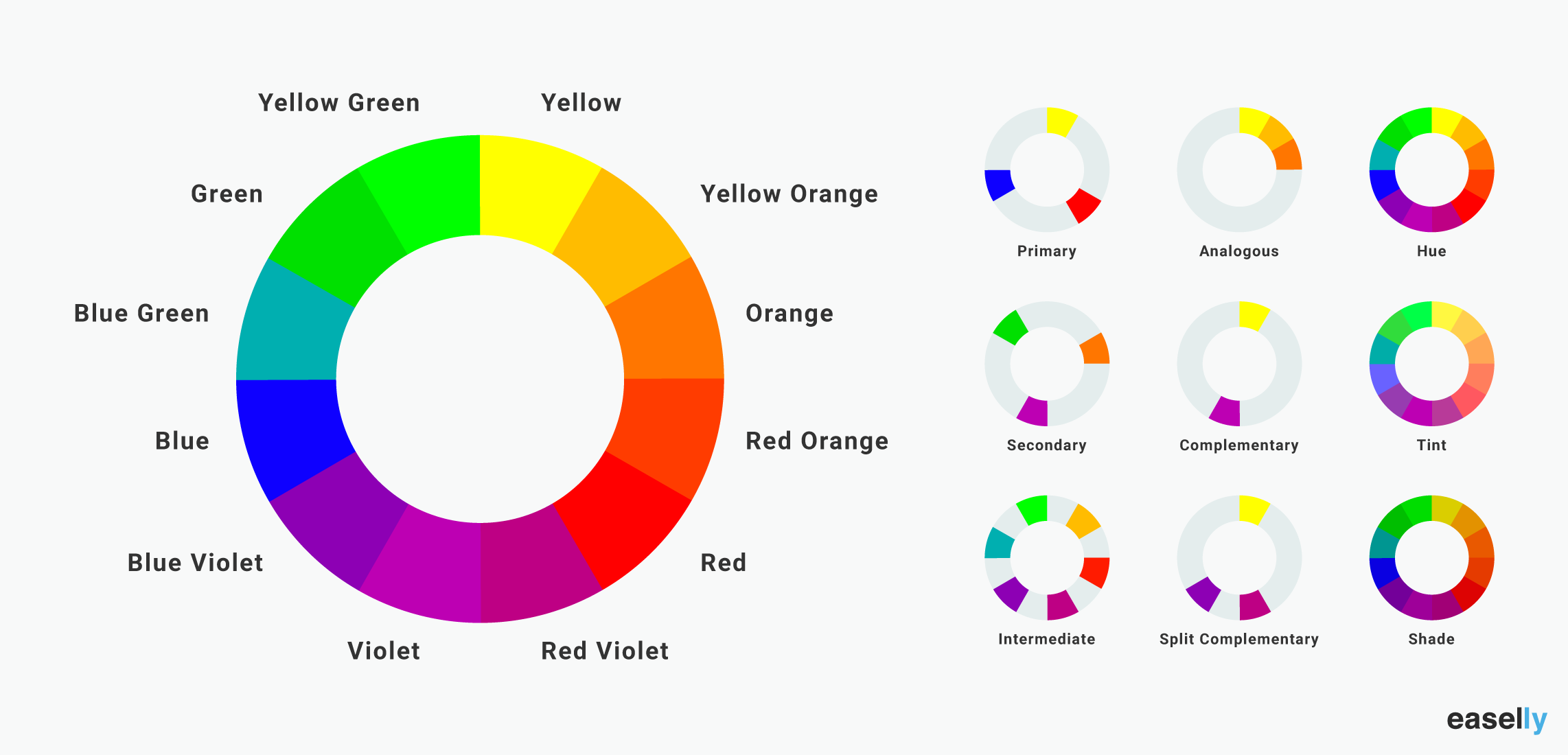
If you want to understand color theory, you need to understand the color wheel. The color wheel was created by Sir Isaac Newton in 1666. On a color wheel, colors are grouped into three categories. You have primary colors, secondary colors, and tertiary colors.

Source: Easel.ly
The color wheel looks deceptively simple. Colors seem to flow into each other. On one half of the color wheel, you have warm colors, and on the other half, cool colors.
Designers use color wheels all the time. I’ll highlight three ways you can use a color wheel.
First, there is the system of complementary colors. Complementary colors are always opposite each other. For example, orange and blue are complementary colors. Complementary colors have a striking contrast. When you use two complementary colors together, you’ll make a design that stands out.
You can also create a split-complementary color scheme. A split-complementary color scheme is where you use three colors that are opposite each other on the color wheel in combination.

Source: Pinterest
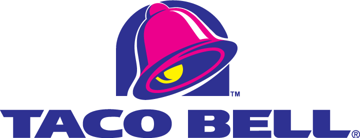
The Taco Bell logo is a nice example of a design that uses the split-complementary color scheme.

Source: 4Vector
You can see how they used violet-red, blue-violet, and yellow in combination.
It’s a striking image.
Next up, you have analogous colors. Analogous colors are three colors next to each other on the color wheel—for example, yellow, yellow-orange, and orange.

Source: Pinterest
With an analogous color scheme, one color will dominate, one color will support, and the third color will accent the design. Below is a nice example of a website design that uses an analogous color scheme.

Source: Crazy Egg
You can see how they used orange, a contrasting color, for the buttons. That contrast helps draw the eye to the “connect me” button. The contrast between the button and the background is striking.
Finally, you have triadic colors. Triadic colors are three evenly spaced colors that form a triangle on the color wheel. If you scroll back up to the original image, the “primary” colors – yellow, blue, and red – form a triadic color scheme.
Below is a nice example of a logo you might recognize that uses the triadic color scheme.

Source: Pinterest
The triadic color scheme creates a sense of contrast and harmony. The colors work well together, but there is sufficient contrast to make the image stand out.
Mastering the color wheel takes time. There’s a lot of information you need to understand. You should see how you can apply these principles to create a nice-looking website or attractive marketing materials. Equally, you can use the color wheel to make your call to action stand out, improving your conversion rate.
2. Consider Information Hierarchy
Information hierarchy plays a vital role in design and copywriting. The logic and principles underpinning information hierarchy are quite straightforward. If you want a person to take action, your copy needs to cover the four W’s; who, what, where, and when.
Let me give you an example of information hierarchy in action.

The screenshot above is from a landing page on the GetResponse site.
The first thing a person landing on the page will see is the menu. Below the menu is the main headline. The headline contextualizes the offer on the page. The headline also sets the expectation about what to expect – Autoresponder Emails.
Below the headline, you have the copy. The website copy contextualizes the offer on the page. The message we’re sharing with our readers is the following; “autoresponders are important. It’s easy to set up automated emails with our software.”
Finally, above the fold, you have the main call to action – Try Free For 30 Days.
The following article provides more information about how to design a high-performing landing page.
A powerful visual hierarchy of information will naturally guide visitors. The flow of information in your hierarchy is essential. You will increase your conversion rate when you place a call-to-action at the point when your visitor has all the information they need.
Establishing a good information hierarchy will have a huge impact on your conversion rate. It is a vital element to get this right. Let me share a case study by VWO as an example.

The image on the left is the original homepage. The image on the right is the new design. Improving the visual hierarchy on the homepage led to a 35.6% increase in online sales. You can use an information hierarchy for infographics, websites, and more.
3. Remember Visual Patterns
Many factors play a role in the way we consume information. For example, if you speak English as your first language, you’re used to reading information from left to right. If you speak Japanese, you read information from right to left.
When you design a menu for your website, you should create an information hierarchy that follows the way we consume information. The most important information should be on the left of your menu.
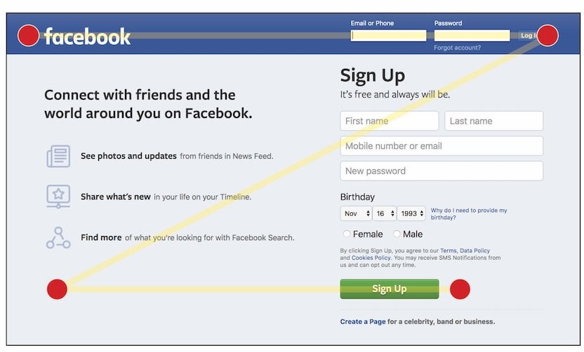
The old Facebook homepage is a nice website example of a website that combines the Z-pattern with a logical information hierarchy. Check out the screenshot below to see what I mean.

Image source: Blue Frog DM
The login input fields for existing users are on the right side of the menu. The headline and key bullet points are on the right, and the signup information for new users is on the left.
We naturally follow this pattern when we look at content. We look at the top of the page for important information. Afterward, we scan down and across the bottom of the page. The placement of information on this page aligns with the way we consume content.
Another visual pattern you should be aware of is the F-pattern. The F-pattern is used for content-heavy pages. A prime example of a design that accounts for this pattern is the search results page of Google.

Image source: Blue Frog DM
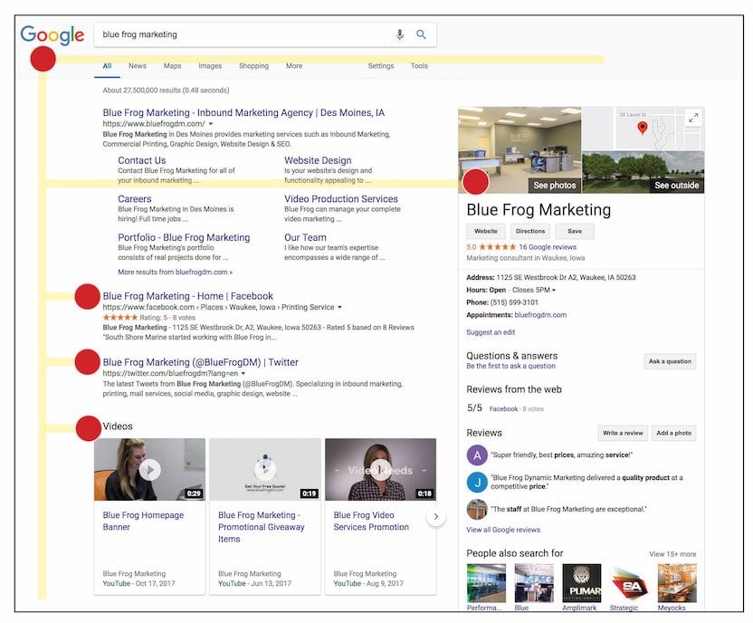
The F-pattern follows the way we read blocks of text. You might want to use the F-Pattern when designing:
- A blog post
- A resource page with a lot of information
- A landing page with multiple topics
If you are following the F-pattern, you should place the important elements of your content in the top left-hand corner of the page. You can place your CTA and other important information on the top right of the page.
4. Create a Focus
When creating a piece of content, you need to consider how to create a focus. There are two things you should do to create a piece of content with a clear focus:
- Identify what it is you want to highlight
- Remove all the clutter that distracts your attention from this element.
Place the most important elements at pivotal places on your page. Then give those elements space to breathe. Taking this approach will ensure people focus on the right elements of your design.
There are numerous ways you can play with the elements on your page to create a focus. For instance, you can increase the size of your font relative to other elements on your page.

In the screenshot above, you can see how we used different font sizes on the page to draw attention to different elements. The font size follows the information hierarchy.
The headline is the largest font. Naturally, your attention is drawn to this first.
The sub-headline and bullet points are smaller but still prominent. So, you start by reading the headline, and then your eyes naturally focus on the sub-headline.
You can combine this design principle with color theory to draw attention to different elements of your design. We use two prominent colors on our homepage page. You have the blue, which highlights the model, the button, and the bullet point icons. Then you have yellow, which is used to highlight the headline.
5. Use Visual Cues
Our brains rely on visual cues and visual aids to help us understand a situation. For example, imagine you’re in the jungle, and a friend looks behind you and starts running away.
Regardless of your next action, you’d be reacting to a visual cue.
When you see someone looking at something, you’ll probably turn to look in that direction. You can take advantage of visual cues in your design. Let me give you an example.

Source: Neuro Web Copywriting
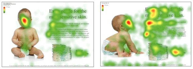
In the first image, the baby is facing the viewer. Naturally, you look at the baby; it’s the main element of the landing page. It also happens to be on the left-hand side of the page.
In the second example, the baby is looking at the headline. People who visit the website look at the baby, then immediately look at the headline. The visitors then read the copy and then look at the CTA.
When optimizing your design, use visual cues to lead your visitor to your call to action/conversion point.
You can use arrows and images to help focus the visitor’s attention on an element. Effective use of visual cues will help visitors know what they need to do. It’s an important design principle, especially when designing for conversions.
6. Hero Images & CTAs
The hero image is the primary image that customers see when they click onto a page. Your hero image commands the attention of your visitor. It needs to be relevant to the content on your landing page.
Below is a nice example of a hero image from a landing page.

The hero image is for an eBook by SEMrush. The hero image grabs the visitor’s attention. You know what you’ll get when you download the Free PDF.
A hero image should have the following characteristics:
- High-quality image.
- Show what you sell/ do.
Many sites that sell or give away digital products will create a hero image. The hero image of an eBook, for example, helps your visitor visualize the value of the content on offer. You can also use photos. In the example I showed before the eBook, the hero image was of a happy baby.
A good hero image will set visitors’ expectations for the rest of the page.
7. Include Social Proof Trust Signals
You see social proof used all the time online. Often, the social proof is in the form of testimonials or trust badges. They are used to help you generate trust with your audience. Three obvious examples of companies that rely heavily on social proof are Amazon, TripAdvisor, and Capterra. All three companies rely on impartial customer feedback to generate engagement and sales.
These businesses are far from the exception. Most online businesses include some form of social proof on their core landing/ sales pages. For example, Easel.ly has two testimonials on the homepage just above the final CTA.

Those pieces of social proof help convince visitors of the value of the service.
Trust badges play a similar role to social proof for eCommerce websites.
Inflow, a marketing agency, ran an A/B test to compare the TrustedSite Vs. Norton trust badges on a client’s website. It was a tiny update. In case you missed it, the trust badge is in the bottom left-hand corner of the screen.

Source: Inflow
The TrustedSite badge resulted in a 2.6% increase in sales over the Norton trust badge.
Hopefully, these examples show the importance of social proof and trust signals. They are both important design principles to consider if you want to optimize your content for conversions.
8. Use Motion to Draw Attention
Motion is a great way to draw attention to specific points or information. When used correctly, motion can help enhance your page and make it easier for customers to follow the information flow.
Epic Fitness has a nice example of how to use motion to draw attention to your CTA. They use subtle animations to help readers navigate the content. The motion in their design also leads the users’ eye directly to the calls to action, which will improve the conversion rate of their landing page.
You can use motion to draw attention to your CTA’s and other important points. Creating animated infographics and graphs can also help you convey complex information to your audience.
Concluding Comments
If you want to create a design that converts, you need to understand design principles. In this article, I reviewed eight important design principles you can apply to your content to create attractive designs that increase user engagement.
One of the most important design principles is color theory and contrast psychology. It will take time to master color theory. However, once you have a basic understanding of the topic, you can apply these principles to your work.
There are several other design principles you need to consider in addition to color theory. They include things like information hierarchy, visual patterns, social proof, and more. By applying these design principles to your work, you’ll create content that wows your audience. Best of luck.
Michal Leszczynski is immersed in developing, implementing, and coordinating all manner of content marketing projects as the Head of Content Marketing and Partnerships at GetResponse. He has 9-plus years of expertise in online marketing with a Master of Science Degree in Strategic Marketing and Consulting from the University of Birmingham (UK). Michal is the author of more than 100 articles, ebooks, and courses for both GetResponse and renowned websites like Crazy Egg and Social Media Today. You can reach out and connect with Michal on LinkedIn.