Whether you’re having a romantic interest over, inviting friends for a relaxed night in, organizing an elegant gathering or just want to add a bit of something to your dinner, chances are you’re going to wander near the wine racks. Knowing how to choose the right bottle is essential, and knowing something more than the bare basics is always neat.
Wine infographic examples
Here are some infographics from the wine world for experienced drinkers and first-time tasters alike.
Wine cheat chart infographic
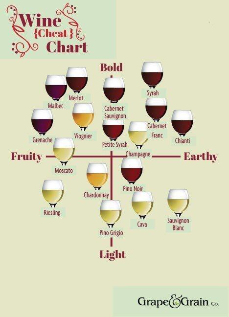
It’s no use to have heard a name if you don’t quite know where to place it. Wine can be classified by more than just color and this neat little cheat sheet helps decide what is it exactly that you’re looking for. While it may seem a bit cluttered at first glance, it’s actually very well organized and clearly displays which characteristics are shared by which particular wines. The background color is a smart choice, since it makes all the wine glasses stand out nicely regardless of color and so the chart is that much easier to remember.
Understanding wine aromas infographic
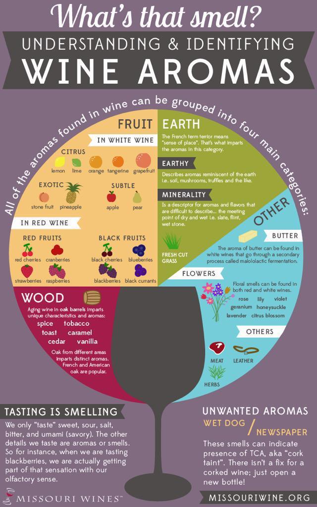
Everyone ever encountering a wine glass was probably told at least once to “take your time, smell it first”. But what exactly should you sniff out? The infographic above is a great way to explain it. It divides aromas into neat categories and gives the essential info concisely, while the cliparts make it more visually appealing. The link between taste and smell rounds out the whole thing, and the unwanted aromas section makes for a memorable finish.
Benefits of red wine infographic
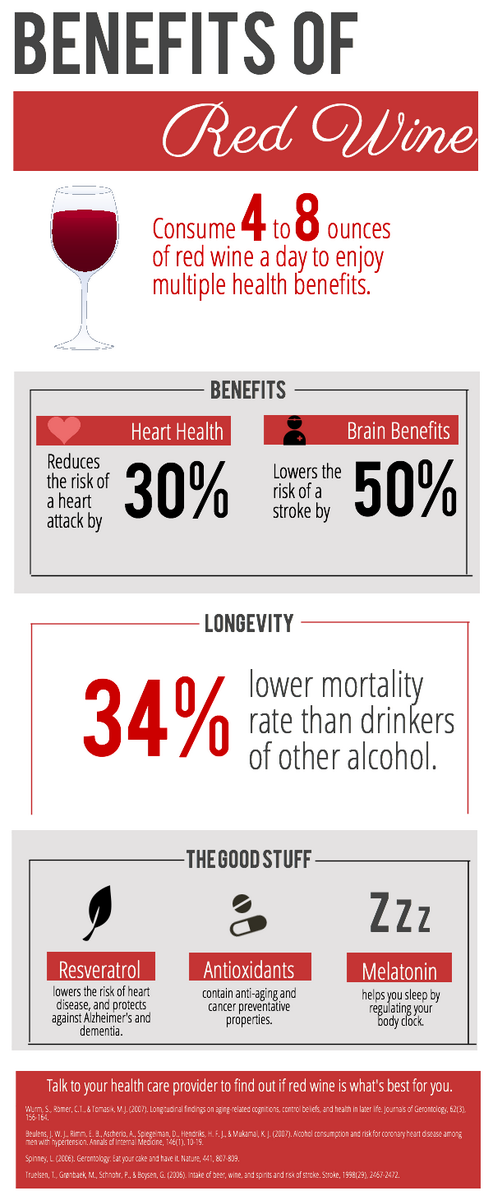
Almost everyone has heard something about “a glass of wine a day keeping a heart problem away”, but it isn’t always all that clear. This infographic gives some of the benefits of wine drinking in a simple and understandable way. A red theme is a perfect fit to the topic, while combining gray and white for the background makes it stand out all the more, so it’s much easier to grab attention. It’s organized into short and neat segments, and making the numbers larger makes them more memorable.
Wine and cheese infographic
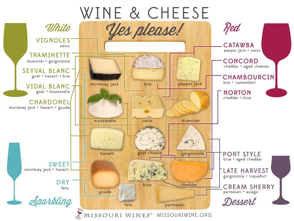
Cheese is definitely one of the all time favorite choices when it comes to wine and food combinations, whether as a bite of an appetizer, a fragment of some larger meal or a sort of dessert. But with so many types of cheese out there and so many kinds of wines to choose from, how do you know what’s what and what goes best with what else? For a confusing situation like that, an infographic like this one is a total lifesaver. All the cheese is displayed neatly and having the wines in different colors, along with repeating the adequate cheese names, helps to reduce any feeling of clutter or complexity that the connecting lines might cause.
Wine buying calculator infographic
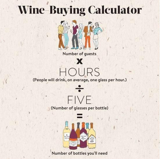
Whatever kind of context you’ll find yourself in when wine shopping, it’s definitely a good idea to have some kind of template which will help determine your purchase volume. Having to run down to the store because you’re short of drinks of serve to your guests or being stuck with leftover alcohol for days later can be downright depressing. That’s why this calculator chart is a must-have reference. Simple math and a plain background with a soft color make it easy to digest, and the cartoonish illustration adds to the friendliness and overall warm feeling.
We hope that with these wine world infographics we chose to share you’ll find picking your perfect bottle a bit easier and enjoy your time with this drink all the more. You can even make one of your own and share some interesting words about wine, all for free and easier than ever.