A popular trick to get attention online – short of a vague Facebook post or a clickbait title – is to latch onto a trending topic. For example, the BuzzFeed article “12 Charts Only Game Of Thrones Fans Will Understand” has nearly 900,000 views, and it offers little in the way of substance (but plenty in the way of humour).
Framing content through a lens like this might seem cheap, but it has plenty of merit and a surprising amount of utility. If you want examples of how, read on as we shamelessly latch onto a trending topic and share some of our favourite Game of Thrones inspired infographics.
WARNING: This post’s content is dark and full of spoilers.
Infographics as portfolio pieces
Where have all the wildlings gone?
This huge, gorgeous, and interactive infographic by Nigel Evan Dennis is basically a portfolio piece and passive income all wrapped into one single-page website.
You may wonder why a clearly talented designer has poured so much time and effort into something like this. The reason most relevant to this article: showcasing something (e.g. design talent) through something your audience finds interesting (e.g. Game of Thrones) will get more involved attention than a piece that does not have the novel hook.
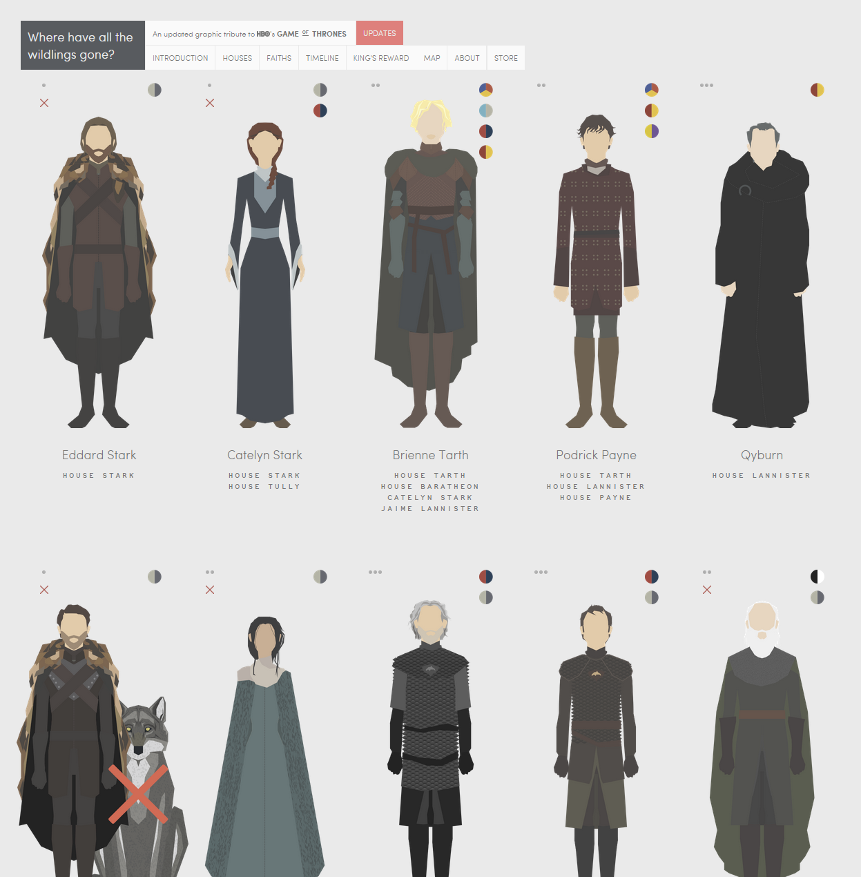
(make sure to check out the website from this one – the above is only a screenshot)
Similar Examples:
Fishfinger had the same idea as Nigel, and they’ve made more than a few infographics as a result.
Infographics that condense trivia or a topic
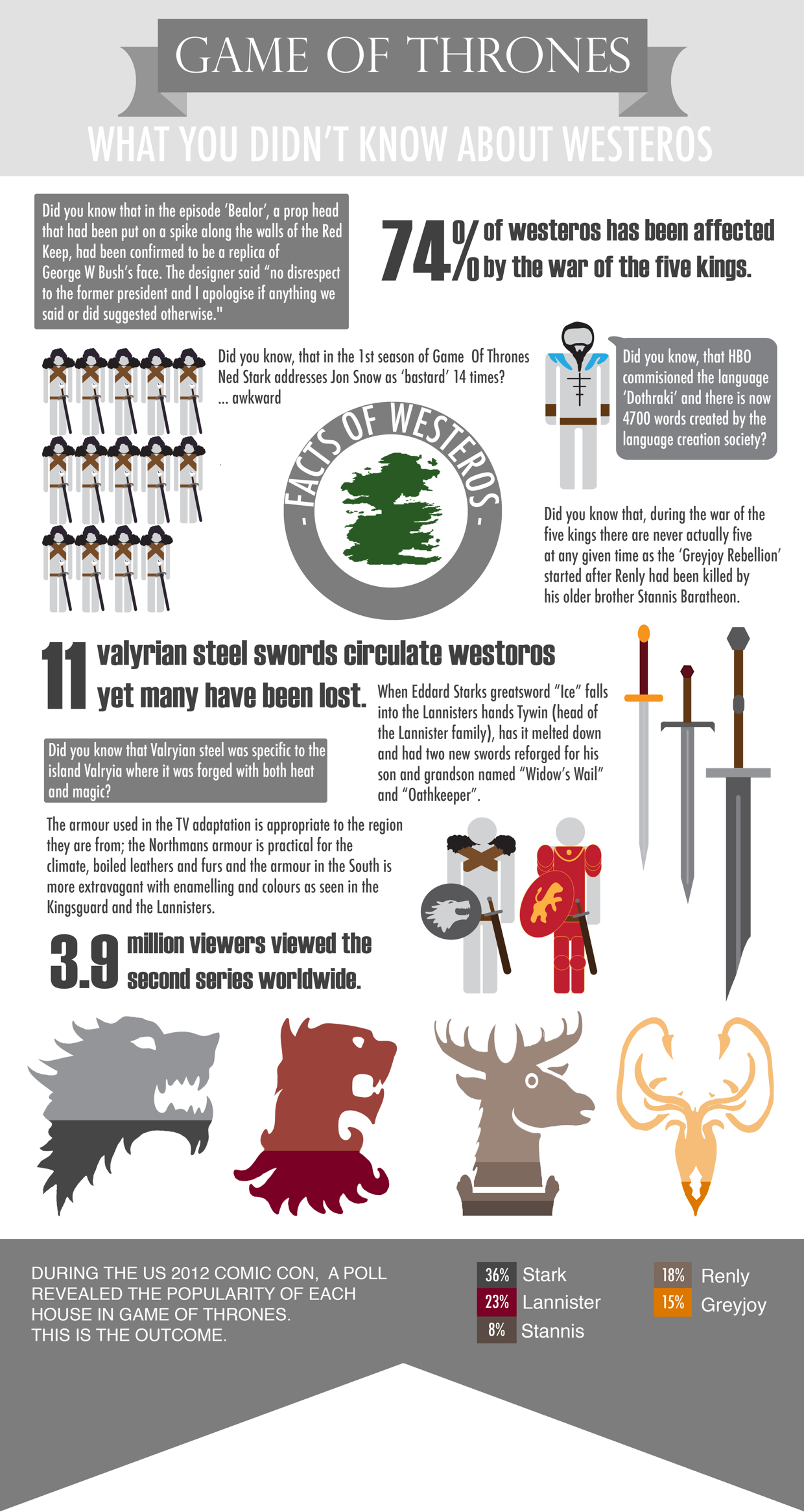
What You Didn’t Know About Westeros
This is basically a BuzzFeed article without the superfluous GIFs and listicle-style formula.
The Game of Thrones Sex Infographic
Need more proof that infographics can make complex topics palatable? Somehow, this infographic makes sense of all the sex in Game of Thrones.
Though, admittedly, it only makes includes relations up to season 3.
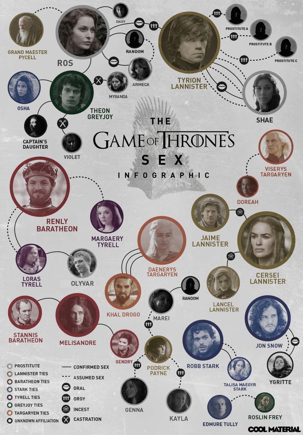
P.S.: If you’re ever looking to hook an audience, “sex” and “the most popular TV show on the planet” are good places to start.
Infographics that contextualize with novelty
If Social Networks Were ‘Game of Thrones’ Houses
Though this infographic doesn’t say much, it does make an amusing parallel between its two topics. And, because one of those topics had a season premiere coming up, you can bet they saw some additional traffic as a result.

Money Saving Tips According to Game of Thrones
Uh, what?
Despite being in defense of using Game of Thrones as a contextualizing topic for your infographics, this one has next to nothing to actually do with the show or books.
Essentially, this infographic takes the math question “Greg buys six pineapples and gives three away. How many pineapples does Greg have?” and replaces Greg with The Hound. Cheap, but, well – it got our attention.

In conclusion…
Popular, trending, or novel ideas are a powerful resource for infographics. They can get attention, they can contextualize information, or they can just be plain fun.