Using and interpreting data is key for making decisions in every area of life. Despite this, looking, reading and understanding data can be tricky. If you’ve ever spent too long staring at a complex spreadsheet, you’ll have some understanding of why data visualization is essential.
What is data visualization?
Data visualization is the concept of translating information or data into a visual context that makes it easier for the human brain to understand. This involves presenting information or data in a way that the human brain can pull insights from, making it easier to identify patterns and trends in large data sets.
Data visualization has also been defined as a form of visual art that grabs our interest and keeps our eyes on the message, allowing us to internalize the messages and trends present in the data. Forms of data visualization, particularly infographics, can also be used by marketers, bloggers and other online asset owners as a way of building backlinks and growing their online income.
In short, data visualization is helpful for any business—from the blogger next door to massive B2B businesses.
The most common forms of data visualization are:
- Bar graphs
- Column charts
- Area charts
- Dual-axis charts
- Line graphs
- Mekko charts
- Pie charts
- Heatmaps
- Waterfall charts
- Scatter plot chart
- Bullet graphs
- Infographics
To give you some deeper insights into some of these different forms of data visualization, we’ve compiled seventeen captivating examples for you to draw inspiration from that will help you create more engaging posts.
Let’s take a look at them.
Examples of data visualization
#1 Megabyte to Zetabyte
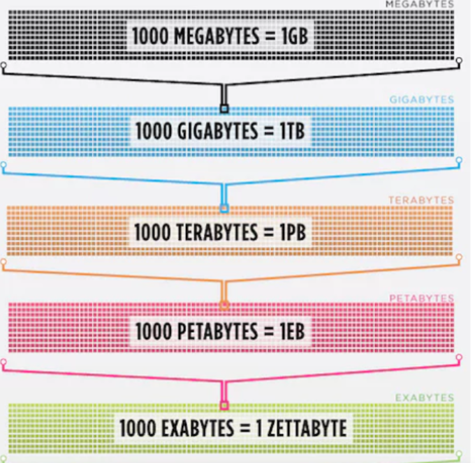
If someone asked you, ‘do you know what a zettabyte is’, would you know? There aren’t many of us who would, but if the same person showed you this graphic, you’d probably have a much better understanding of what a zettabyte is.
This example of data visualization from IT company Cisco makes it easy to understand just how big a zettabyte is while giving us a clear understanding of the amount of data in each subsequent unit of measurement leading up to a zettabyte.
#2 A simple (yet clear) graph
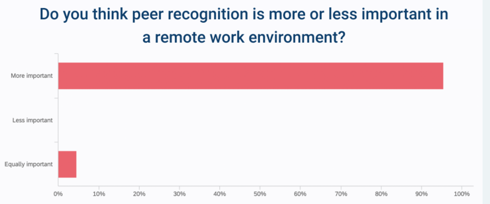
This graph by Nectar HR displays the findings of a survey they conducted about the importance of peer recognition in a remote work environment. The graph is easy to understand. The X-axis clearly displays the percentages, and the Y-axis shows the categories that the survey participants could choose from, and it’s easy to see the survey results. The question is also clearly laid out so anyone viewing the graph can easily understand what the graph is about.
Another example of clear data visualization is this graph from Higher Visibility.
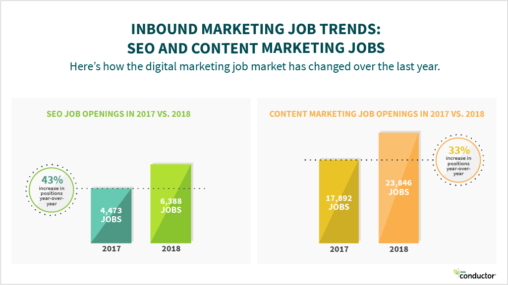
It clearly points out the findings from the study and allows website visitors to quickly pick up the information they need without having to go through paragraphs of content.
A person looking to get a job in SEO or who is wondering whether taking an SEO course could be beneficial to their work would possibly find these statistics helpful in guiding them to the next step.
#3 Languages of the world
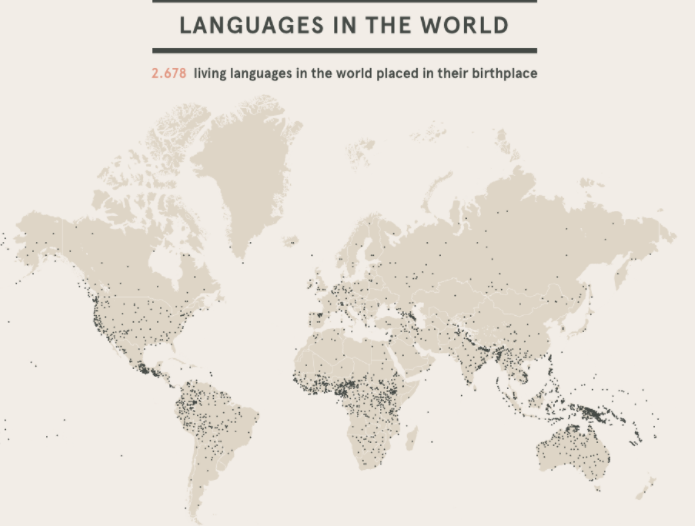
This ‘languages of the world’ piece is a great representation of visual storytelling. It’s easy to get drawn into the graphic and to want to know more about some of the different areas in the world where different languages are spoken. It also shows how a complex topic can be brought to life through a captivating visual; if the 2,678 languages had just been listed out or displayed in a document, the appeal wouldn’t really be there. By displaying them visually, anyone looking at the image can get a sense of how many languages are spoken worldwide and where they are spoken.
#4 History of the NFL
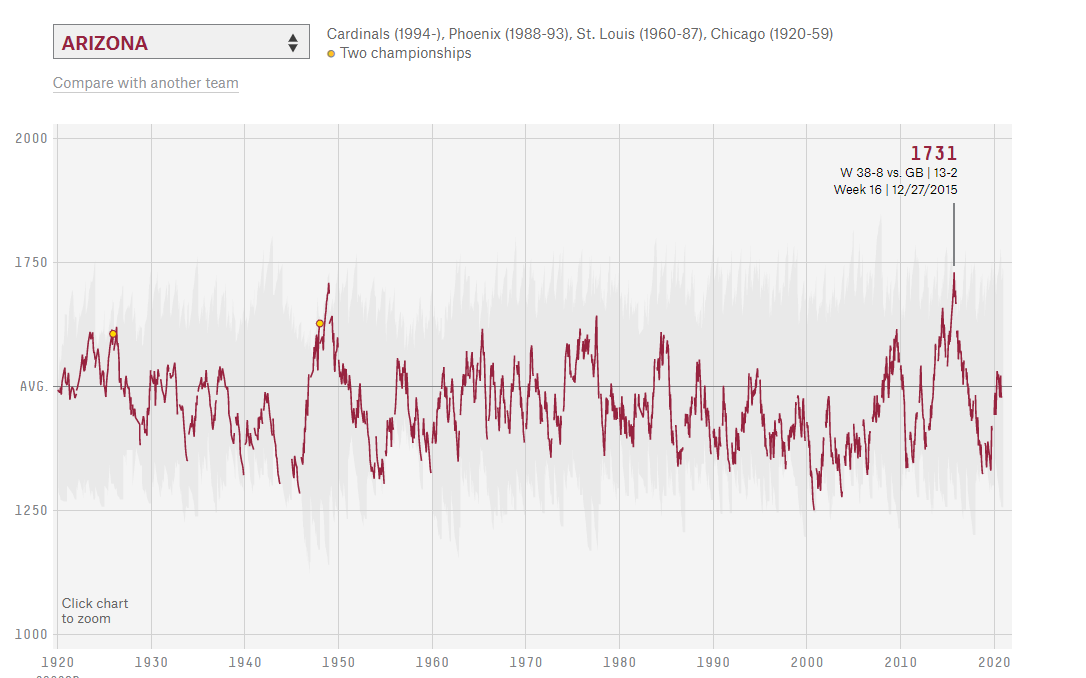
This interactive infographic by Fivethirtyeight.com displays how every team in NFL history has performed over the 100 years. The graph tracks the team’s position season by season, which anyone viewing the graphic can see. From the drop-down menu, you can select the team you wish to view and even compare their performance with another team from the list. Additionally, if you click into one of the years, you can see a game by game breakdown of their team’s performance. A great graphic for any NFL fan to check out!
#5 US wind graphic
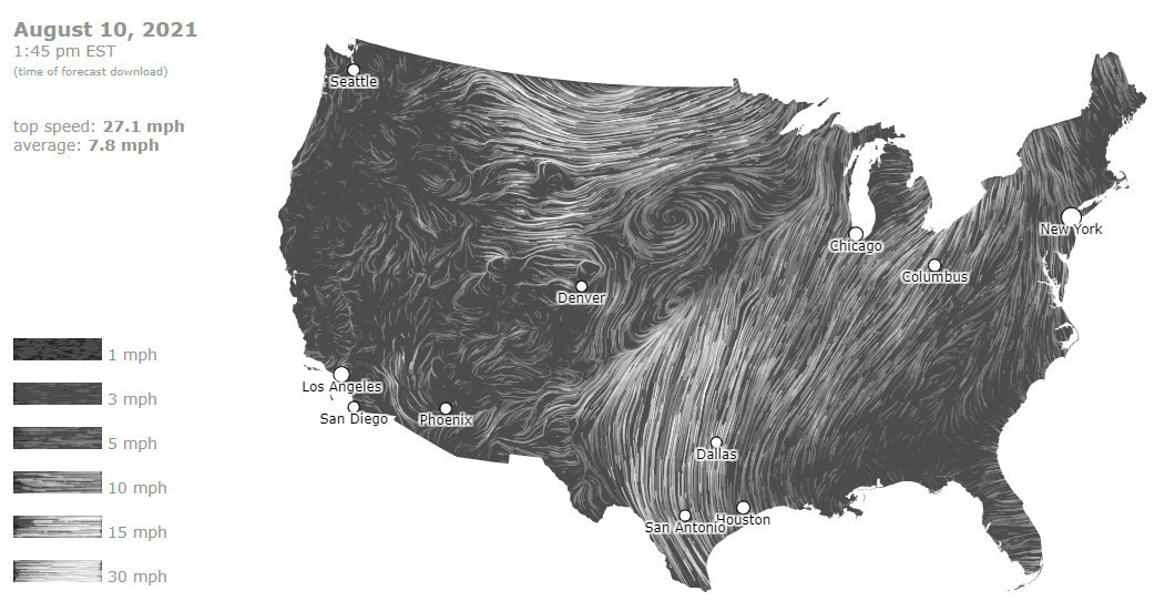
This example of data visualization from hint.fm shows you how the wind is currently flowing around the USA. There’s a clear key on the bottom of the left-hand side of the graphic showing the wind speed. You can also see the top speed in the country and the average wind speed and even click into individual cities to see the exact speed in that particular location. The graphic updates every few days to give an up-to-date representation of the current wind speed and the direction it’s going in.
#6 Where the audience fits on the political spectrum 
For any politics fan, this graphic is a must. It gives an insightful breakdown of the main media sources across the United States and where their audience lies on the political spectrum. The difference between each media source is significant, and this allows the viewer to get some perspective on how the US public lean on the political spectrum. If all these media sources were just written down in a list, viewers wouldn’t be able to get the same perspective on how the audience of each media source lies on the political spectrum.
#7 The daily routines of famous creative people

This visual of how famous creatives spend their time and give some great insights into the daily routine of some of the most influential people in the last few hundred years. The clear color key at the top provides a clear breakdown of the different categories used in the graphic, which unsurprisingly shows that famous creatives spent most of their time, aside from sleeping, engaged in creative work.
#8 The news stories Americans tweeted about
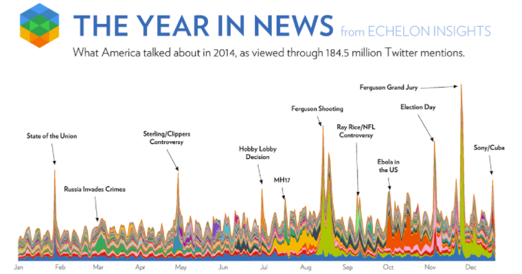
Despite being a few years old, this graphic gives some interesting insights into the most tweeted news stories of 2014. The months listed at the bottom give the viewer a clear understanding of when the events took place. Like the other graphics we’ve featured, showing the events in a visually appealing graphic is much more appealing than simply showing a written, text heavy list of what events occurred at each time. This image also shows the power of social media and how rapidly information can spread across it.
#9 Who’s fighting who in Syria
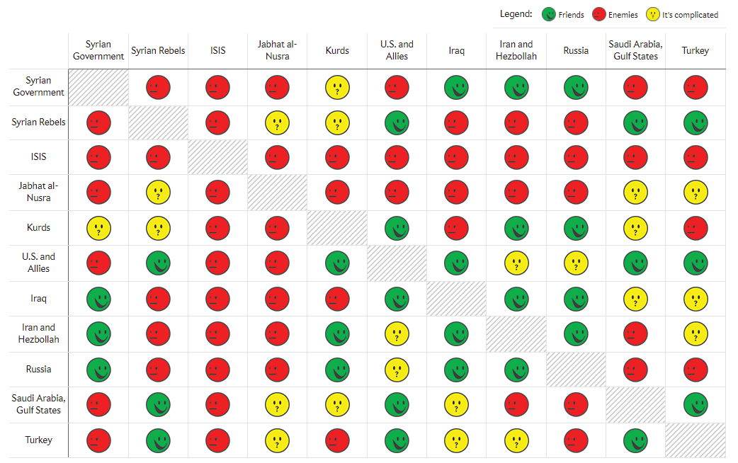
This graphic published back in 2015 at the height of the Syrian Civil War lays out the different factions involved in the conflict and who’s allied with whom. Anyone following the war at the time may have been confused at who was on who’s side, but in this example, it’s easy to see who was fighting who. The legend in the top right-hand corner clarifies what the different emojis mean and helps break down a complex topic into one that’s clear to understand.
#10 Color palettes of great artworks
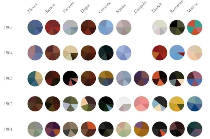
Any artists or fans of great artwork will enjoy this graphic showing an overview of the different color palettes great artists have used throughout the years. Each chart represents an individual painting with the five most prominent colours shown proportionally. One can only imagine how long it would take to source this information if it weren’t displayed in this way; you’d have to go and look at the paintings each of the painters released by the year to see the color schemes of each painting.
#11 Percentage change in county population 2010 to 2020
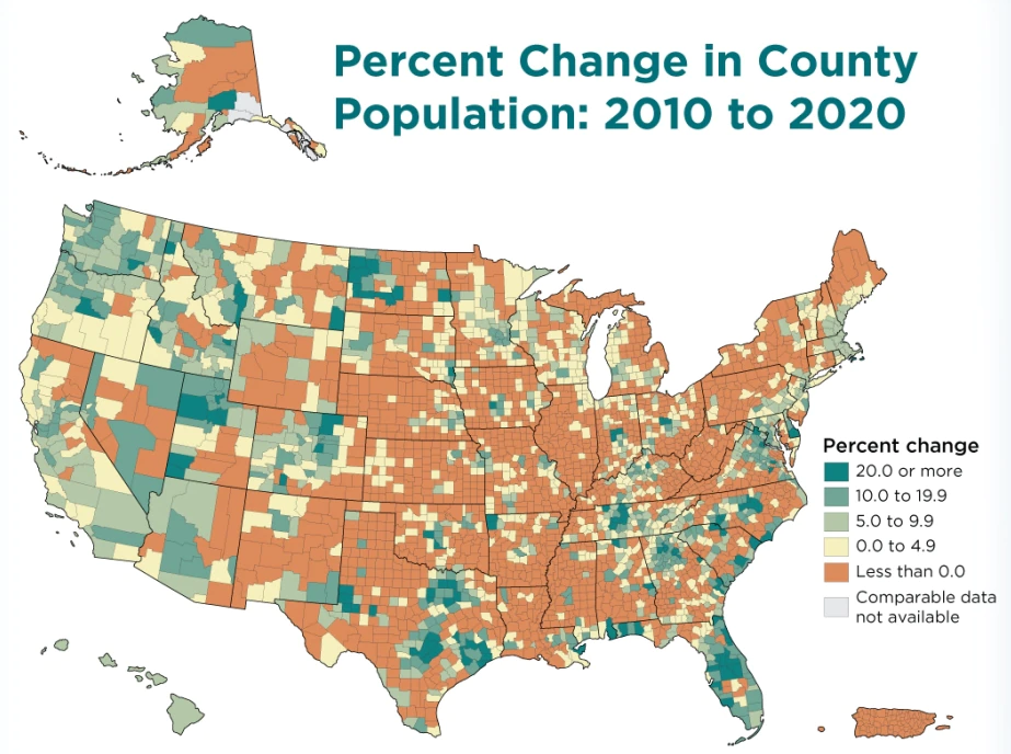
Anyone interested in the population changes in the USA over the past ten years will enjoy this example of data visualization showing the population change in each county. The different percentage changes are easy to see with the clear key on the right-hand side of the image. With the borders of each state and county clearly visible, it’s easy for anyone looking at this map to see the area they want to look at.
#12 Film dialogue
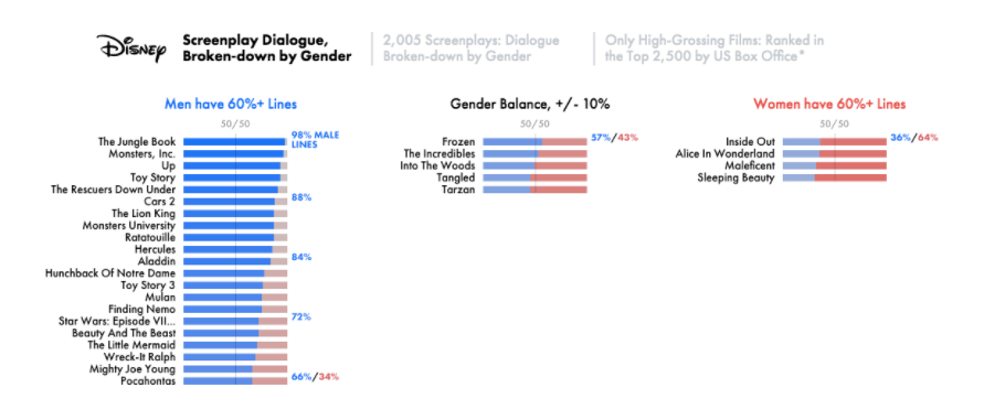
This data visualization of famous screenplays gives unique insights into the percentage of different lines spoken in famous films broken down by gender. This graphic makes for interesting viewing and shows some of the gender disparities that have existed in film. The color scheme and the clearly labelled charts make this graphic easy to understand and straightforward to spot the trends on display.
#13 Email open rates by region
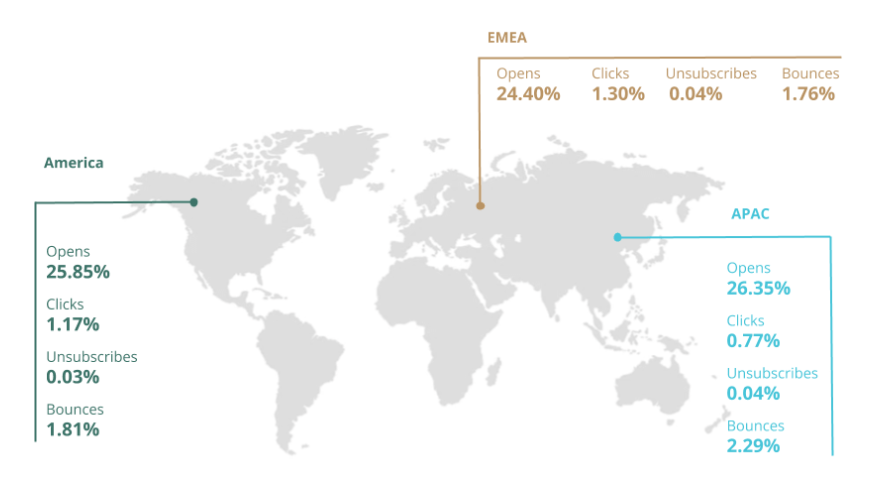
This in-depth breakdown of email metrics by email marketing company Sendinblue is an interesting graphic for every marketer to look at. Anyone seeing the graphic can clearly understand the average email performance rate by region and compare this with their open email metrics based on region.
Interestingly email open rates in APAC have the best open rates but also the highest bounce rates. Marketers can use this data to make comparisons with how their own digital marketing and email marketing campaigns are performing.
#14 Lawrank – SEO for lawyers
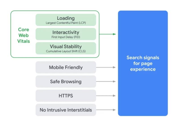
The above graphic from Lawrank, an SEO company for lawyers, is an image from their step-by-step guide to SEO for lawyers.
It gives a breakdown of Google’s core web vitals, which is an initiative by Google that provides unified guidance for quality signals that are a key part of SEO and are vital to a website providing a great experience for its visitors. When the reader gets to this part of the guide, this image helps them to visualize what core web vitals look like instead of just reading about them.
#15 Pairing wine and food
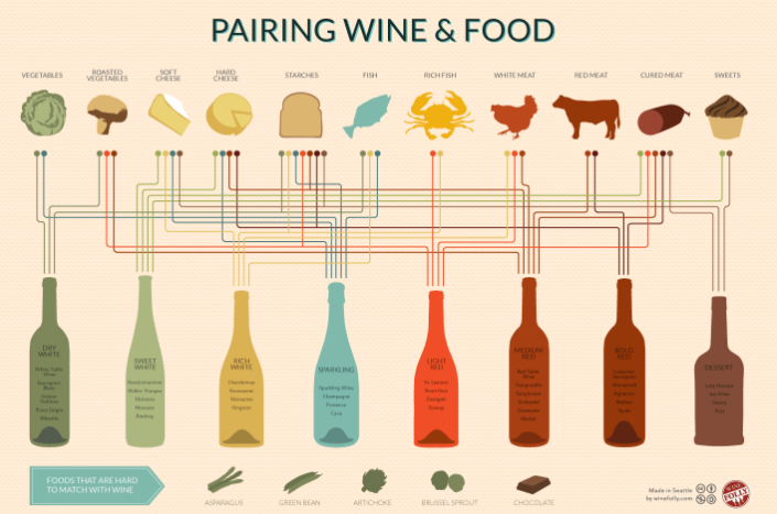
This graphic is great for anyone interested in knowing what foods go with which wines. This image could be easily blown up, printed out, and used as a wall chart for anyone’s kitchen. It’s easy to understand and is easy to reference.
The colors used blend well with one another, and the text in each part of the graphic is easy to read. At the bottom of the image, you can even see information on foods that are difficult to match with wine. Wine Folly has done a fantastic job of creating an in-depth, captivating example of how data visualization can display large amounts of information in a captivating way.
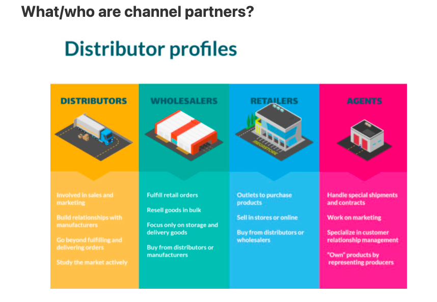
The great part about the graph above is it is full of colors and sketches which make it so much more visually appealing. Referral Rock does something similar in their blog post about channel partners:
#16 Unintentional poisonings
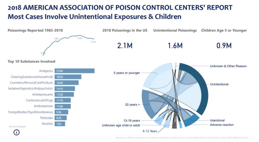
While this graphic isn’t about the most cheery of subjects, it does give some good examples of how different types of data visualization can be displayed in the same image. The bar chart gives a clear breakdown of the ‘top 10 substances involved’ with the figures clearly displayed on each bar; the ‘poisonings reported’ graph also gives a useful representation of how the figures have changed over the years. Each section of the graphic is clearly labelled, and anyone who’s looking to reference trends and data from this data visualization is able to.
Prillon has a similar bar graph that shows visitors a visual on the most regulated industries in the U.S:
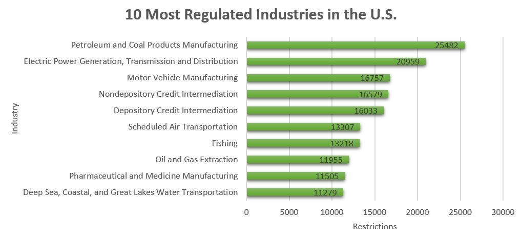
As the number of industries become more diverse, this graph is a helpful visual for people who want to compare between different sectors of the economy.
#17 Selling a service
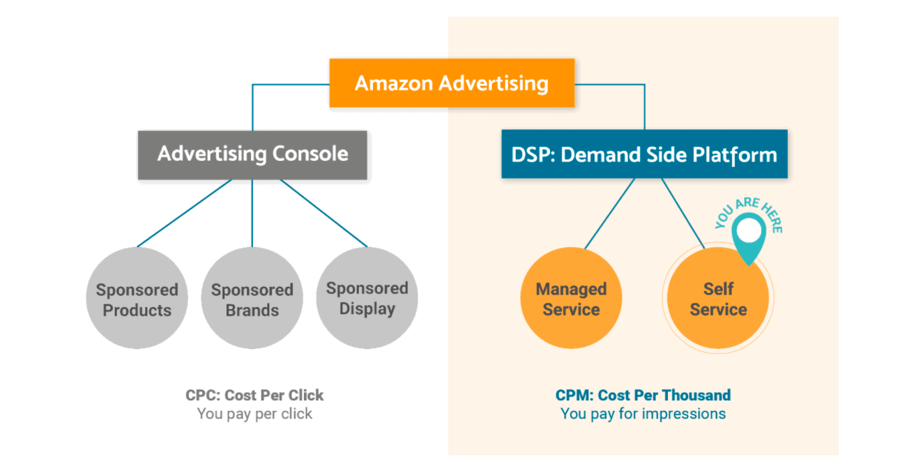
Brands like Amzpathfinder use graphs to illustrate how their service can benefit a customer. The above graph visualizes how their service works. While sales copy is highly effective at the best of times, people’s attention spans are reducing by the minute which is why data visualization can be a powerful tool to bring in new customers.
Amzpathfinder also uses graphs in their case studies to demonstrate how they have helped brands improve:
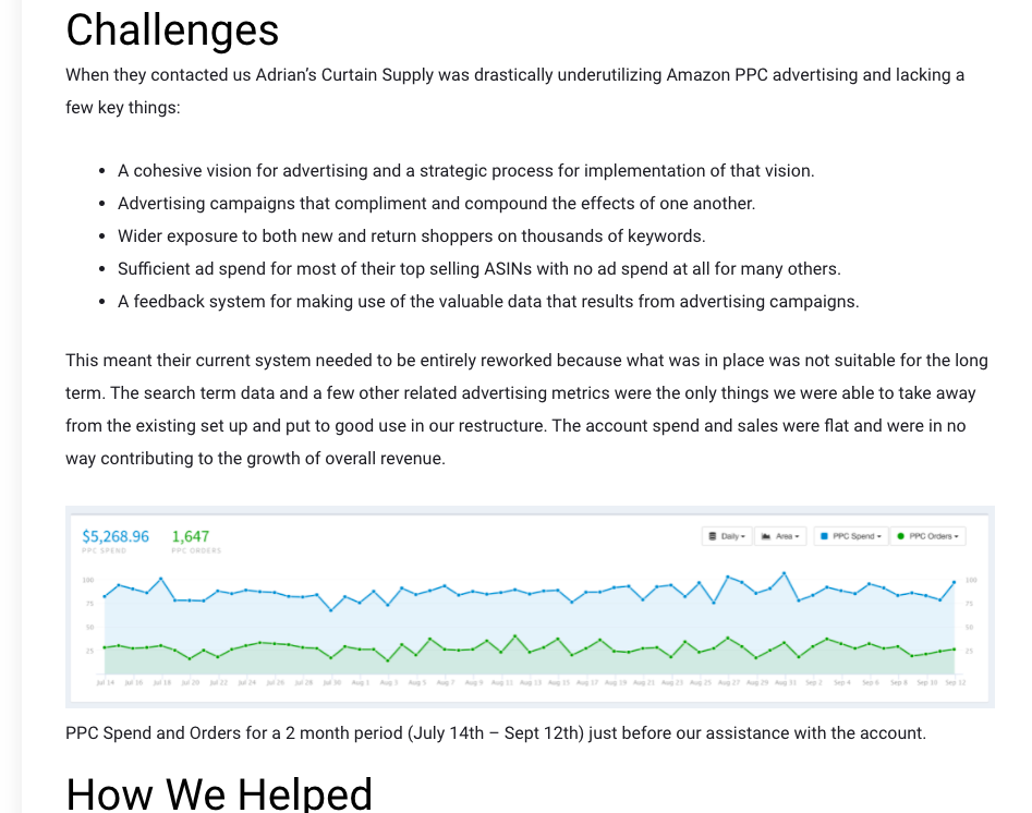
It uses data from before and after they took a customer on to demonstrate the difference their service has made.
While customers do not always get swayed by words, data does not lie so it can be a convincing sales strategy to rely on. Here is the ‘after’ graph they included in the same post:

Conclusion
These data visualization examples should have given you some ideas of how you can represent data and information in a visually appealing way. Presenting data in a way that’s easy for you and your audience to understand and make conclusions from will always be more powerful than presenting data in a way that’s difficult to interpret and understand.
As you can see in these examples and the different types of data visualization we listed in the introduction, there are many different ways of displaying data in a way that’s appealing.