This post is part of our ongoing series on educating with infographics and our series on marketing with infographics.
The folks at NeoMam Studios made the infographic below, but the interactive version on their site is even better. This article will be examining the infographic’s content and discussing how it is an example of a best practice in the field.
It answers a question
Right away, the first thing this infographic does is pose the question it will answer. You won’t miss it; it’s even bolded in the static version.

It offers a thesis for each section
Each section of the infographic tells you what the accompanying content will help prove.
It provides context and a story
There is a purposeful order to how the claims are introduced and the facts are displayed. Typically, you want to ask a question, offer context, offer an answer, address the counter-argument, and then expand on your original point from there. This infographic does all that.
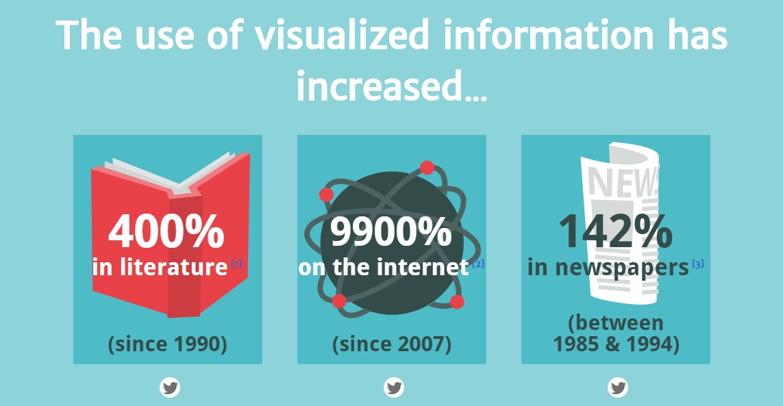
- It shows that visual information is on the rise (across mediums)
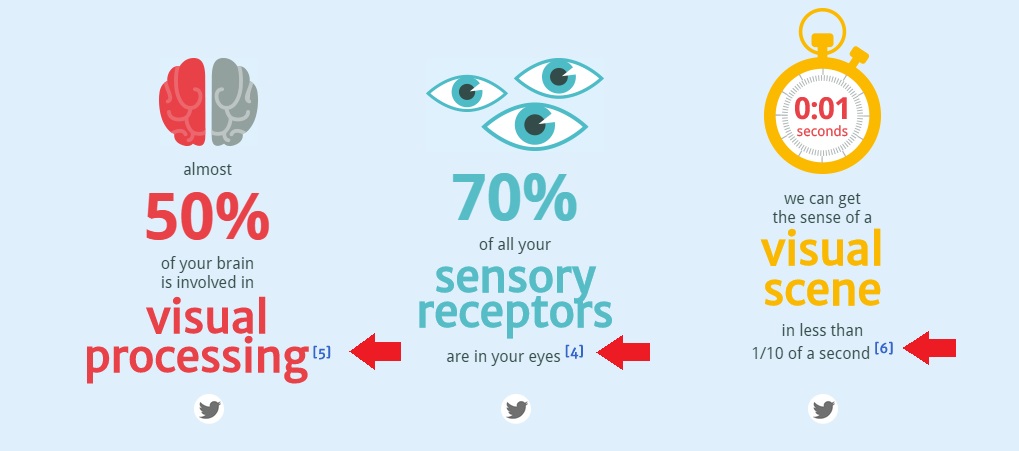
- It explains that this rise is because people are ‘visually wired’
- It addresses the counter-argument (i.e. information overload)
- Now that you have context and understand the subject, it begins to show why the rise of visual information is a good thing with each new section thesis (e.g. more accessible, more persuasive, etc.)
- It summarizes its argument and content
- Finally, it offers links to learn more (e.g. additional case studies, the more comprehensive article, etc.)
It offers sources
While there’s a simple reference list on the static version, the interactive version does even more. Next to each claim is a link to the fact’s source.
It empowers sharing on social media
In addition to the source reference next to each fact, there’s also a button to share that fact on social media. Plus, the site header offers links to share the entire article.

It does everything possible to go viral
The interactive version of this infographic is the superior one, but it’s not as easy to share in articles like this one. NeoMam Studios realized this and they made a static version so that less-talented folks like myself have the opportunity to talk about it off-site.
In conclusion…
This is not only a great argument for infographics, it’s an amazing example of the best practices behind creating one. Check out more of NeoMam’s work here.