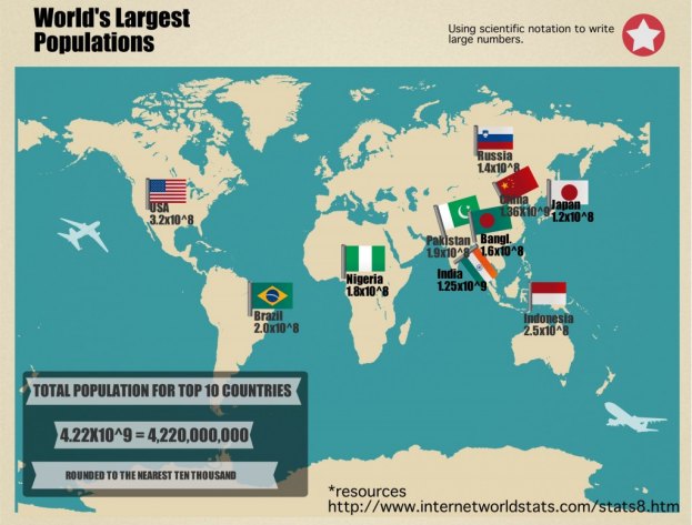
Trying to find technology to describe mathematics is sometimes not easy. I have found that Easelly makes a great presentation tool for students to show their mastery of math standards while integrating other subject areas. I used this lesson in a middle school class that was learning scientific notation. The data we used was the top 10 countries with the highest population. You could incorporate any data that has extremely large or small numbers. The students had to go online and find the top 10 populations, round them to the nearest ten thousand, and then write them in scientific notation. They were to find the map template in Easelly and replace the oil drop with the country’s flag and type the scientific notation under each one. Also, because they have been working on research in other classes, I had them cite their source on their presentation. Not only were they learning how to write numbers in scientific notation, they were learning locations and flags of countries. This was a big hit with the students and other faculty members at the school.