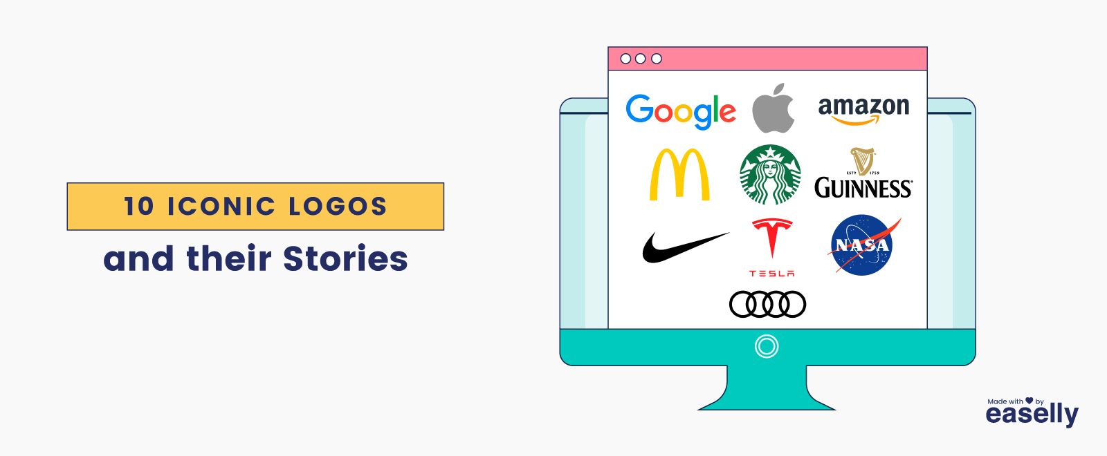
10 Iconic Logos and their Stories
Logos are an incredibly important aspect of your brand’s visual identity. A good logo tells your customer what they can expect from your company, a great logo can build brand loyalty and work as a sales tool. How often have you been lost in a maze of products, seen a familiar brands iconic logos and been instantly drawn to them? If you’re anything like us it’s happened far too often.
We’ve put together a comprehensive guide to logo design on a separate blog found here. However we thought it would be interesting to look at what happens when you get your logo absolutely perfect. Obviously the logo isn’t all these companies had, it does help to have a killer product. However we guarantee that you’ll recognise them instantly from their logo. Here is a list of 10 of the most instantly recognisable and effective logos in the world and the stories behind them you may not have known!
- Guinness
When you read the word Ireland, Guinness is undoubtedly one of the first things that pops into your head. The two are interlinked and have been since first the incredible brewery started all the way back in 1759. Guinness is one of the most popular beers in the world and for good reason. In the home of “the black stuff” (it’s actually an extraordinarily deep red colour) The beer has reached a legendary status and a faithful bordering on religious following. Different myths and traditions surrounding the beverage and the correct way to serve and store it can be found in every town and city across the country!
Putting the stout to one side, the Guinness company themselves are absolute marketing masters. Everything from their ad campaigns to their packaging is carefully thought out and planned to build loyalty to the brand. Their main symbol within their logo however has remained the same since at least the mid 1800s. The Harp has been used as a logo in some form or another since then.
The very light, serif style font combined with the harp are instantly recognisable. The harp is an ancient symbol and extremely important in Irish Culture and heritage. When Ireland won its independence in 1922, the new government wanted to use the harp as its symbol but unfortunately Guinness held the trademark for the harp. In the end they decided to reverse the harp and use it this way, a move followed by a variety of Irish companies who have the reversed harp in their logo to this day! (We’re looking at you RyanAir!)
- NASA
Nasa has three main logos, which shows you just how important it is! The NASA seal, the Worm Typeface (this was recently reinstated as a secondary logo, and the famous “meatball” logo. The most recognisable of the three is the “meatball” logo shown above and has been in use as a simplified version of the seal.
The logo consists of a sphere to represent planets, stars to represent space and a red chevron to represent aeronautics. A spacecraft is shown orbiting the lettering. This has been the predominant insignia since 1992. The original insignia was confirmed by President Eisenhower and later slightly modified by President John F. Kennedy in 1961.
- Audi

The Audi Logo is incredible based almost solely on its pure simplicity. It wouldn’t be all that difficult to reproduce and it’s instantly visible. The four interlocking rings is a staple of car shops and traffic around the world but what is the reason for four rings? Many falsely assume it was to represent four cylinder engines. However the real answer is rooted in the company’s foundation.
The modern company we know today as Audi AG is an amalgamation of the four car manufacturing companies of Saxony; Audi, DKW, Horsch and Wanderer. The Four rings combined represent these four companies.
- Nike

Chances are when you read the title of this blog, your mind instantly went to the Nike swoosh. The logo is one of the most recognisable in the world and is worth a whopping $26 Billion all by itself! The Nike swoosh was developed and trademarked in 1971 and has been a staple of sports teams and stadiums around the world for decades.
Nike is named after the winged goddess of victory in ancient Greek mythology. The Nike logo was designed to simply display fluidity, motion and success, whilst also representing the wing of the goddess the company is named for.
The swoosh design was produced to this brief, whereupon one company founder exclaimed “I don’t love it, but i think it will grow on me.” And grow, it did!
- Amazon
One of life’s biggest success stories. Amazon quickly rose from humble online bookshop to globe conquering conglomerate, seemingly overnight. For better or worse it’s changed the world of online shopping and internet use forever and seems to take on new projects and ventures every day!
The current logo has been in use since 2000 and is one of the most recognisable brands in the world. It’s a clever, clean and friendly design, intended to put its customers at ease upon seeing it. An arrow points from A to Z and also represents a smile! The lower case font and sunny colour schemes impart an air of trust and friendliness. The amazon font is custom designed, and with the company being worth $1.7 trillion, they can definitely afford it!
- Tesla

With their ultra high tech cars and eccentric owner, Tesla really seems like something from a sci fi film. They’re an incredible company with their eyes on the future. The uber futuristic font wouldn’t look out of place in star trek and the iconic logo stands out as much as the luxury electric vehicles do!
The Tesla logo itself is an iconic example of symbolism as well as a brand showing off what they do. Founder Elon Musk states that the “T” represents the cross section of an electric motor. A perfect example of a logo showing off what your company does in a clever and simple way.
- Mc Donald’s

Another hugely recognisable brand that came from extremely humble beginnings. McDonald’s golden arches can be found all over the world. It would be difficult to find a young person who doesn’t get excited seeing the golden arches. It’s hard to believe it all started from one small bbq and hamburger shop.
The emblem as we know it today was first designed in 1961. The iconic golden arches logo was based on the architecture of the early stores, especially the roofs. The original emblem had a beam across both archers but was simplified into the logo we know and love today in 1968. The logo hasn’t changed much since then, some simplifications and updates have been made but the simple, impactful design is the same.
- Apple

Apple software is famous for their sleek and artistic designs, therefore it is no surprise that their logo is as iconic as their products. The simple logo, an apple with a bite taken out of it has been the subject of dozens of theories and ideas. At one point many believed that the apple was a tribute to the godfather of modern computing Alan Turing, who sadly took his own life by eating a poison apple following persecution for his sexuality. Whilst the imagined tribute itself is beautiful, the designer of the logo has stated this was simply a “wonderful urban legend.”
Other sources have linked the apple to Adam and Eve and Sir Isaac Newton. Both theories have also been discarded. The designer claims he was never given a specific brief, but that he enjoys the theories, happy coincidences and mystery surrounding the design.
Although we may never completely understand the logo, the fact that it generates so much buzz surely this in itself makes the logo iconic!
- Starbucks

It may surprise you to learn that Starbucks is actually named after a character from one of America’s greatest literary contributions to the world, Moby Dick. The coffee shop was originally going to be named after the ship but it just didn’t have the same ring to it. The first mate Starbuck was chosen as a replacement name.
Little of these early nautical themes remain in the company’s branding, however the mermaid or siren is the exception. The twin tailed siren has been a mainstay of the Starbucks logo since the company began. It evokes history and trust and the instantly recognisable logo has undoubtedly contributed to Starbucks’ conquering of the cafe industry!

The google logo is classic, simple and timeless. It’s also versatile and gets changed up to mark special occasions and events. The original logo was made by Larry Page in 1998 and has gone through an array of colour changes and font adjustments.
The logo is simple, fun and was made completely in house. The final colour scheme follows the primary colours, however the order has been changed around representing the fact that google does not play by the rules!
Conclusion
That about wraps up our 10 favourite iconic logos. Have a read through our ultimate guide to logos if the inspiration has struck you!