Whether you’re standing in the ticket line out in the city or rotating your furniture and monitor for the ideal home cinema experience, there’s nothing quite like watching a good movie with some friends – especially if there’s a tasty snack involved. Regardless of what we look at – the stories themselves or the industry overall, movies are a whole world of their own.
Here are some fun screen facts put into the infographic format.
The trilogy meter
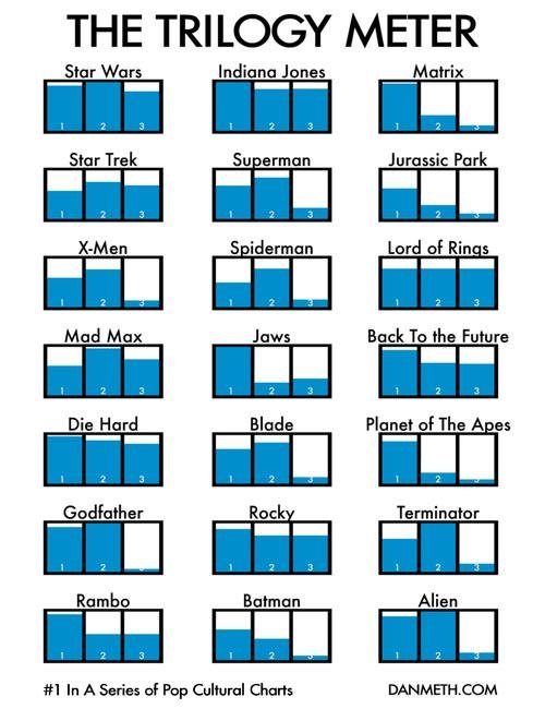
A large number of all-time favorite movies were serialized. Everyone can probably name a few even if they didn’t watch them, and it somehow seems they always end up broken down into threes. The trick to it is that not all installments are equally good. This infographic is a neat illustration of how well some of the big titles have done. The simple design and minimum of text keep our attention to the visuals which cleverly display not only the success of individual installments but the whole series, too. The blue is easy on the eyes and having a black and white geometrical theme keeps it clear and concise.
Highest grossing superhero movies of all time
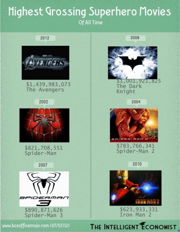
Everyone occasionally needs a hero, and where better to find them than in superhero movies? These eternally popular films sell millions of tickets, and this nifty little infographic shows just how successful they are. Having them split into two columns and ranked by total income makes it cleanly organized, and the mild green background makes the movie icons stand out all the more.
3D Breakthrough
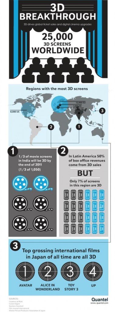
Ever since the first pair of red and blue movie glasses, 3D experiences have been rapidly multiplying, but just how widespread are they? The infographic above gives a clear answer in a simple way. Having it divided into segments counters the long page, and connecting the segments through numbers maintains a good flow throughout. It has a great balance of text and icons which breaks down the info into digestible chunks, and the color scheme is an awesome choice. The blue serves as a brilliant highlight against the gray background and black text, but it’s still easy on the eyes since it’s a cool color.
Sound in movies
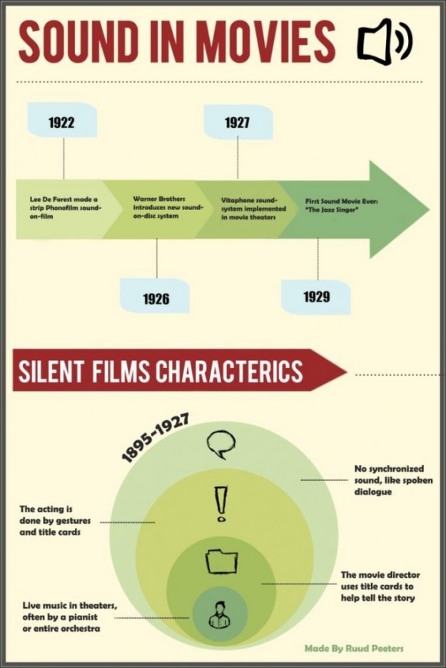
Nowadays it’s hard to imagine a movie without sound and dialogue, and the film scores can often make for downright brilliant albums on their own. However, movie sound went quite a long way from the black and white silent screenplay to the auditory experience of today and this infographic is a wonderful illustration of it. The colors are mild and well balanced, while the red headers make for a clean division between segments. Having the timeline as a set of arrows emphasizes the flow of the message and contrasts nicely with the circles below. The circles themselves maintain the overall dynamics since they’re set up differently from the traditional dartboard style. The text is kept to a minimum so the information is easy to remember.
The evolution of 3D
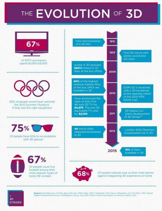
For all its awesomeness, 3D also has some history to share, and that’s exactly what this infographic does. The color scheme perfectly matches the topic and gives the entire infographic a sense of dynamics and cheerfulness, and since the background is neutral, the information stands out all the more. However, it manages not to come across as too goofy since the message is presented through numbers, which automatically gives it a more serious tone. It’s split up into small segments which are easier to memorize and the icons and arrow-style timeline add an extra layer of clarity.
We hope that you enjoyed our little selection of movie world infographics and came across some new bits of information about this popular pastime. Why not share some of your favorite film trivia, too? Pay a visit to Easelly’s infographic maker and make a cool movie infographic all of your own. There’s no way to mess it up – it’s intuitive and easy to use, we have a bunch of templates and themes to play with, and best of all, it’s totally free!