From a bunch of students hanging out in a park, through craftsmen, sports fans and various relatives, to random fishy faces in alleyways, a bottle or glass of beer can be seen in pretty much anyone’s hand nowadays. This popular drink, however, has a much longer tale to tell about itself than just the different colors it comes in.
Beer infographic examples
We’ve selected a few infographics created by beer fans from around the world that share some interesting info in a wonderfully visual way.
History of beer infographic
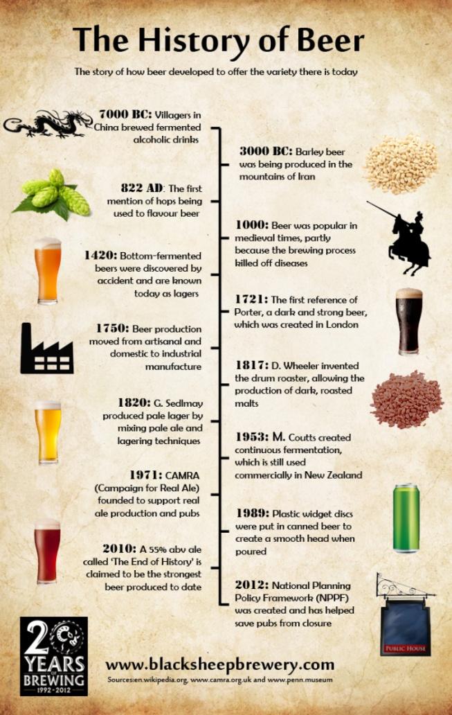
Although it might look like something simple when you see it sitting in a can or popped on top every table in the pub, beer actually went through a whole lot to become the drink we know today. This infographic does a great job of presenting the history of beer in a clear timeline. All the main points are there with colorful illustrations that really make them livelier. Having the timeline points on altering sides makes sure that the visual isn’t cluttered and makes the flow easier to follow.
The wide world of beer infographic
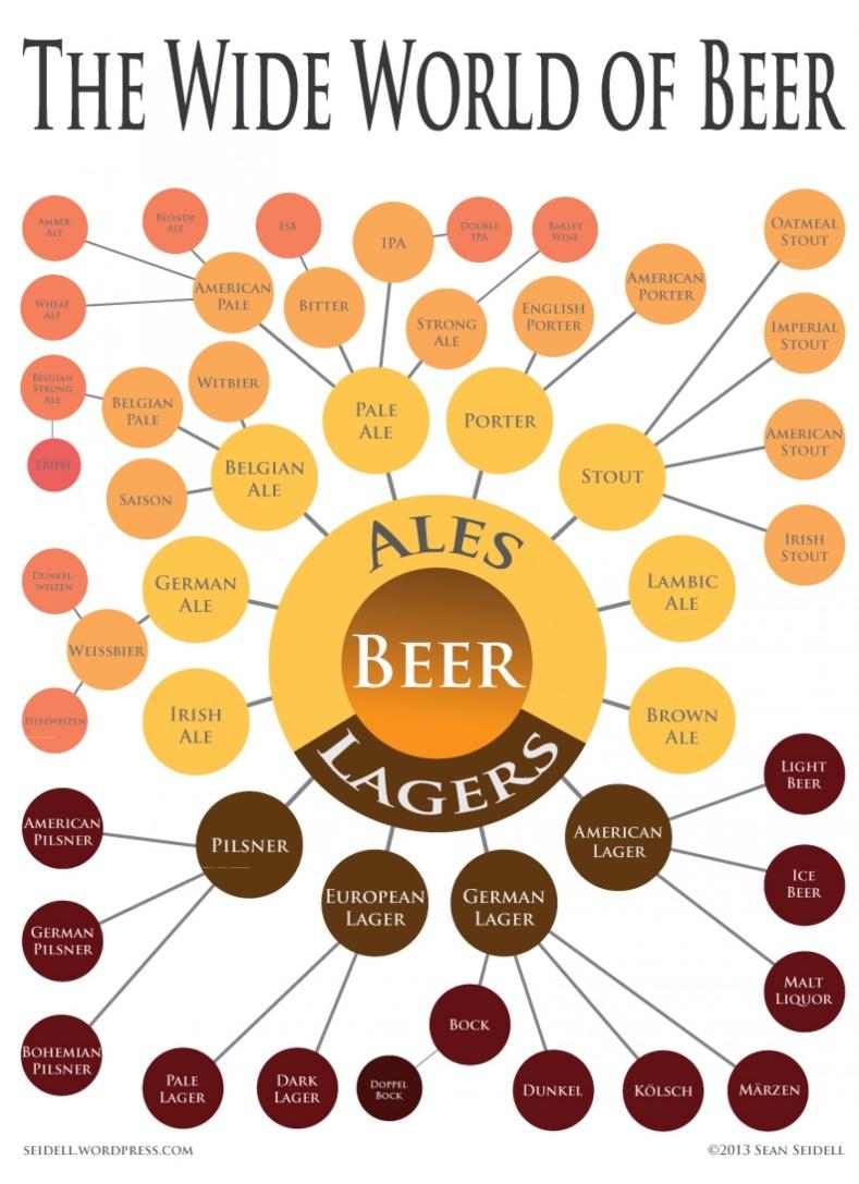
Between just light and dark, or just tap and canned, there are myriads of different kinds of beer out there, with unique stories and characteristics. The above visual is a neat way to list them all without the boring bullet points. The color theme is perfectly put together and altering dark and white text makes sure all the info is clearly visible. Giving the infographic a hierarchical tree-like structure improves the overall flow and makes it more memorable.
Why drink a beer from glass infographic
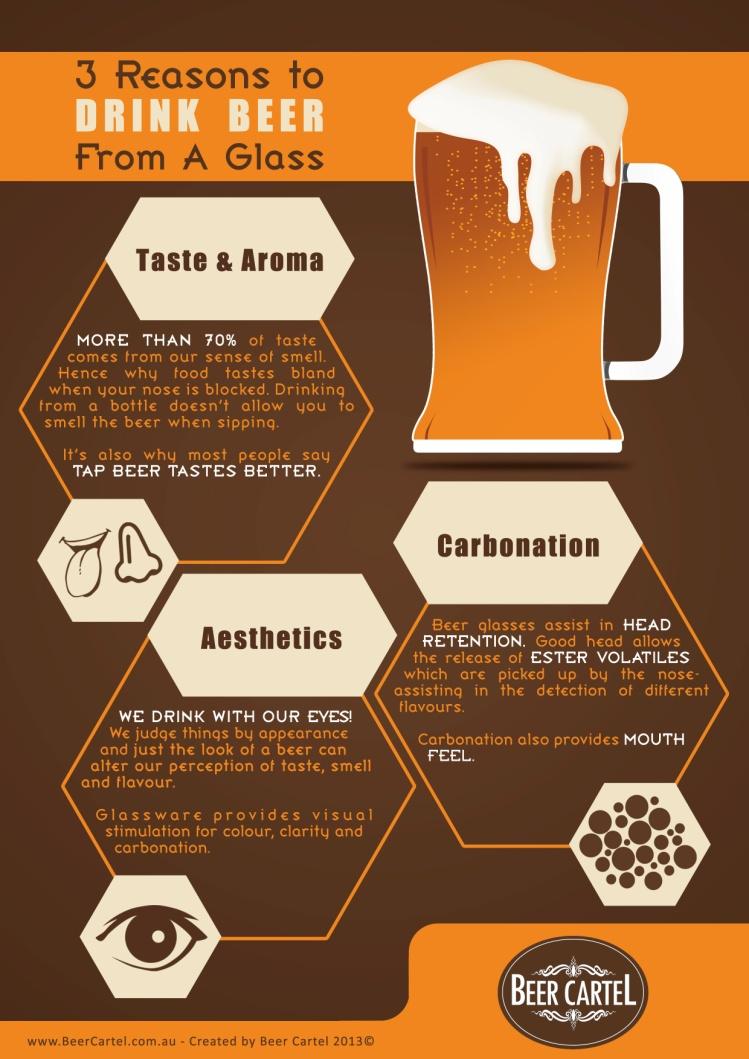
Bottles, cans, mugs – there’s a wide choice of containers to drink your beer from, whether you’re sitting at home, out in town or on the go. Beer has a culture of its own, though, and having a good old glass in hand is still the top choice for a huge number of drinkers out there. This infographic giving some pro-glass reasons is a full hit. The colors are perfect, it’s split up into logical segments and all of them are spacious with a simple design. The information is presented in a concise way, using everyday words and minimalist icons for extra clarity. Of course the huge beer glass is an effective attention grabber and ideally fits the topic.
How to serve your beer infographic
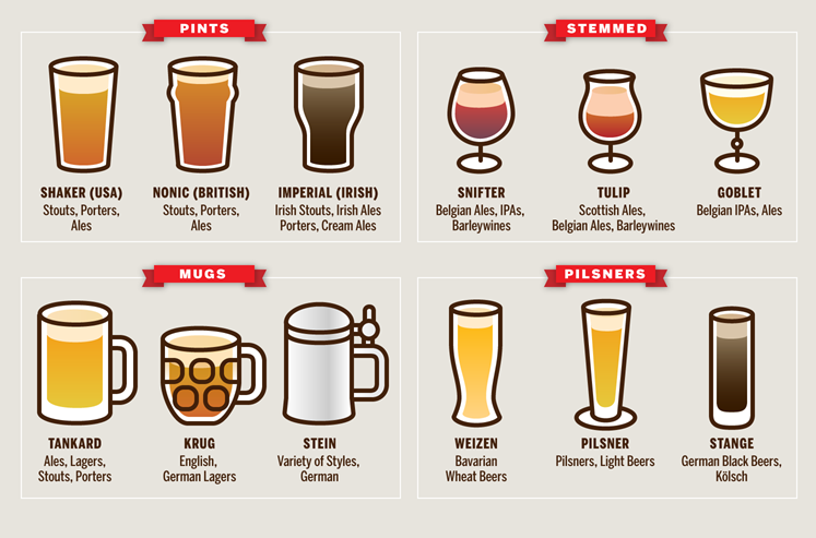
Just like with wine, if you opt to pour your beer in a glass, you’re best off knowing what goes where. Maybe it’s not so important for a simple hangout with a couple of friends, but it might be useful at a larger gathering or if you land a bartender job – or just to impress your fellow drinkers. The above example is a great help in clearing up that bit of confusion, since it’s neatly organized and everything is kept simple. The cliparts are minimal but keep all the important details, and the gray background makes them stand out and stick into the memory.
Beer cocktails infographic
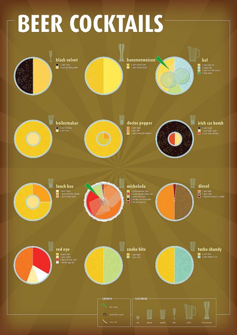
When someone mentions cocktails, beer probably isn’t the first thing to pop into our heads. Even so, it definitely has a spot in the shaker, and this wonderful visual makes for a great recipe sheet. The background strikes a balance between neutral and dynamic, and the pie chart style makes everything understandable, memorable and appealing. Adding the garnish and glassware boxes is a neat and functional finish.
There are whole worlds to explore in the beer realm and these few infographics we chose for you just scratch the basics a bit. We hope you found something new and interesting, and maybe even inspiring.
Feel free to drop by our infographic maker tool and share some brew wisdom in an awesome infographic all of your own.