With 2015 almost out the door, we thought it was about time to reflect on all the fun we had with all of you and all the new things we got to learn through making wonderful visual content together.
Here are some of the infographics you’ve shared with us over the year:
Average cost of mitzvah infographic
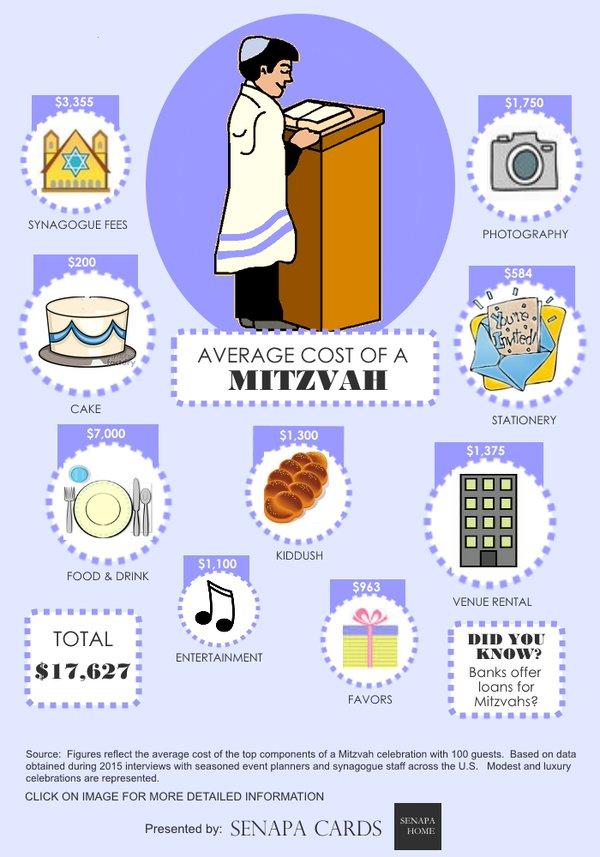
This one was created by a Twitter follower of ours. The barmitzvah or batmitzvah is a special occasion and this infographic managed to get that atmosphere of celebration and ceremony right across while providing essential information about the topic. The color scheme is elegant and gentle on the eyes, and the images make it instantly clear what that section is about. It’s not cluttered with unnecessary text and the useful fact box at the end makes for an effective finish.
How to come with up with a winning idea for an infographic
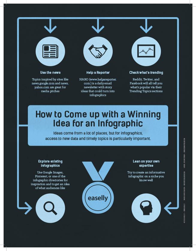
What better way to get started on creating an infographic than actually referring to one? The color scheme here is a perfect pick. It’s just serious enough but still light-hearted and friendly. The arrows ensure a natural flow of attention and the icons help remember the info that goes with them.
How to focus infographic
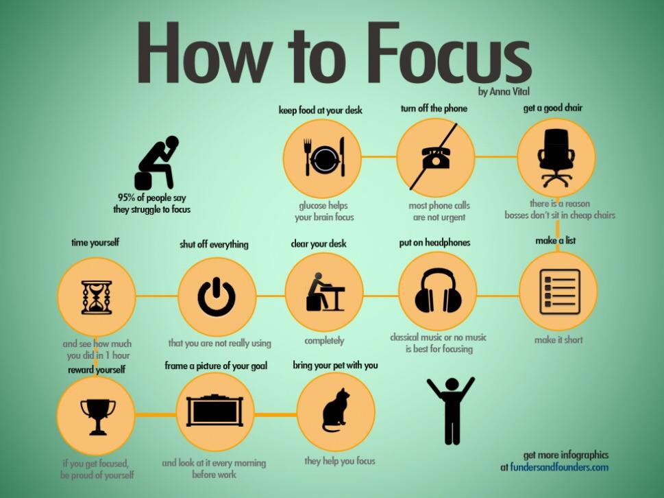
This wonderful little gem from our Pinterest board covers one of the biggest problems of students, teachers and work world residents alike. That’s why the large title is a spot-on attention grabber and the contrasting colors help keep the reader interested. It’s a neat trick to have the text continuing on different sides of the icons, and mixing a conversational style with a relaxed and friendly theme is a sure win.
Shakespeare in statistics infographic
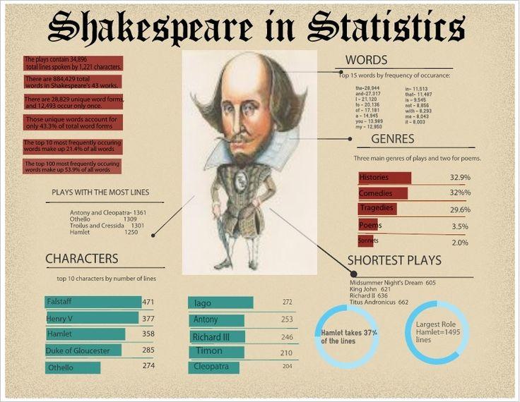
Shakespeare probably wouldn’t rank among most students’ favorite class topics, since he’s been covered, stretched and chewed over thousands of times. That’s why this clever little visual can be a total game changer in class. The quirky caricature is the first element to attract our view and starts everything off on a cheerful note. The information itself is concise and cleverly highlighted against a neutral background, and having the main emphasis on statistics is approaching the topic from a new and creative angle.
Coca-cola infographic
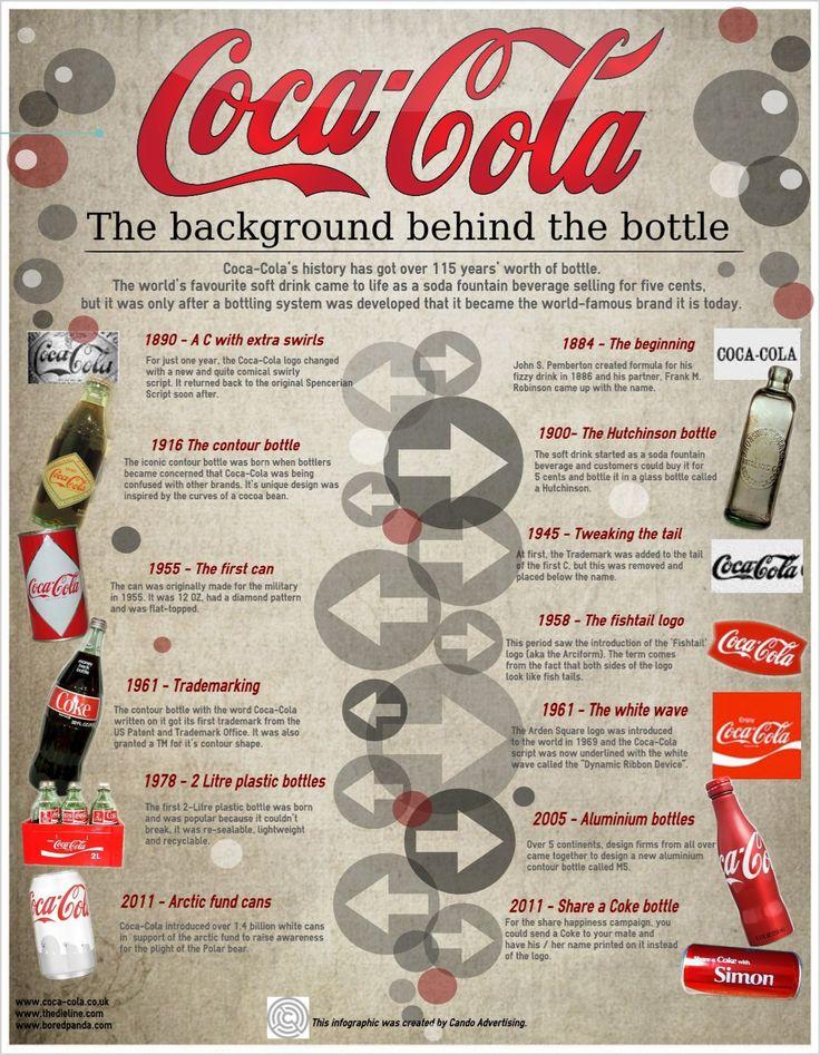
Another interesting piece from Pinterest shows the brief history of the globally loved soda in a bubbly but still serious style. Choosing the earthy background template was a perfect move since it makes the red stand out all the more. The infographic gives a comprehensive overview of all the key points in its topic timeline, and the arrows which guide the reader’s attentions are nicely complemented by the decorative bubbles.
Best practices for designing an infographic (so meta!)
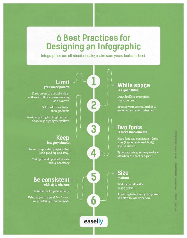
The simplest things are often more successful, that’s why this minimalistic infographic made our list. While creating engaging and unique visual content can seem challenging sometimes, this awesome little tip collection brings it down to simple and comprehensive segments. It keeps to its own advice with a dual color scheme and good font balance, and all the info is phrased in a way that’s easy to understand and remember.
Albert Einstein infographic
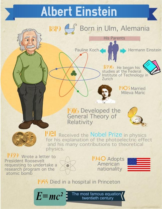
This is a great example of an infographic being a student’s best friend. Homework and essays just got a brand new dimension! All the info is there, organized neatly and with a steady color scheme that fits a historical topic, while the cartoonish title character gives everything a warm and friendly tone.
Fiber is functional infographic
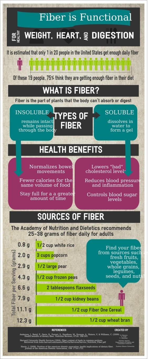
This one goes to show how even a big bulk of data can be made appealing and easier to digest. The highlighting colors are a contrast to each other, but having a neutral background and dark sub headers evens it all out. Dividing it up into smaller areas and altering between black and white text is a great way to keep attention, make sure everything is clearly seen and gives an overall smoothness.
Tutor and tutoring infographic
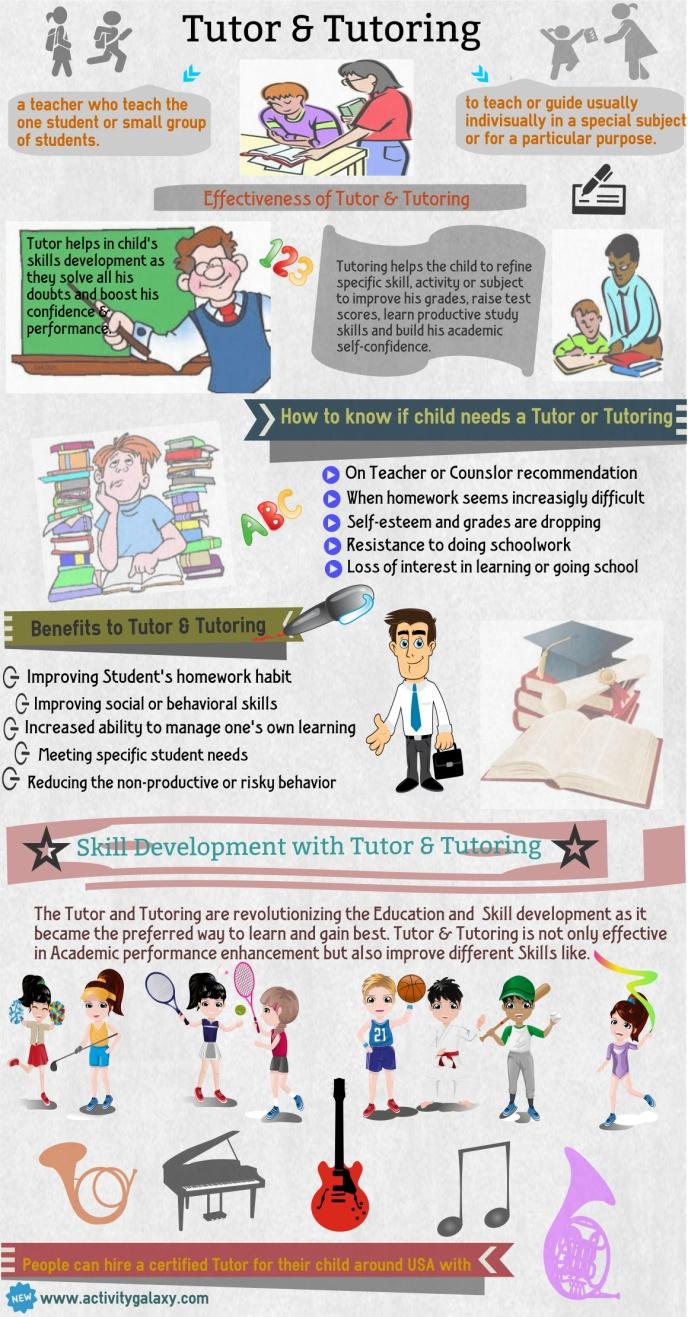
This little tutorial is a comprehensive overview of all the essential info on tutoring. It’s organized into digestible chunks and the clipart illustrations make it visually appealing while the gray background makes the content stand out more.
Animal rights infographic
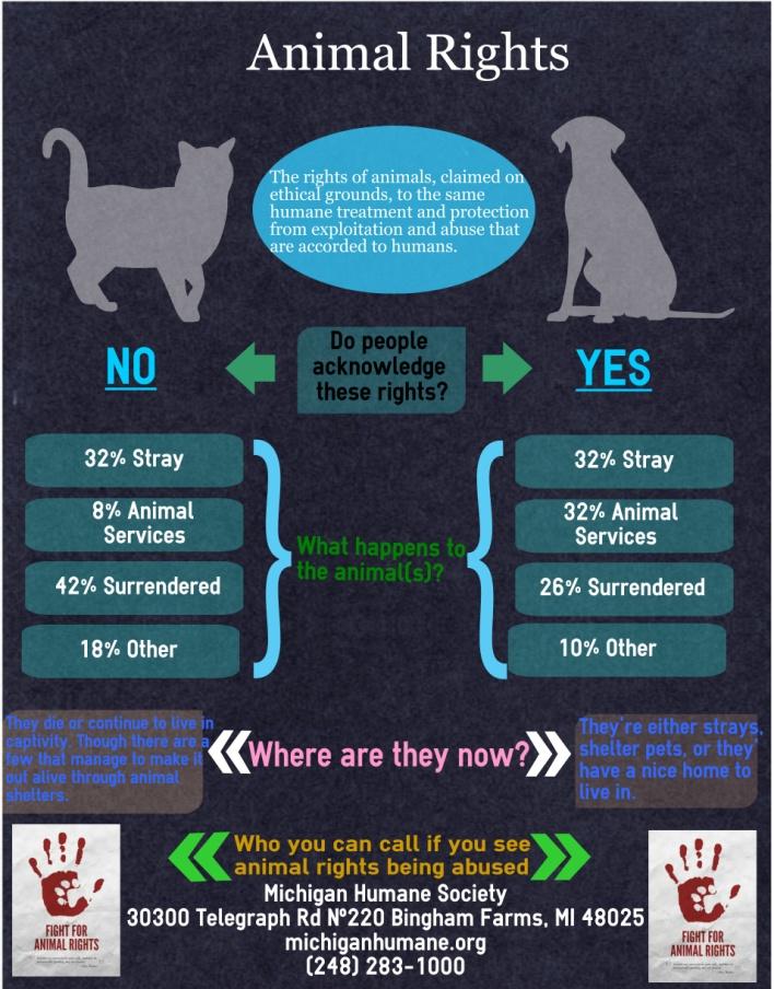
This is a great example of employing color. The dark background and corresponding element colors give a serious tone that fits the topic, while the bright text makes sure the information is clearly displayed and grabs attention. The layout is a perfect comparison and contrast scheme and the arrows add just the right bit of dynamics.
These are some of the infographics that caught our eye over the past months, but there are many more at our blog and Pinterest board, so make sure to stop by and check them out! Of course, we’d be very happy if you included some of your own unique creations in these collections, so head on over to our infographic maker tool and see what awesome templates and themes we have in store for you. Have loads of fun with it, enjoy your holidays, and we hope to keep seeing you in 2016!