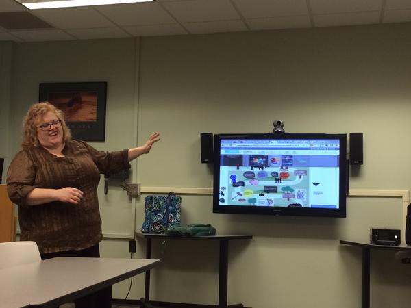
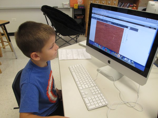
In this article, we are going to share some of the work that students and teachers created using Easelly.
This is an interesting infographic created by a teacher. The colors look great and the message is perfectly clear.
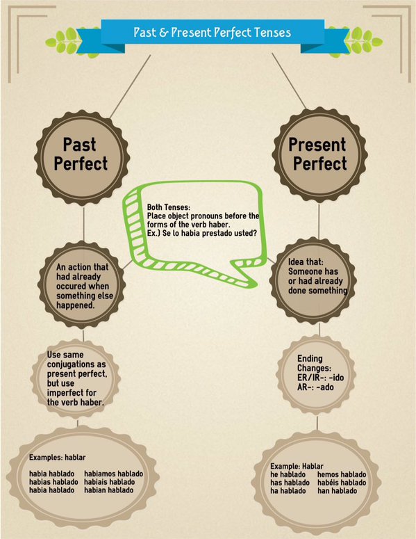
One more infographic created by students. The best way to remember the difference between Past Perfect and Present Perfect is to visualize them. It’s always great to see kids learn and do good work.
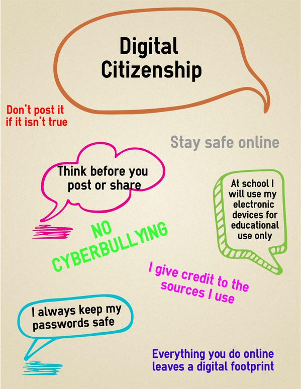
5th graders create infographics about cyber-bullying. What makes us proud the most is seeing children using Easelly, being part of their education.
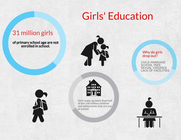
This infographic was created by a college student. Red was a great choice to point out the numbers and relevant questions.
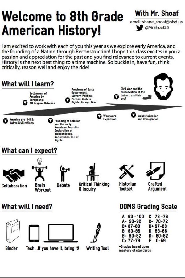
The next infographic is created by an 8th-grade teacher. Start studying the past to understand better the future. Can you imagine all the fun in learning history through infographics? The icons look so nice together with just one color – black. Simple and yet, descriptive. #HackingEducation
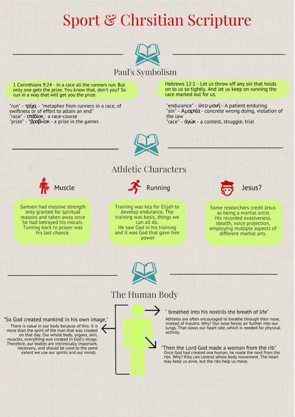
Another infographic created by a teacher for her class on Sport and Scripture. Good choice of typography.
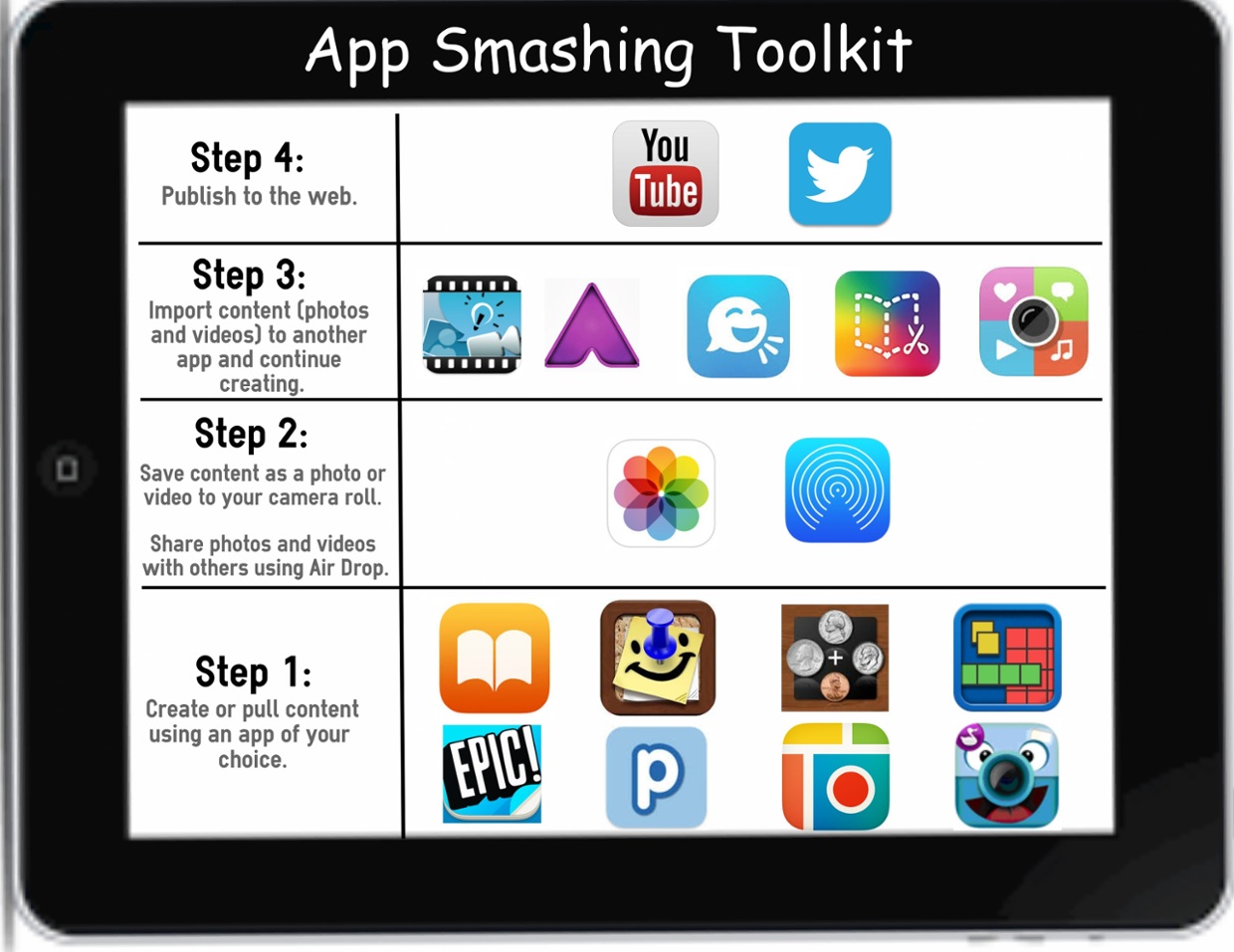
Another one from a second-grade teacher — an infographic for an app smashing toolkit.
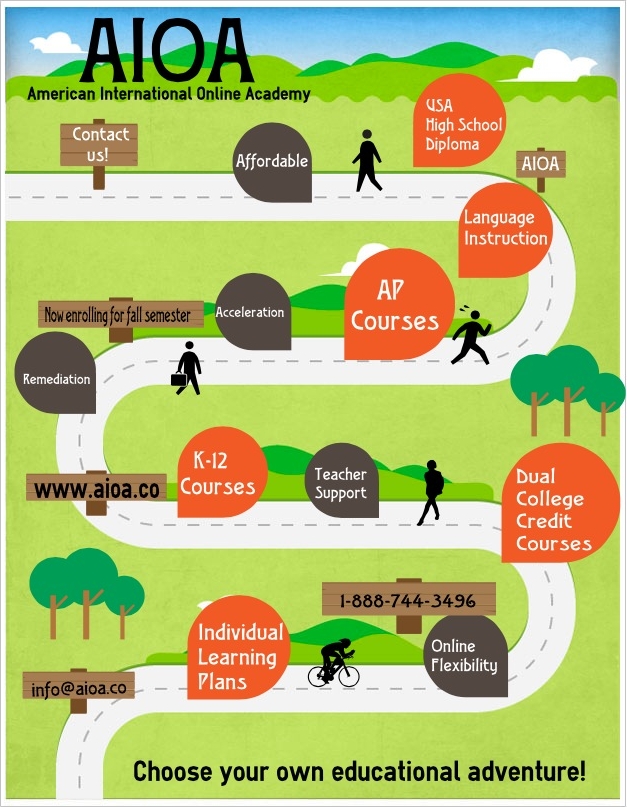
Another example of teacher using Easelly to create infographic. This infographic is created for AIOA, home to international & US students.
A class about agriculture: Teacher bringing some solid #edtech resources to class – like Easelly
And the last one, an elementary school student making infographics about candy using Easelly.
Technology conditions the brain to pay attention to information differently than reading. Presentations that contain both text and images are found to be more engaging, informative, and captivating. We hope to see more and more classrooms implementing Easelly and helping students learn more about learning.