Over the last couple of months one of the most requested features was Charts. I’m pleased to announce that Easel.ly has enable charts for everyone to use. We look forward to seeing your new infographics that now will include charts.
Here’s your quick guide to how to use charts:
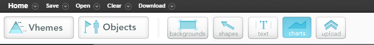
1. Select “charts” from the toolbar
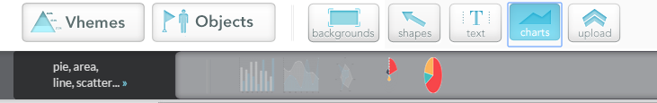
2. Drag you chart type (line, bar scatter, pie charts) from the toolbar
3. Double click the chart to get chart options
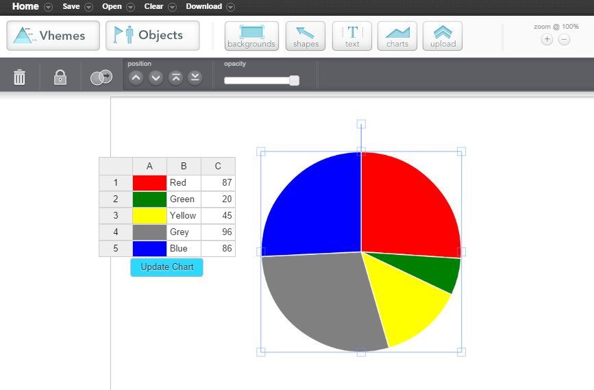
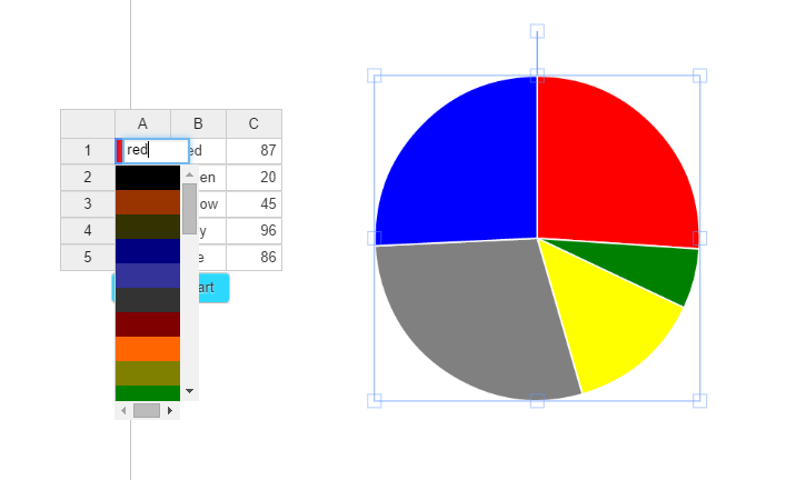
4. Double Click on a color to change that color on your chart.
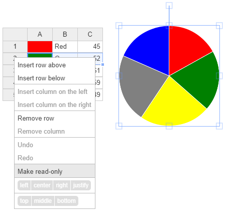
5. Add a new section – Right Click on a row.
Make sure and share with us your creations on our Facebook or Twitter pages.