The most difficult part of creating infographics is making sure that they’re clear, concise, and well-designed.
Sometimes, we find ourselves making infographics that look more like pretty essays rather than the graphics they’re intended to be.
Plenty of people make this mistake, but it’s time to see infographics as more than just a template for new fonts or images to use with your text.
Using Infographics to Get Your Audience’s Attention
Infographics are a visual tool that you can use to tell a story (whatever story that may be) in the most memorable way possible.
Here are four tips to help you do just that!
1. Ditch the Paragraphs
Take a moment to think about what you want to say in your infographic. Do you need to relay data or statistics?
Do you want to explain how something has grown or changed over time? Do you want one final point to really stick out?
Think about how you can say what you need to say with ONE picture or ONE sentence.
If your concept or subject is too complicated to break it down into either an image or a sentence, consider making a series of infographics on the different facets of your subject, or possibly think about narrowing your subject down.
Taking this time to really evaluate the important bits of information will prevent you from sharing overwhelming, text-based infographics. If you skip this step, you might end up with lines and lines of information, which overwhelms your audience. Don’t force them into reading your infographic – help them visually absorb your information!
2. Make it Move
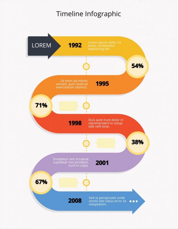
One of the coolest thing about infographics is that they can tell a story in pretty much any direction you can think of. They can tell linear stories…
They can show how things are connected…

Or they can show the different paths you can take…
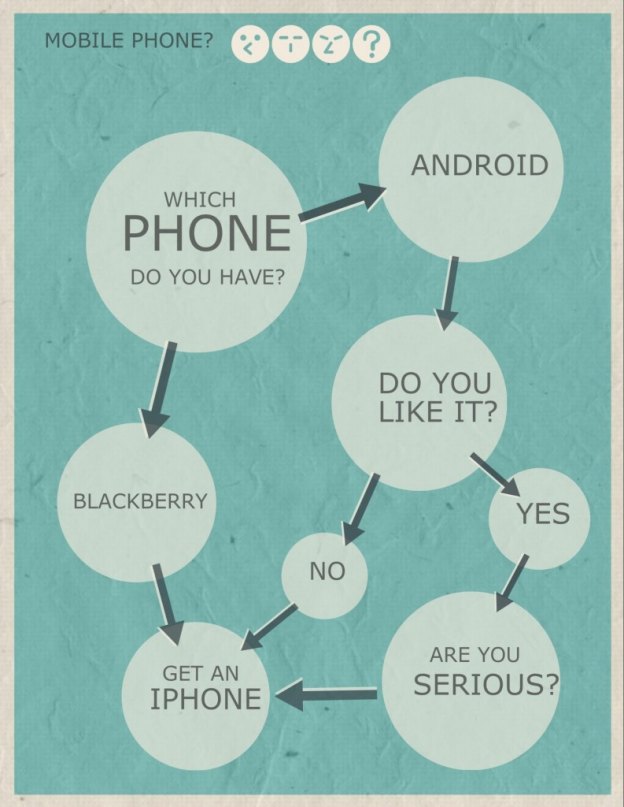
One thing they don’t do is spell out which way to move. Nowhere in these infographics does it say “Turn here,” or “Now let’s move to the blue square.”
Your brain naturally knows where to go next if the infographic is well organized, right? So next time you’re thinking of an infographic, think about how you can design the infographic so the brain naturally knows where to go next, rather than overwhelming your audience with direction.
If you can highlight your points in one image or one sentence and then connect the dots in visual ways, you’re on the right path!
3. Let the Icons Do the Work
After creating your general theme or layout for your infographic, you might be tempted to fall back on text to get your point across. Resist temptation! Instead, really try to think about what icon or image you can use in place of words that will get the point across better. What do you think about when you see a big check mark?![]() What do you think about when you see a large “X”?
What do you think about when you see a large “X”?
![]() Translate this into other points – use meaningful images and get creative!
Translate this into other points – use meaningful images and get creative!
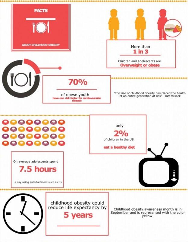
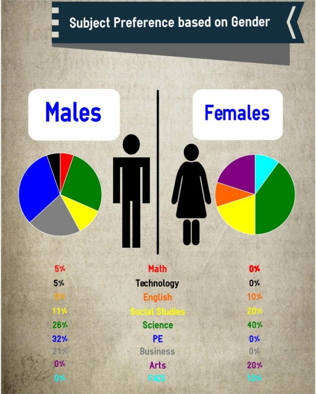
Why not use little stick figure icons to represent people in your data or use a pie chart or graph to explain your stats (or both, like the image below)?
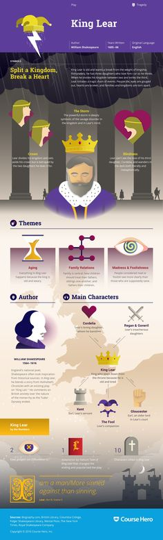
This can get tricky for some subjects, like history or literature, but the more creative and visual you get, the more your audience will respond. There is always ONE image you can use for whatever statement you want to make, and if not, try to stick to ONE sentence to explain something images cannot.
4. Think 100 Percent Visual
While not every point you can make will always be translated into visuals, thinking about your information visually will help you make infographics that stand out and tell exactly the story you want them to. It also gets your creative juices flowing.
The second you try to challenge yourself to make your data 100% visual, your brain will work in ways to make that happen. You can also use infographics to make a standalone visual that supports your presentation, blog, product, business – whatever.
Make a visual that represents a few main points about what you’re trying to expand on. The second you connect visually to your audience, the more likely it is they will want to hear the rest of what you have to say.